The interior of Edwards Lifesciences’ new Innovation Center near Tel Aviv mixes cool scientific futurism with an organic approach that speaks of its work with the heart and circulatory system
A complex interplay of organic and straight lines pervades the interior of Edwards Lifesciences’ Innovation Center in Caesarea, Israel, a coastal area midway between Tel Aviv to the south and Haifa to the north.
Edwards Lifesciences, an American company whose HQ is in Irvine, California, specialises in artificial heart valves and haemodynamic monitoring (the study of how blood flows through the cardiovascular system).
Originally called Edwards Laboratories, it was founded in 1958 by engineer Miles ‘Lowell’ Edwards who, working with heart surgeon Albert Starr, invented an aortic valve prosthesis which would save the lives of thousands of patients around the world.
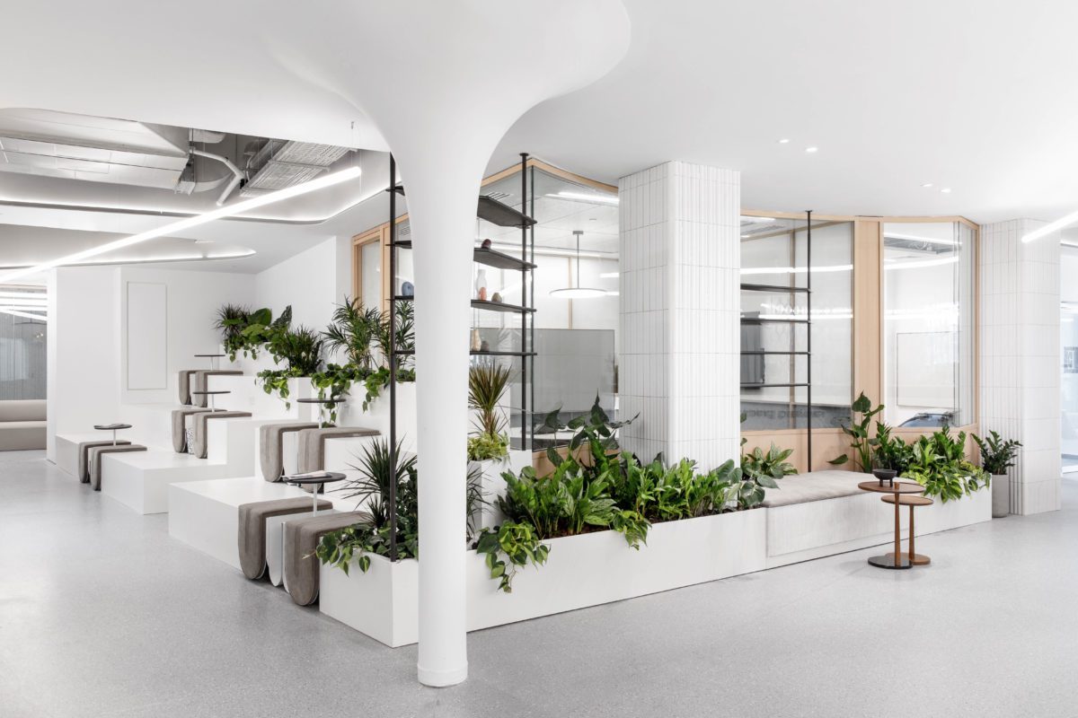
The interior of its Israeli outpost has been designed by Tel Aviv-based practice Roy David Architecture. Its style is predominantly futuristic. Lightsaber-like strip lights shoot along ceilings or are positioned diagonally at ceiling height to dynamic effect. One breakout space triggers flashbacks of such classic 1960s and 70s sci-fi movies as Stanley Kubrick’s 2001: A Space Odyssey and Woody Allen’s spoof sci-fi movie Sleeper.
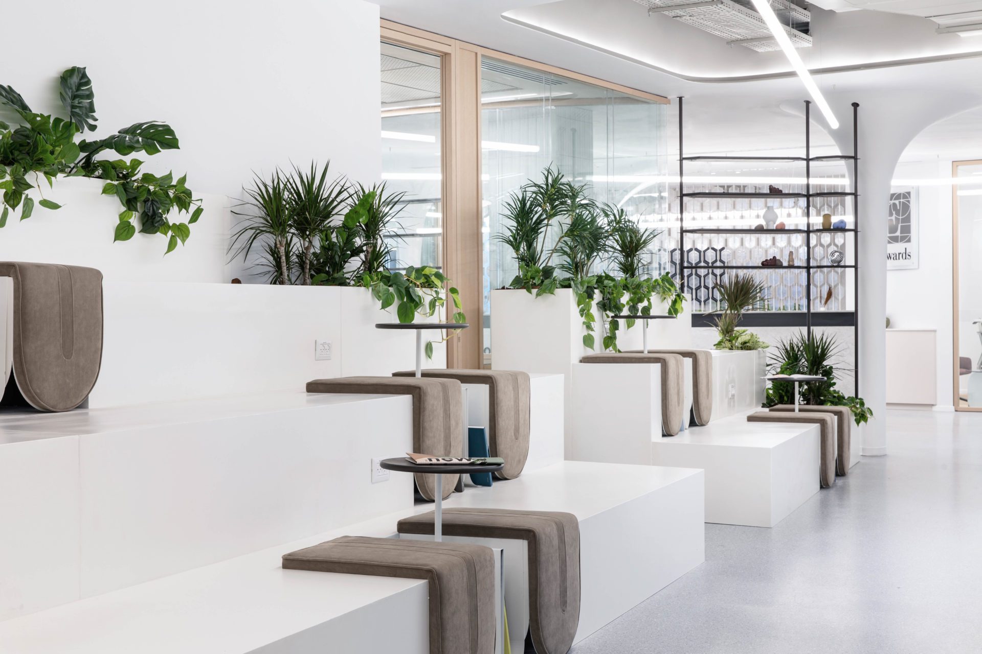
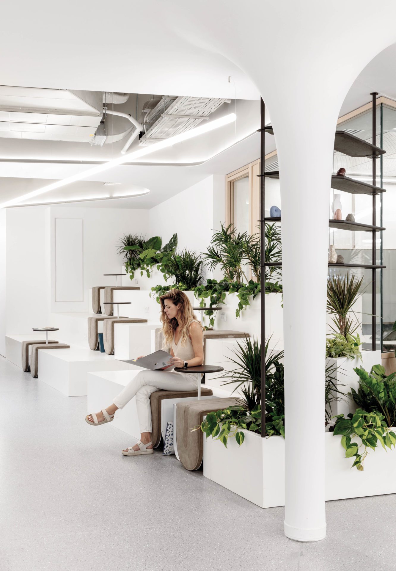
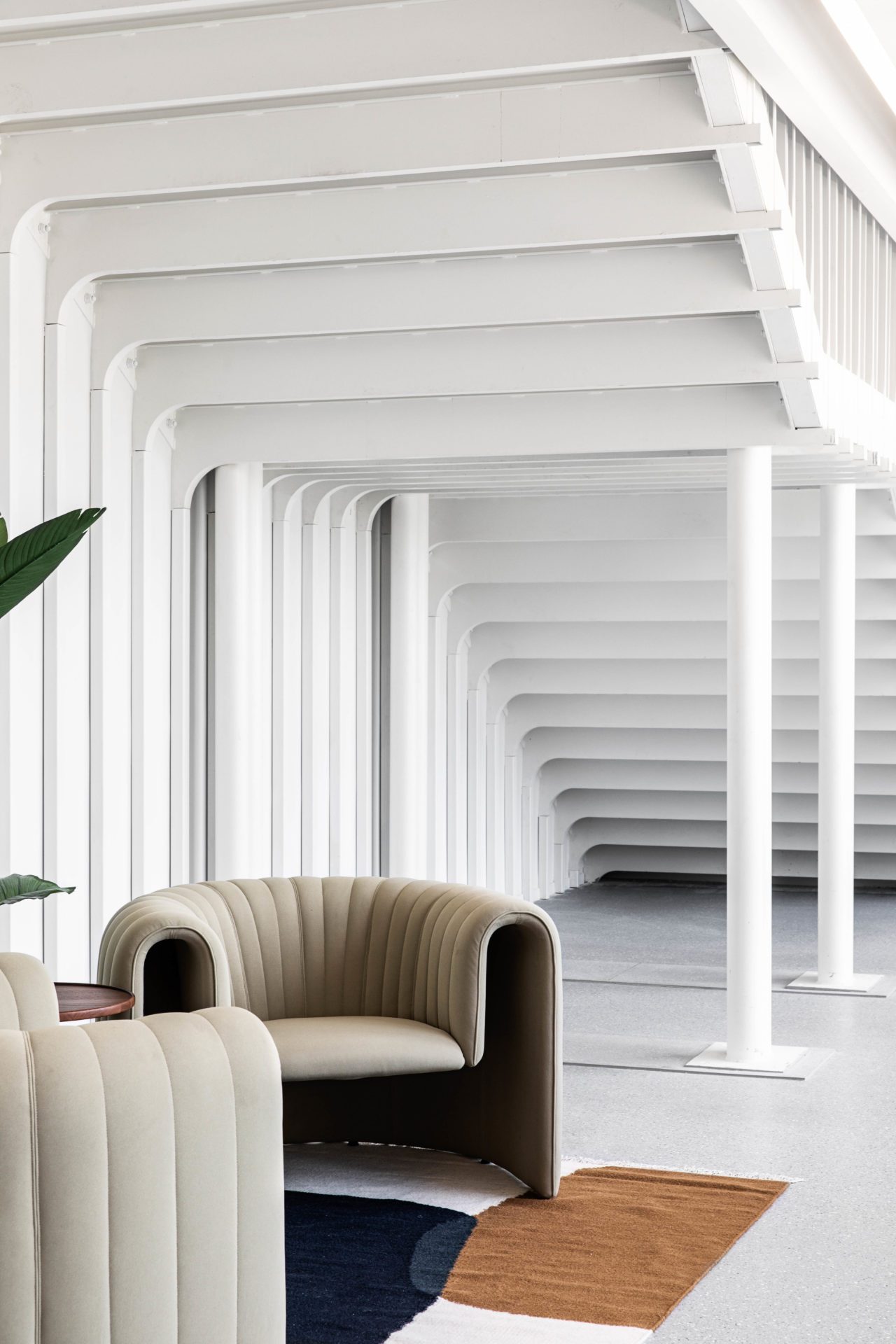
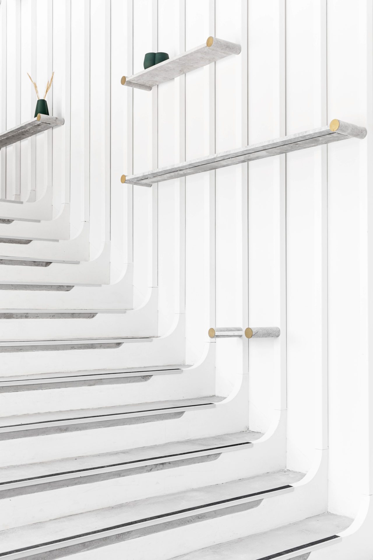
There might be no sign of any robots or human-voiced computers (aside perhaps from Alexa) in this breakout area but it’s reminiscent of this genre of movies, with its almost all-white interior featuring columns flaring out like mushrooms as they reach the ceiling, and a bank of steps, minimally upholstered with cushion pads shaped like tongues, providing seating for the workspace’s 250 employees.
Breaking up this potentially clinical space are various boxy planters sprouting luxuriant plants – an unmistakably contemporary touch, given the craze among millennials today for lush indoor greenery. The fusion of straight and curved lines here is in fact highly considered. Its organic, biological forms reference the human heart and body, while its orthogonal or right-angled planes are designed to evoke the idea of engineering.
The project, initiated in January 2020 and completed in June 2021, entailed connecting two sites on three levels linked by a striking double-height staircase overlooked by a mezzanine. Two floors occupy 2,500sq m, the third 500sq m. It features many bespoke elements.
The client stipulated that the project house workstations in both open-plan or cellular spaces and facilitate scientific research and development in the form of 250sq m of laboratories – these include a catheterisation lab kitted out with diagnostic imaging equipment used to visualise the arteries of the heart and chambers of the heart – and a clean room (a space sealed off from dust and airborne organisms, designed to keep these away from any products handled inside it).
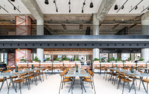
Other amenities include a cafeteria that normally seats 100 people but can be expanded to accommodate all 250 employees for large company events, different types of meeting rooms, including one suitable for 40 staff, phone booths, a gym, showers and balconies.
The biological theme is carried through in other areas of the space, notably in the cafe, whose layout is intended to suggest the heart’s four chambers. Its ceiling has gigantic biomorphic lighting fixtures that cast indirect light and incorporate pendant lights, while similarly shaped apertures above the staircase expose mechanical elements and pipes suggestive perhaps of arteries and veins.
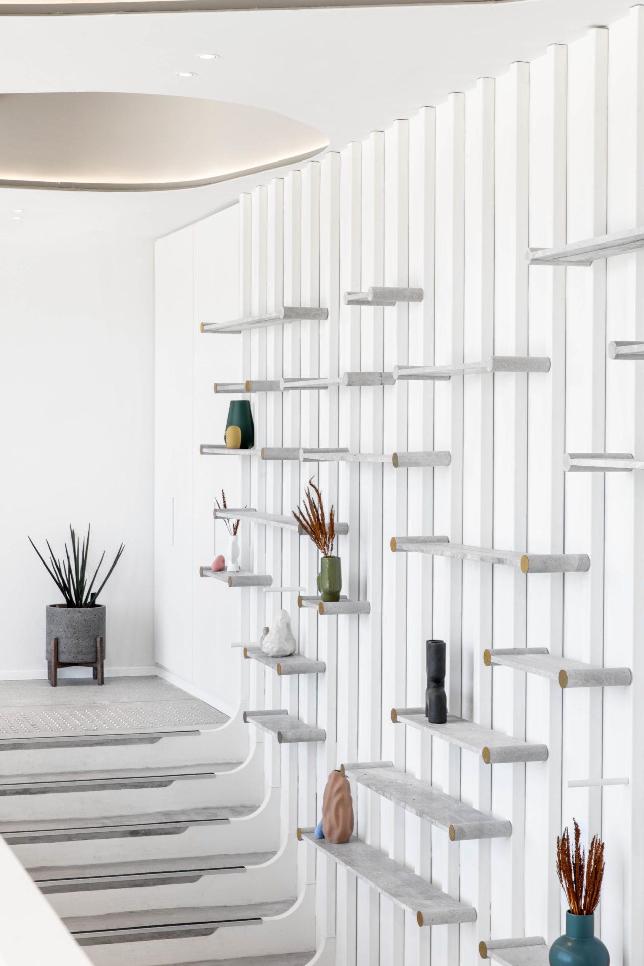
A massive wall-mounted unit displaying plants, vases and sculptural ceramics in organic shapes, which lines one wall in the stairwell and faces a mezzanine opposite, combines curves and straight lines.
It would be simplistic to sum up the style of the project’s interiors as futuristic, however. Certainly, the word aptly describes one white and pale grey corridor flanked by glass-fronted rooms as well as the breakout area with stepped seating. The latter might boast a plethora of plants, but the space feels hermetic, redolent of a space capsule. In this context, the greenery, which is in stark contrast to the otherwise all-white environment, looks rather artificial.
Yet the project, which acknowledges its context, is inspired, too, by its natural surroundings. The building housing the innovation centre is one of three structures located around a park with a pond that overlooks the Mediterranean.
“The interior’s atmosphere and colours were influenced by the context and views of the old city of Caesarea and the Mediterranean seen from the offices,” say the project’s lead architects Shira Cohen and Lital Fogel. “We used white and pale colours together with elements made of wood to achieve a sense of a calm, coastal interior.”
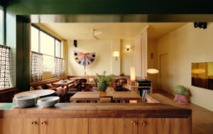
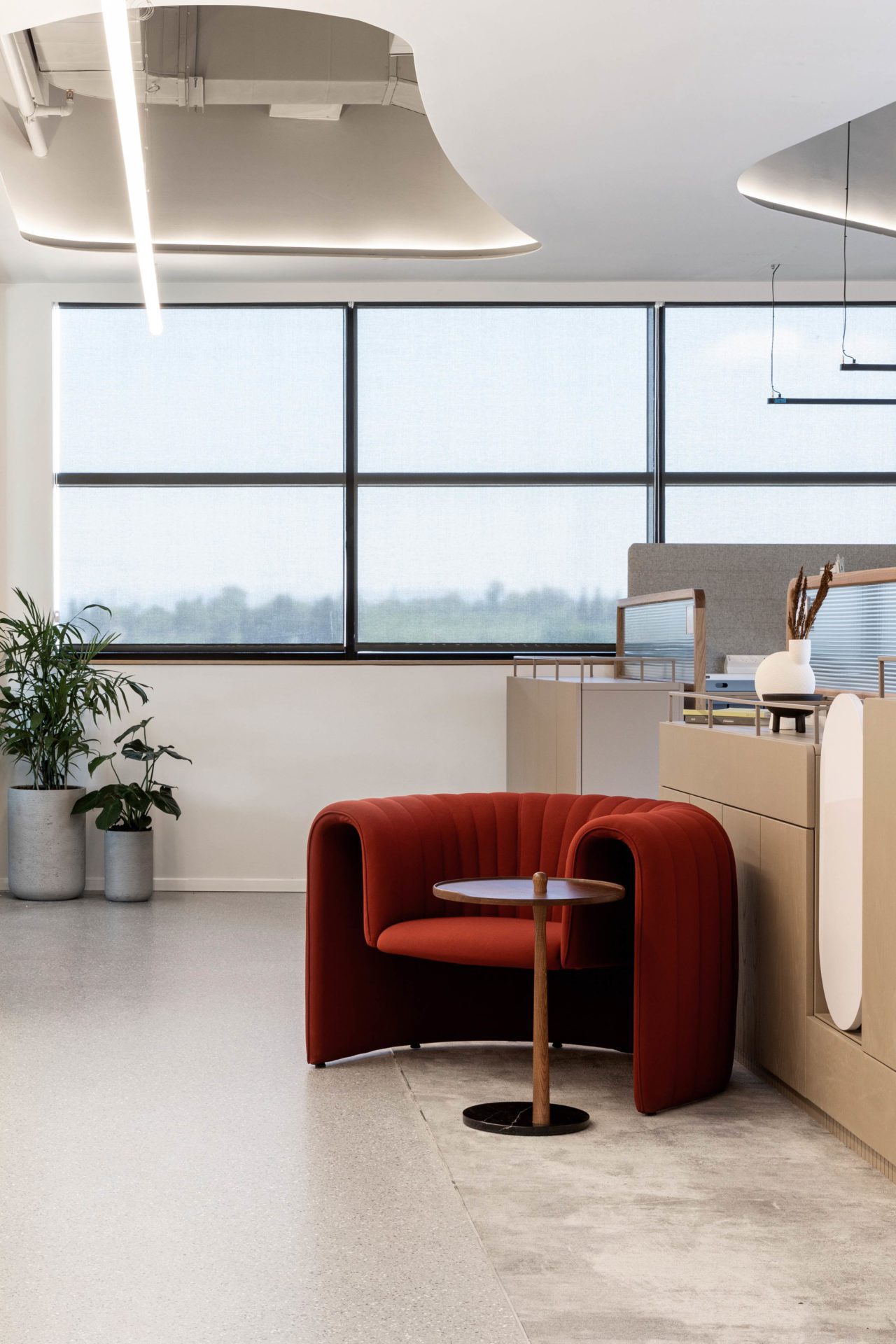
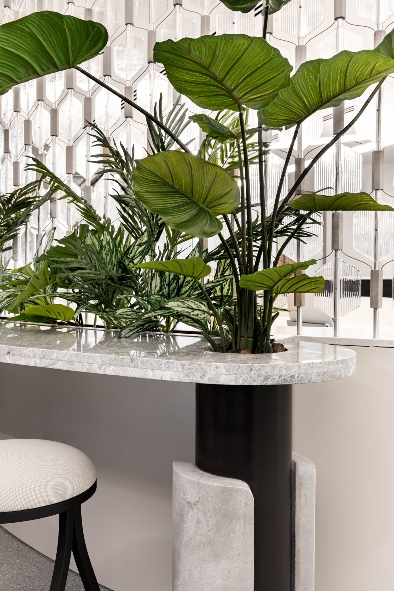
In the cafe, furniture, including tables, chairs, storage units, bar stools and monolithic bars, all in blond wood, bring a degree of warmth to the otherwise white and pale grey space. There is a human scale to a lot of the furniture found in the building. This includes conventional benches and small, informal tables where employees can casually place drinks and laptops.
Although Edwards Lifesciences didn’t address sustainability as part of its brief, according to Cohen and Fogel, Roy David Architecture factors this into its projects as a matter of course: “We take sustainability into consideration in all our work.” Examples of this in this instance include carpets and ceiling-mounted acoustic foam panels made of recycled materials. “We also strive to use locally fabricated elements which don’t require to be transported internationally,” add Fogel and Cohen.
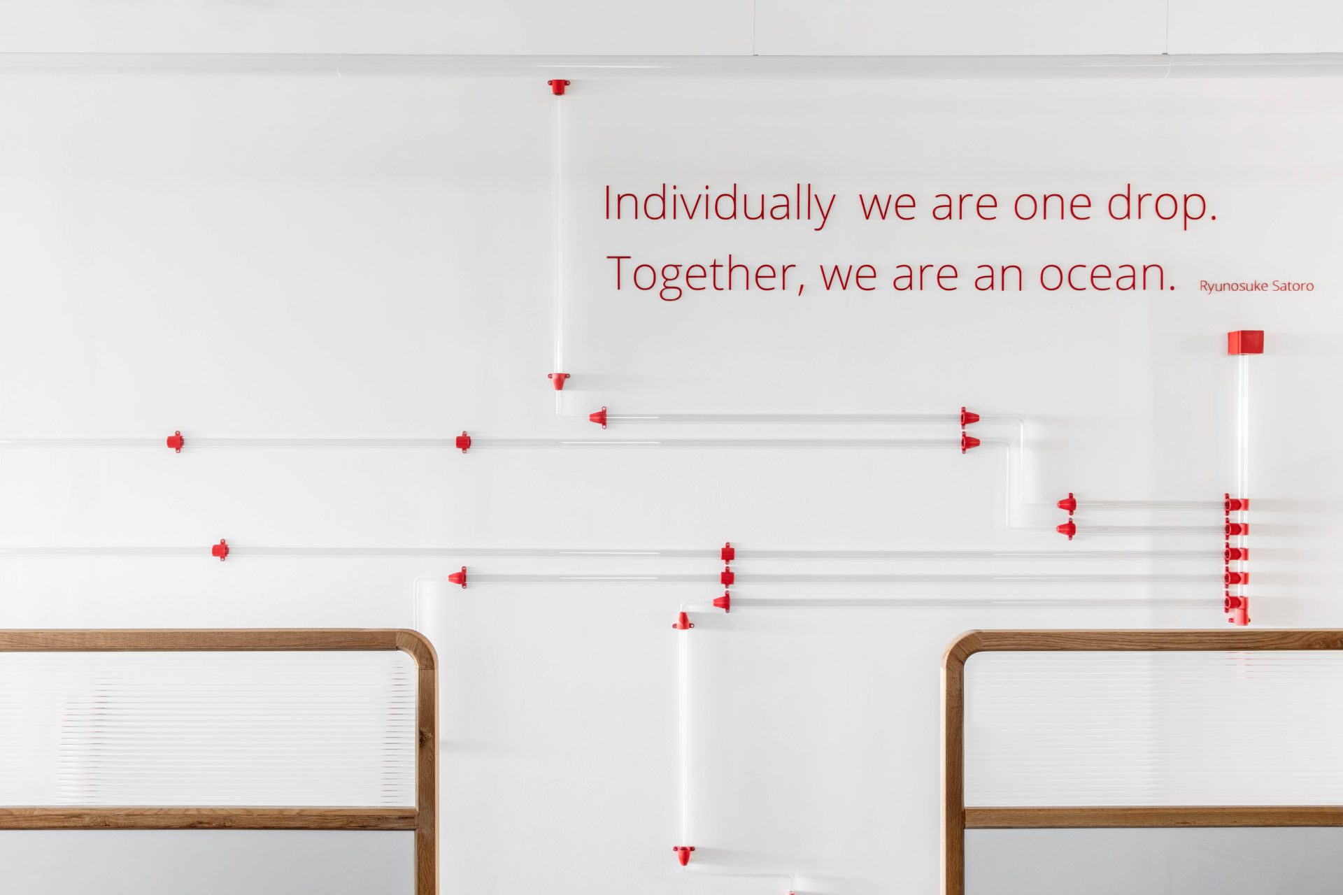
Another aspect of the project is that it doesn’t feel purely science-orientated. Dotted around its interiors are artworks, encompassing video art and installations, some of which are interactive. The fact that the space is designed as an innovation centre was an invitation to the architects to experiment. It was vital that the end result avoided looking mundane.
“The client had asked a few studios to create presentations as a preliminary phase with an initial design – and our studio was chosen for the project,” say Cohen and Fogel. “The main point that had to come across was that as an innovation centre it should inspire and make an impression on employees and visitors alike. Our goal at the outset was to create an innovative, productive workspace while reflecting the story and essence of the company.”
Images by Itay Benit
As featured in OnOffice 159, Summer 2022. Read a digital version of the issue for free here


