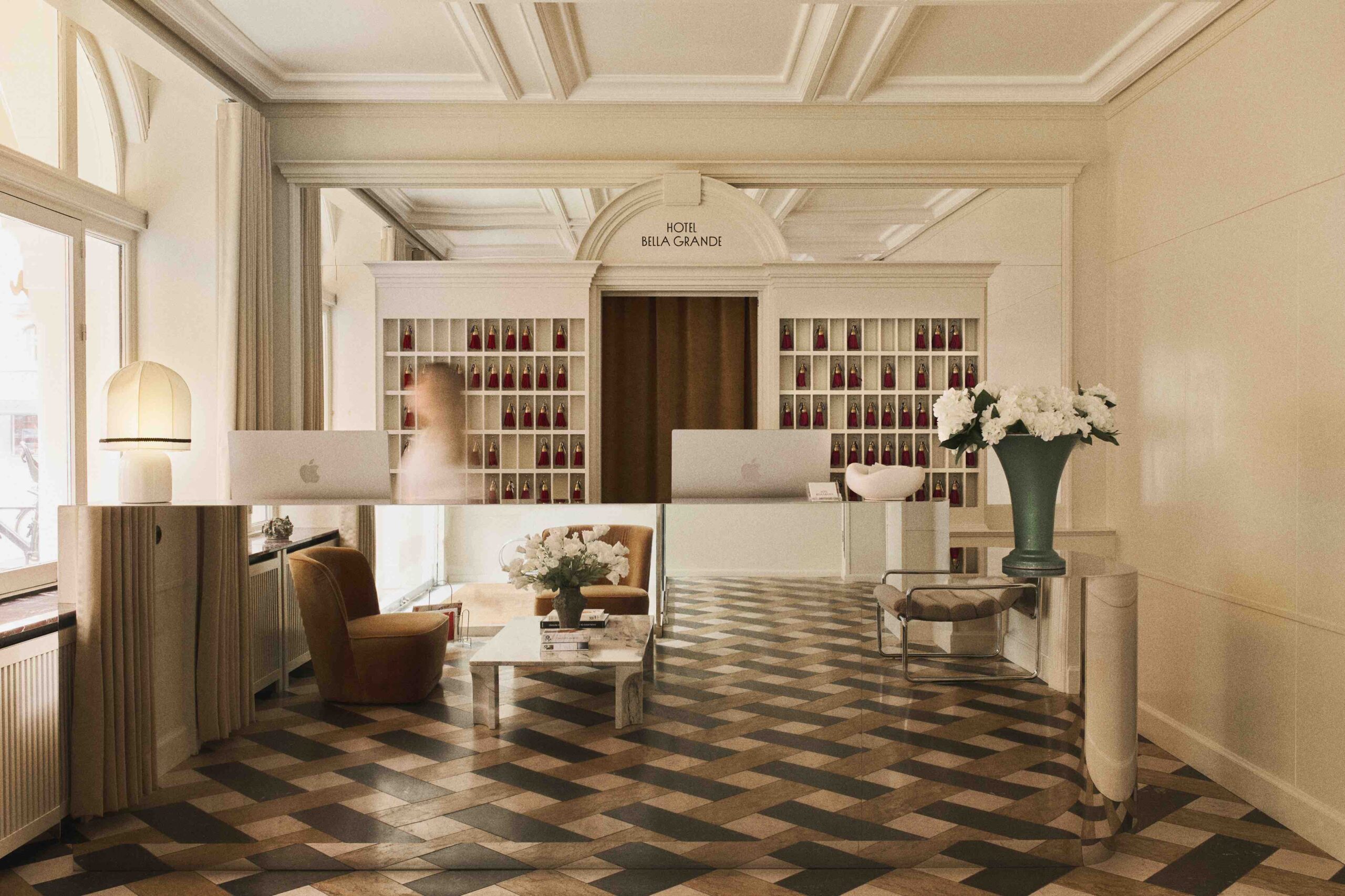
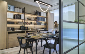
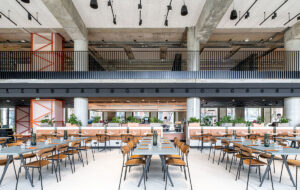
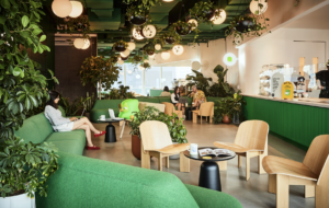
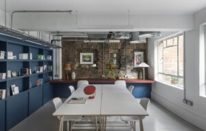
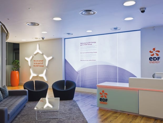
 Company branding and philosophy dominate the reception area|Graphics and manifestations carried out by Ltd Limited|Images of British Olympic cyclist Victoria Pendleton loom large over the bench-style seating in the cafe|Plenty of light reaches this break-out area, with its oversize suspension lamp and abundance of windows|A revamped meeting space with some of EDF’s old furniture reupholstered in new fabrics and tables updated with new tops||
Graphic branding takes centre stage at energy giant EDF’s ultra-green new office space
“The interior was about living and breathing their green ideals,” says Vyshali Sardesai, associate at BDGworkfutures, which worked with UK energy company EDF on the revamp of its headquarters near Victoria station in London. This encompasses everything from the selection of sustainable materials within the fit out to showcasing the company’s new brand messaging.
This began with the reception. Before the redesign, visitors encountered a large, bright atrium space upon entering the Grosvenor Place building, where levels of welcome and security were relatively high – yet when they crossed the EDF Energy threshold on the first floor, the contrast was marked: there was no formalised meet-and-greet area.
This has now been rectified with a clearly branded destination point and a manned reception desk, where visitors are greeted and given a welcome booklet as they sit and wait on the charcoal-grey tub chairs and sofa, while a light installation further reinforces the EDF message with brand imagery.
“We went out of our way to get a good quality reception and we felt that as well as being professional it should be secure, so we introduced glass turnstiles,” explains Andy Trotter, EDF Energy’s head of property. A concierge-style floorwalker service is available to show people where they need to go, where previously they would have headed into the firm’s open-plan environment.
“The worktops in the service area are made entirely from yoghurt-pot tops”
Guests can now go straight to the new Touchdown zone, for instance.
“We have a very large number of visitors and we needed a facility for them, where they could plug into the internet and log on to EDF’s systems and also store their luggage. This hotdesking space is exclusively for their use,” says Trotter.
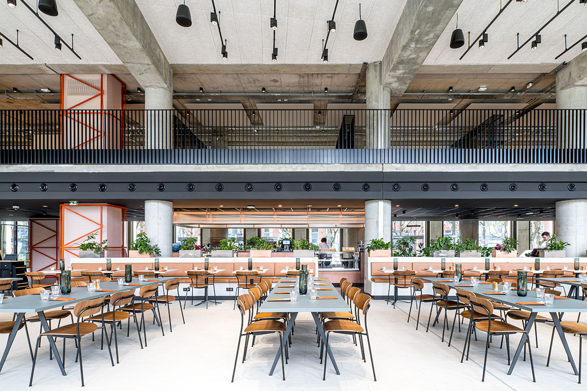
The brief called for a contemporary yet classic interior, and this is best exemplified in the cafe area, which has a combination of tables and chairs and bench-style seating, with bright orange and white oversize suspension lights. Images of Olympic cyclist Victoria Pendleton loom large here, part of the corporate branding imagery used throughout the space.
Where previously there was a lack of standardised work settings – some staff had an abundance of space around their desks while others were in somewhat cramped conditions – now the building is used more efficiently and the density is on more of an even keel. There is further transparency too – the office landscape is lowered to ensure a clear line of site, as Trotter explains: “In the old office design, everybody had their backs to you. The staff weren’t linked in. Now, people can look at a variety of other areas. It’s a much more welcoming environment.”
Sardesai explains how BDG created a more fluid circulatory route: “We came up with the idea for a manifestation, using icons that would talk about green Britain, based on EDF’s ten steps to reduce carbon emissions.”
Here houses, trees and bicycles are interspersed with soundbites on how the company is working with car manufacturers to improve the design of electric vehicles or providing charging bays for them.
During BDG’s discussion and discovery phase of its design process, it conducted a space utilisation study, where it found that although most of the meetings were two-person or four-person, most of the space available was for between six and 20 people. The space was reconfigured to meet these needs by increasing the number of more informal spots to gather. The more formal space that remained was given a makeover with white walls to add a crisper finish, and there are increased facilities for video conferencing to cut down on travel and consequent carbon footprints.
The green theme is embraced in all concievable areas of the office”
Interestingly, even though this workspace has a certain boxfresh aesthetic, Trotter says the reality was quite the opposite: “In terms of being sustainable, one of the most basic things we did was reuse the furniture.”
All frames and legs on the desks are the same, with new tops added, task chairs were reupholstered and refurbished with new fabric and all high and mid-height storage units were resprayed – 70 percent of pieces were recycled in all. Ceiling tiles were also refreshed instead of being replaced, while the air-conditioning system was refurbished to improve its output.
Recycling of materials is a huge part of this workplace design story. During the fit out, demolition material was saved from landfill as much as possible and the timber in the reception is reclaimed from Hoxton Square Gallery, east London. Instead of run-of-the-mill wood, imperfections such as small splits, nails and pinholes are what gives the timber its character.
The worktops in the service centre, meanwhile – home to centralised printers and copiers that cut down on paper usage and get staff moving around the workspace – are made entirely from yoghurt-pot tops.
The new carpet tiles are from Desso, which has a commitment to the “cradle to cradle” approach of waste-free production, while elsewhere flooring is made from rubber with coconut fibre rope, which is not only hard wearing but also provides texture. Instead of using pin boards, the walls near the meeting rooms are clad with cork, another material with ecological appeal. T
he green theme is embraced in all conceivable areas of the office, even down to the water-based inks used on the graphics and manifestations, which contain no solvents, and the substitution of plastic cups for ceramic mugs in the break-out area. Recycling options have been widened to separate out plastic cups, aluminium cans, white paper, general plastics and confidential documents.
“We had a strong sustainability story to tell,” says Trotter. “The space is used by around 100 people, but it’s also about the 19,900 who aren’t based there.”


