 |||
|||
Tucked away from the hustle and bustle of Slaveikov Square in the city centre of Sofia, there lies a bijou coffee shop that works hard with the given space. Designed by Bulgarian architecture and design bureau DontDIY, coffee and tea shop Drekka arose from a challenging brief whereby the landlord did not allow any permanent changes, rent had to be paid during the redesign, and the architects had to work with both a tight schedule and a tight budget.
“It is far more reasonable when only one of these is an issue,” says Antonina Ilieva, who runs DontDIY alongside its three founding partners Svetoslav Michev, Stefan Minkov and Hristo Stankushev. “But the clients’ appreciation of minimalist design and passion about the coffee culture cause are what convinced us to take up the task.”
The team approached the brief with marked maturity and a clear understanding of the functionality-meets-minimalism paradigm, and with only 42sq m to work with, a minimalist approach seems incontestable. The space consists of two parts: the first is where drinks are prepared, the second is a work-shop and events space with a large Italian Bianco Carrara marble countertop – also an ideal surface for wet process.
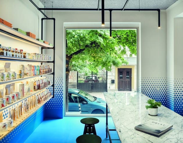
 Exposed open shelving appears to glow from within.
To make the interior look bigger, tailored one-sheet commercial PVC flooring was mounted on top of the existing ceramic floor. The blue flooring was continued upwards on the walls with a custom-order vinyl sticker that breaks up at waist level.
“The blue graphic ombré pattern was our attempt to respond to the limitations of the project in a creative way,” says Ilieva. “The transition of strong colour from floor to wall alludes to the historically affirmed proportion of plinth to wall and provides the minimalist space with comfortable human scale.”
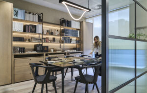
Most walls are left bare, allowing the pattern to thrive, but where needed, DontDIY opted for simple exposed shelving made of birch plywood that the architects specified “both in search of simplicity and for budget-related reasons”. The open shelves appear to glow from within, showcasing Drekka’s collection of artisanal teas, coffees and other accessories, while the rest of the space is lit via a network of custom-made tube lighting that matches the tubular framework of the shelving.
 A vinyl graphic leads on up on the wall from the blue PVC flooring.
The result is an airy interior where programmes are laid out in the two sub-zones of the client space “in a way that makes customers gravitate towards the big windows”. In line with the studio’s belief that neither interior space nor building should be “an isolated entity of self-sufficient beauty”, the visual cues from these large glazed openings help embed the coffee shop in its surroundings.
“In this case,” Ilieva concludes, “although we got a brief for a modern minimalist commercial space targeting a lot of younger and middle-aged crowds, we used the floor-to-wall, and wall-to-ceiling transitions to reflect what we believe to ring true in spaces and buildings in Sofia – a certain sense of historicity and traditionalism in the best nostalgic sense.
DontDIY’s vibrant design for a tiny coffee shop in Bulgaria’s capital focuses on concentrating its unique flavour

