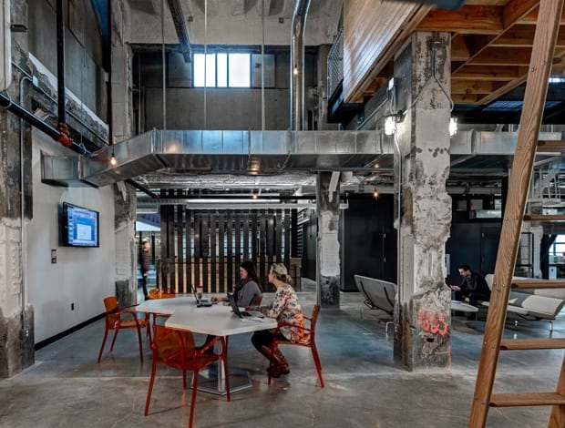
 All that was left in the building was the concrete core and airconditioning|The open-atrium spans five storeys|The openness of the office leads to transparency and connectivity|The 13m LED screen dominates the atrium|Taking a break from the open-office environment|Bespoke lighting was created for key areas|Printing plates from the 50s and 80s line the ceiling|500 wooden pallets were repurposed|Agrricultural wire mesh used for the ballustrade|The original concrete floors were ground and polished||
When Lowe Campbell Ewald (LCE) returned to Detroit in 2014, it was to a very different city from the one it was born into over a century before. The agency moved its corporate HQ into a downtown warehouse built by JL Hudson, owners of what was once the world’s tallest department store, derelict since the 1990s.
The building’s recent reincarnation could be seen to mirror the boom and bust that has beset the city, from a hub manufacturing and automotives to a place where young creatives and tech start-ups flourish – the proverbial phoenix from the ashes.
Joel Smith, partner at Neumann/Smith Architecture, told onoffice that LCE chose to “embrace the ugly” and showcase the warehouse’s “bare bones”, a vision the practice set about translating into a fitting workplace for its 500-strong team.
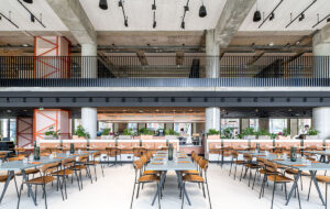
The original concrete floors were ground and polished, while structural steel members on higher levels were sandblasted and painted “to reveal their original industrial flavour”. The concrete bell columns were cleaned up and preserved in their roughed-up state.
“Exposed ceilings featured throughout the new space, all electrical and ventilation systems are on display as key architectural features,” Smith said.
“Great care was taken to make sure all systems looked perfectly parallel, in additional to being functional.”
Put your hands up for Detroit?
The move from a conventional, neatly cubicled office in a Michigan suburb to a derelict warehouse in downtown Detroit wasn’t met well by every LCE employee.
“Some employees viewed Detroit as an unsafe city on the verge of bankruptcy, while others saw it as an aspiring creative community on the precipice of a major comeback,” Smith said.
“Some saw the open-office environment as loud and distracting, while others embraced it as an opportunity for greater collaboration and idea generation.”
The entire office centres on an atrium: a gaping void overlooked on each side by five open work floors. These have been fenced in with glass balustrades in order to maximise the visual connection between employees on different levels and departments. The effect is furthered by the black metal stairwell that snakes up through the centre of it to up ‘the bump factor’.
In case anyone forgets what the company does, a vast 13m LED screen dominates the atrium, galvanising the troops with customised messaging and imagery. Beneath this, a variety of breakout areas contain soft furniture and informal meeting spots that slot around a built-in plywood stage, the broad steps of which double as seating for today’s mobile workforce.
In classic ad-land parlance, there’s also an “ideation space” on the ground floor alongside a two-storey bookcase and display cabinets holding LCE sketches, awards and memorabilia. Hovering above, two “tree houses”, constructed from plywood and reached by scaffolding ladders, provide privacy. Their tilted slats allow inhabitants to peak down on the ideation area without them being able to see inside.
Overall, there are 100 conference and collaboration areas to meet every possible requirement or occasion, lobby suites, pitch rooms and a third-floor auditorium.
To ensure the colossal space didn’t become an echo chamber of sound reverberating off the hard concrete surface, acoustic specialists were brought in to advise. They ended up using Tectum ceiling panels of varying thickness and a “sounded deadening agent” in the form of a spray that was applied to the ceiling. Shredded and recycled newspaper was also incorporated as a more sustainable approach.
Down to the detail
The building’s gritty aesthetic is further drawn out in the careful detailing and use of recycled materials. Wooden pallets have been incorporated, electrical conduits repurposed as room dividers and Neumann/Smith sliced up 500 locally salvaged wooden doors for slatted partition pods. Other sustainable measures include concrete counters topped with reclaimed barn doors from Michigan, and chairs with recycled content and environmentally friendly fabrics.
Perhaps the most idiosyncratic feature is the brass printing plates that line the ceiling in the lobby. They feature LCE ads from the 1950s to the 1980s, showcasing the history of the company the way Neumann/Smith’s design captures the building’s.
The project is a love letter to Detroit that wears the ravages of history on its sleeve. Its scale and audacity take the whole creative agency in factory pairing to a different level, making its East London counterparts look about as industrial as Ikea. It looks like Lowe Campbell Ewald has found its home for the next century.


