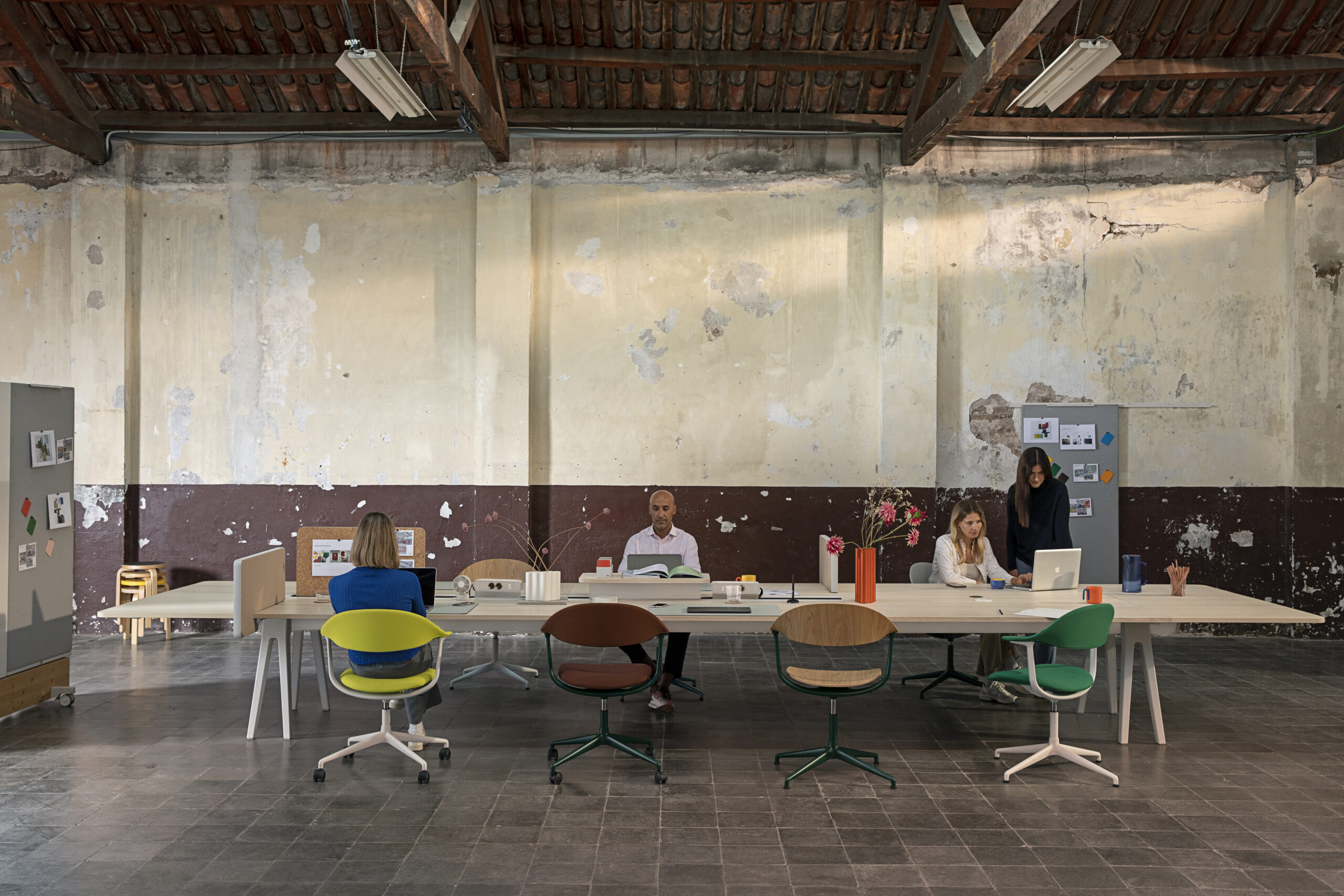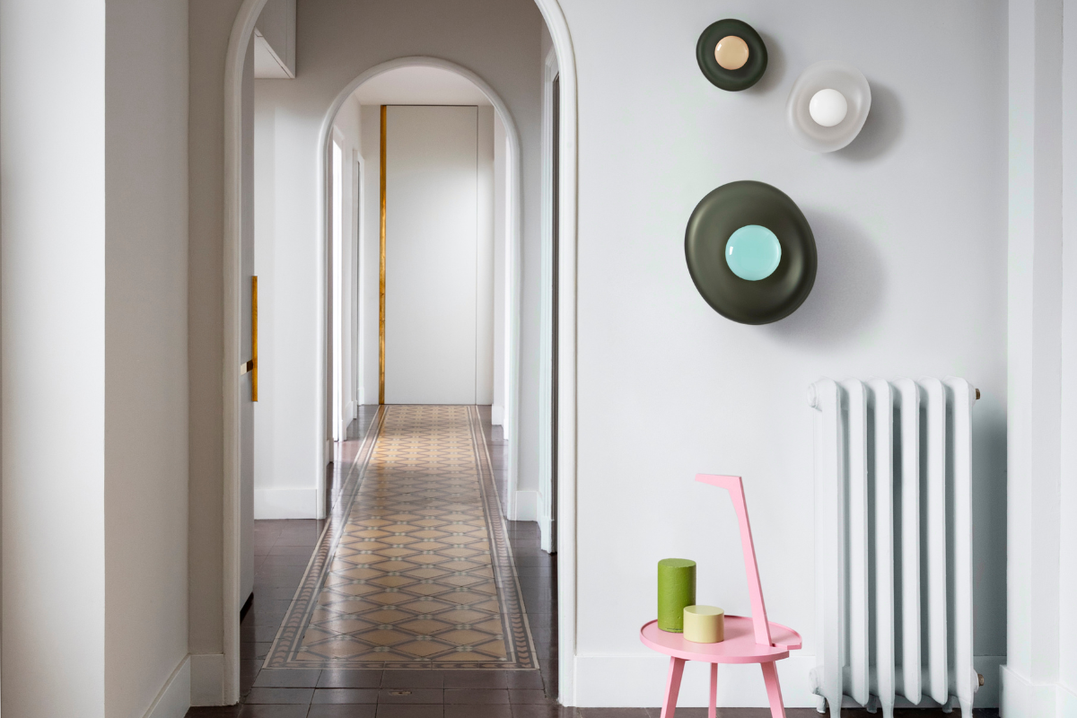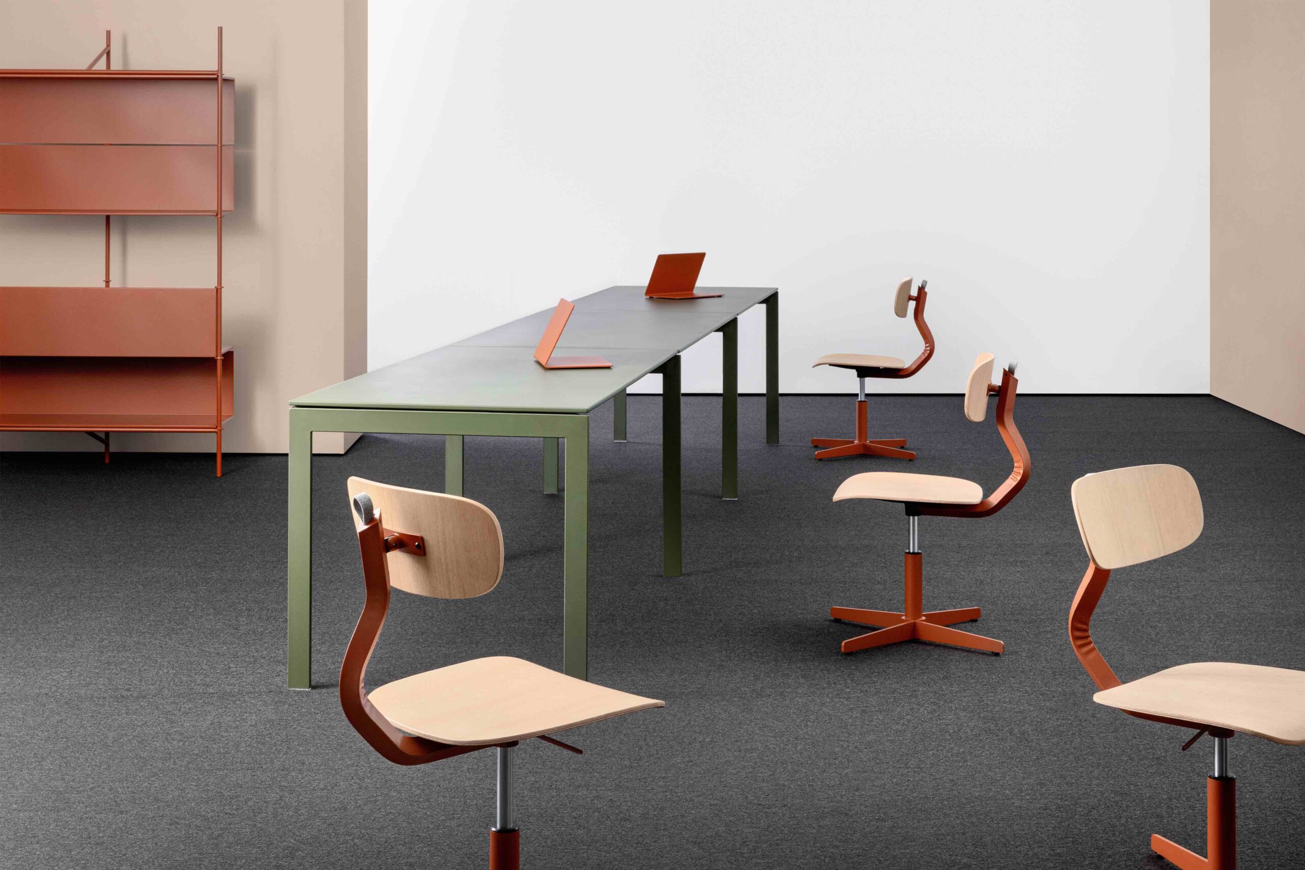
Flexible office provider Workspace wanted a design that respected the heritage of the Barley Mow Centre while paying homage to its Sanderson roots
In 1893, Arthur Sanderson & Sons unveiled its first wallpaper factory in West London’s Chiswick district, but by the 1970s, the elegant five-storey brick building had morphed into Barley Mow Centre, a pioneering innovation hub where small business owners and craftspeople commingled.
Today, the site is part of the expansive Workspace portfolio, attracting entrepreneurs and creatives around London with flexible suites of offices, studios, meeting rooms and workshops housed in such resuscitated edifices as the Art Deco Portsoken House in Aldgate and a former Islington tobacco warehouse.
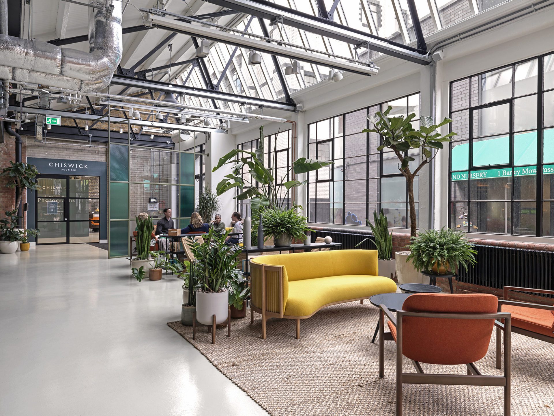
Barley Mow’s own fascinating industrial heritage prompted Workspace to revisit the architecture and design, approaching it more organically and respectfully this time around. London practice Bluebottle, a long-term Workspace partner, responded with a revamp that pays homage to those Sanderson roots as much as “the fabric of the building itself,” explains Charlotta Faulkner, Bluebottle director.
Faulkner further noted the influence of its “scale and irregular characteristics. There was a depth of history that we uncovered during the strip-out phases. For example, there had been a fire in the past and we discovered half of the original timber joists in the café were burnt and charred. These challenges led to an ongoing design process, and ultimately a richer result.”
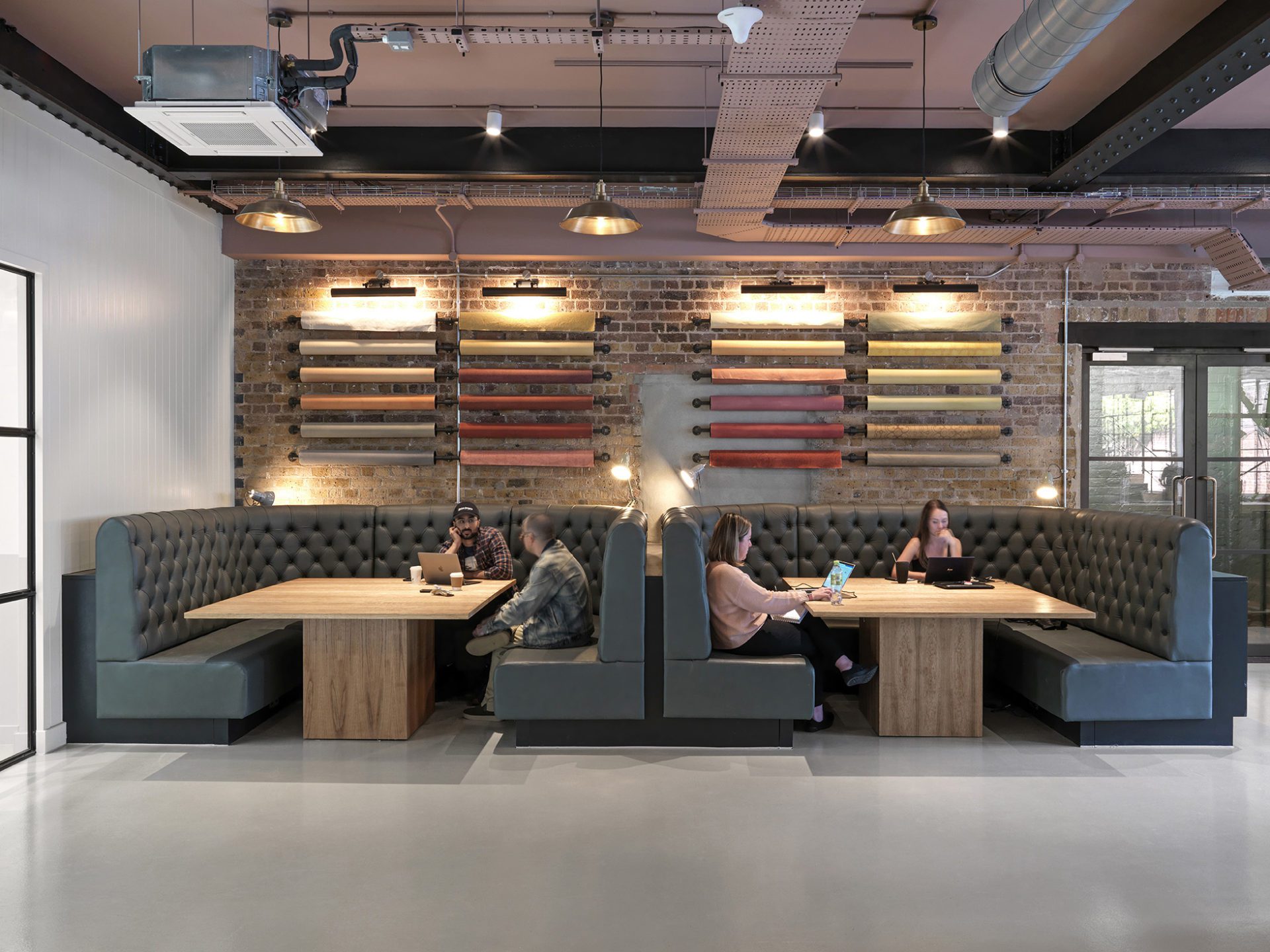
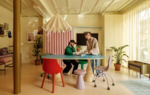
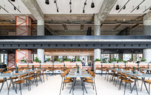
To conjure the manufacturing days of yore, walls were sandblasted, ceilings were laid bare and Crittall-style windows were painted a sleek black. Rolls of colourful wallpaper suspended above curving banquettes are also a whimsically fitting ode to the Sanderson chapter that double as an art installation.
“By exposing the original brick and steel structure, we brought back the Victorian character and introduced a vibrant and fresh interior,” adds Faulkner.
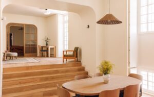
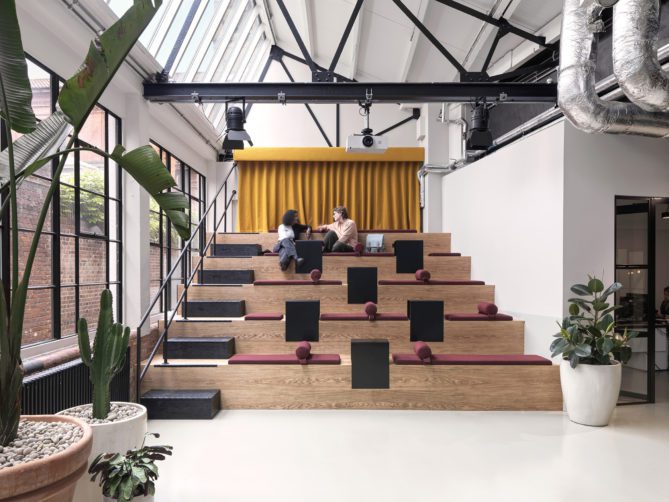
Reconfiguring the layout has also spawned a terraced auditorium for presentations, and an airy, open-plan reception area that fuses with the café, subtly demarcated by a Bluebottle-designed tiered divider.
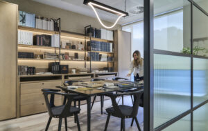
New elements integrated into Barley Mow are thoughtful, like the earthy sawn cut timber, tongue and groove cladding and swath of vividly patterned tiles that express an alluring simplicity.
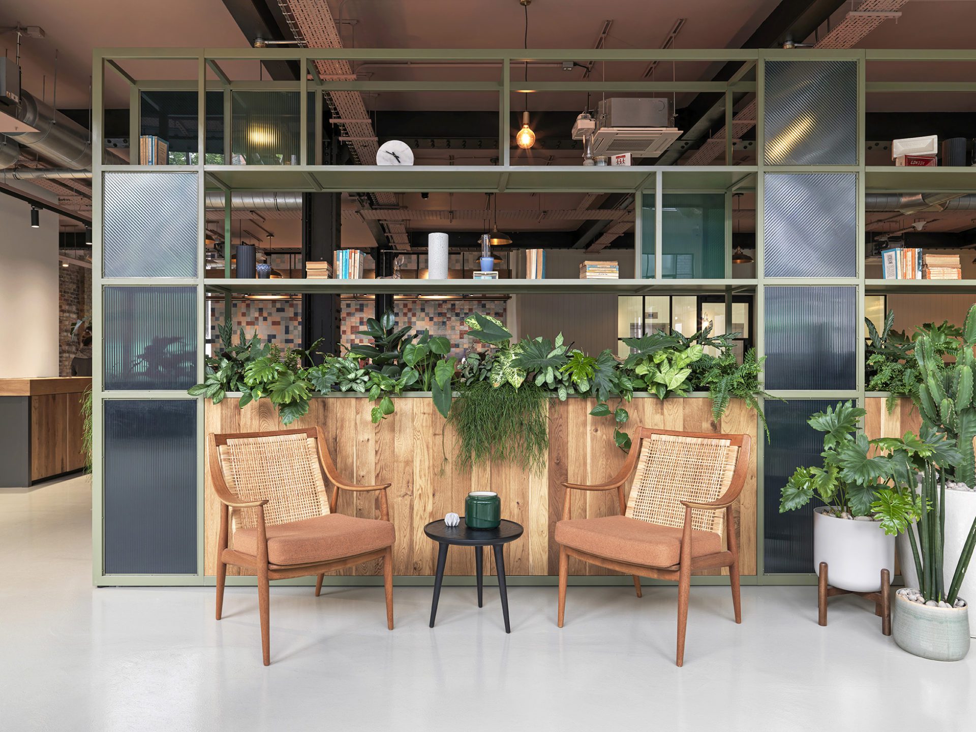
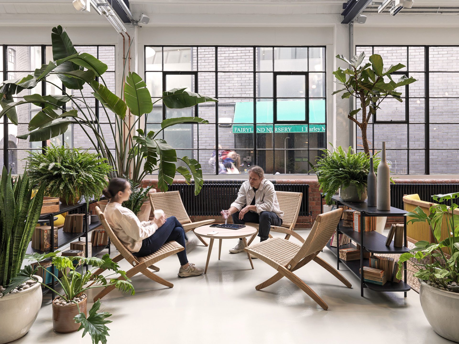
They are paired with 1930s and ‘40s furniture adorned with Arts & Crafts details, including rattan, metal frames and buttoned seating, as well as bespoke pieces like the cafe’s stand-out yellow powder-coated steel table, all procured from sister studio OW-N Furniture.
Between the plentiful nooks for socialising and the pots of greenery sprinkled throughout as a nod to verdant Chiswick, Barley Mow is instilled with an intentionally convivial and calming atmosphere that considers the wellbeing of the hard-working tenants spending the day there. As Faulkner puts it, “We love the generosity of space, with large windows bringing light.”
Images by Charles Hosea
Enjoyed this article? Read more: MoreySmith Design Clockwise’s Latest Flexible Workspace in the Historic Generator Building


