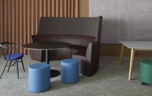
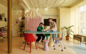
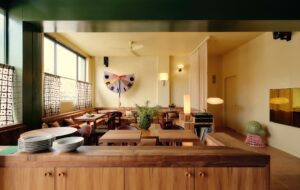
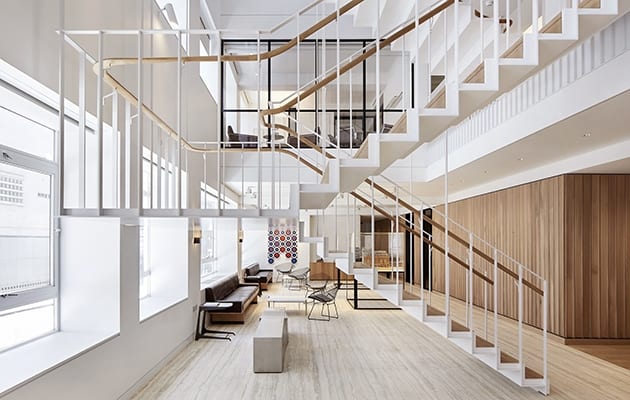
 The stair was digitally fabricated and used less than 0.5cu m of steel. Photo: Hufton+Crow|||
Derwent London moved into its HQ – a 1930s art deco building on Savile Row by Stanley Gordon Jeeves – in 2001.The property company occupied the top three floors, and sublet the first two, all of which had been refurbished by Michael Squire & Partners. “It was a nice refurbishment at the time, but it got tired,” admits Derwent director Simon Silver, and the M&E was coming to the end of its life.
When the business outgrew the space, the directors considered relocating but “we felt our heart and soul was in Savile Row,” he explains. Derwent’s in-house architect Tim Hyman suggested that rather than move, they decamp to the lower three floors.While this would give the 112-strong rm more space, “the worry was that we bene ted from quite good light, and there’s a police station next door,” says Silver. Derwent has a 520,000sq m portfolio of commercial real estate, predominantly in central London, and is considered the biggest London-focused real estate investment trust. Its flagship project is White Collar Factory in Old Street by AHMM.
 Internal glazing opens up the office space with views across the void. Photo: Hufton+Crow
North London architectural practice Piercy&Company had just completed Derwent’s 6,500sq m Turnmill building in Clerkenwell and was on site with the Louis Kahn-inspired 13,000sq m Copyright Building in Fitzrovia. Stuart Piercy and his team were asked to do a study. It was then that Hyman had the audacious notion of cutting out “700-800sq ft of Mayfair”, as Silver puts it.
Into this three-storey void, Piercy&Co suggested suspending a staircase, to let light into the workspace. It would also help with communication because “with the L-shaped floorplate, you get a bit of disconnect [between staff],” says Silver, “never the twain shall meet. We thought that could be a really smart move. It wasn’t considered a smart move by our nance director,” he adds with a wry smile, “but we said the quality of space would be better.”
The staircase is a highly engineered work of art. “It is hung to minimise structure, and to make it look light and not to block the view,” explains Henry Humphreys, director at Piercy&Co. He worked with architectural metalworker Chay Wheeler and structural engineer David Akera, and through digital fabrication they pulled off a very slender suspended stair, fabricated with less than 0.5cu m of steel.
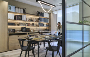
 A bespoke Piercy&Co light fitting hangs above the boardroom table. Photo: Hufton+Crow
With Hyman working on layout and adjacencies, Piercy&Co set about creating an up-to-date workspace.This configuring is dominated by a host of breakout spaces, (“people are not handcuffed to their desks,” explains Silver), and open-plan offices. These are complemented by two boardrooms, which have direct access to a private terrace, the reception on the ground floor, and the winter garden – an almost double-height, fully glazed, enclosed terrace, whose original window voids have been transformed into recessed leather seating.
By turning this terrace into a working space, Piercy&Co clawed back some of the square footage that had been lost through cutting out the atrium. And, as this is the property sector, naturally the highest corner office goes to the boss, and the basement houses not just cycle racks but car parking. There’s also a breakfast area in the basement, which has been given a relaxed, sixth-form common room feel. It’s decked out with a proprietary Howdens kitchen and a bespoke polished concrete worktop by Design nger. Meanwhile, the staff kitchens on levels 1 and 2 were supplied by Dada and feature integrated Zip taps.
 Window voids become leather seats in the glazed terrace area. Photo: Hufton+Crow
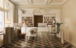
“For us sometimes less is more,” says Silver, hence the choice of just two or three materials. High-quality details abound, some of which are supplied by Derwent’s long-standing artisanal collaborators. The reception desk and some of the flooring are Tuscan Silver travertine; the main boardroom’s table top is European walnut by Benchmark Furniture; the oor and table top in the second boardroom is Douglas fir Dinesen; Bill Amberg Studio crafted leather- cushioned seating and a vertical handle for the front door, and Benchmark made the scalloped panelling of European oak behind the reception desk.
Meanwhile, views through the glass doors of the boardroom are partially obscured by bronze mesh, courtesy of Italian glass company Capoferri Serramenti. “You go with a quality item that’s expensive – it’s that bit of icing on the cake, that little bit of extra effort,” says Silver. Many details were designed by Piercy&Co, such as the light tting over the main boardroom table, and the staircase banister, which is configured to twist from a rotated ellipse “grip” pro le on the flights to a flat, widened ellipse “perch” profile on the landings.
 Leather seating by Bill Amberg Studio and Benchmark. Photo: Hufton+Crow
So pleased is Derwent with the artisanal input that lm director Nick Ballón was commissioned to make a short documentary, Making 25 Savile Row, on the transformation.
At the same time, the architects readied the top floors for prospective tenants.They have their own entrance and reception adjacent to Derwent’s entrance. A sculpture by Hugo Dalton sits in a double-sided glazed timber case connecting both receptions. And two new staircases lead from the top floor to the roof, where IQ Glass has installed two 80sq m glazed rooftop pavilions.
“We wanted it to be what we think a Mayfair office should be like,” says Silver. Savile Row, then, was an opportunity to parade its talents in its own sector.
Derwent London has supplied many of the capital’s great office spaces but when it outgrew its own, the property firm called in Piercy&Co to rethink its Mayfair home


