The 70-strong practice has relocated from its longstanding headquarters in Butlers Wharf to Clerkenwell, transforming a two-storey workspace into a new creative hub
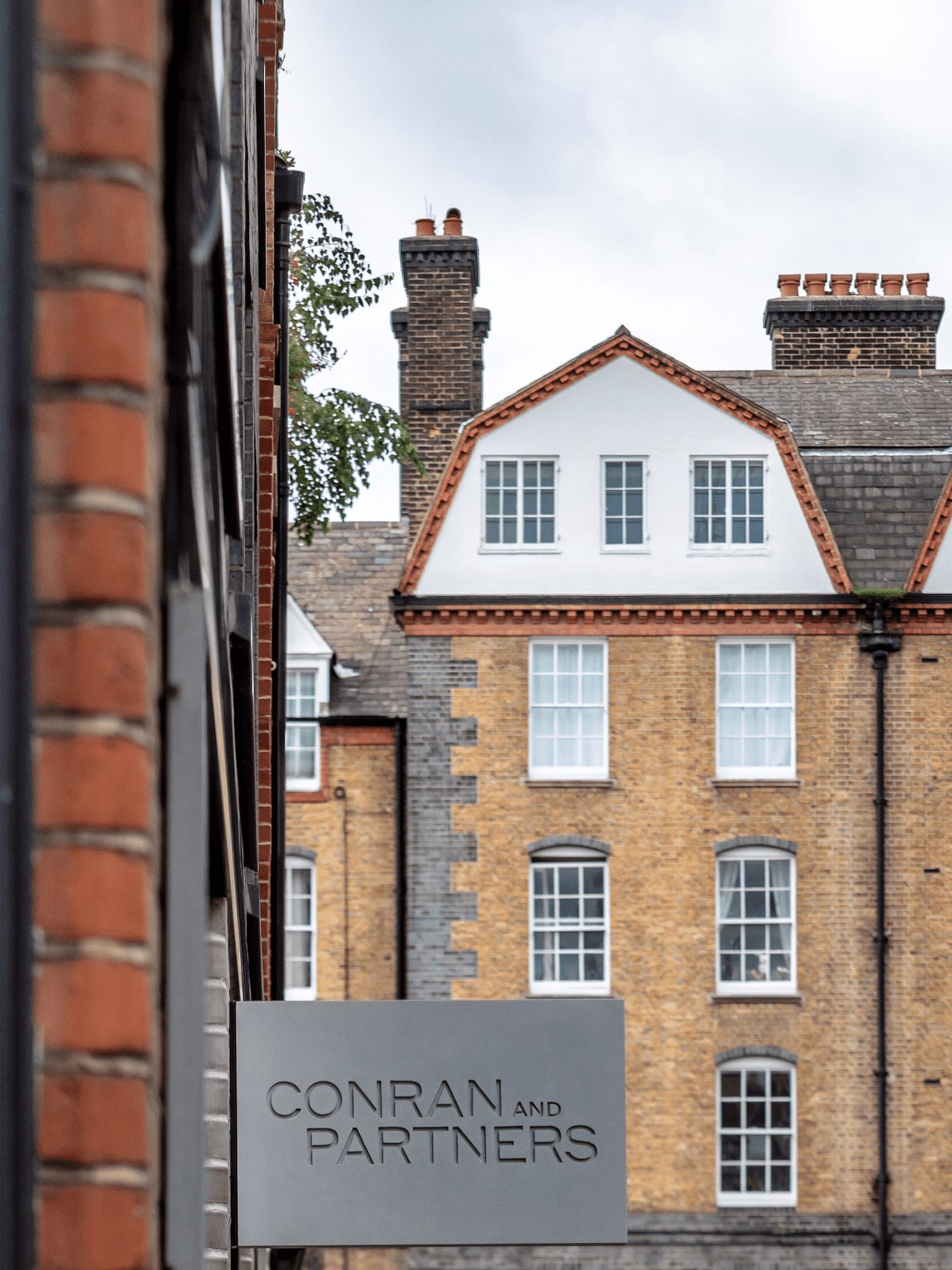
Following the passing of its founder, Sir Terence Conran last year, architecture firm Conran and Partners has recently relocated from its longstanding headquarters, where it had been working for over three decades, to a vibrant new workspace set in London’s creative district Clerkenwell.
The move is part of a wider re-calibration for the practice, following a period of rapid evolution that included an expansion of its international reach through opening a thriving east Asia studio in Hong Kong in 2018.
This watershed is further marked by the unveiling of a refreshed brand that better reflects the ethos and design principals of the practice today and into the future.
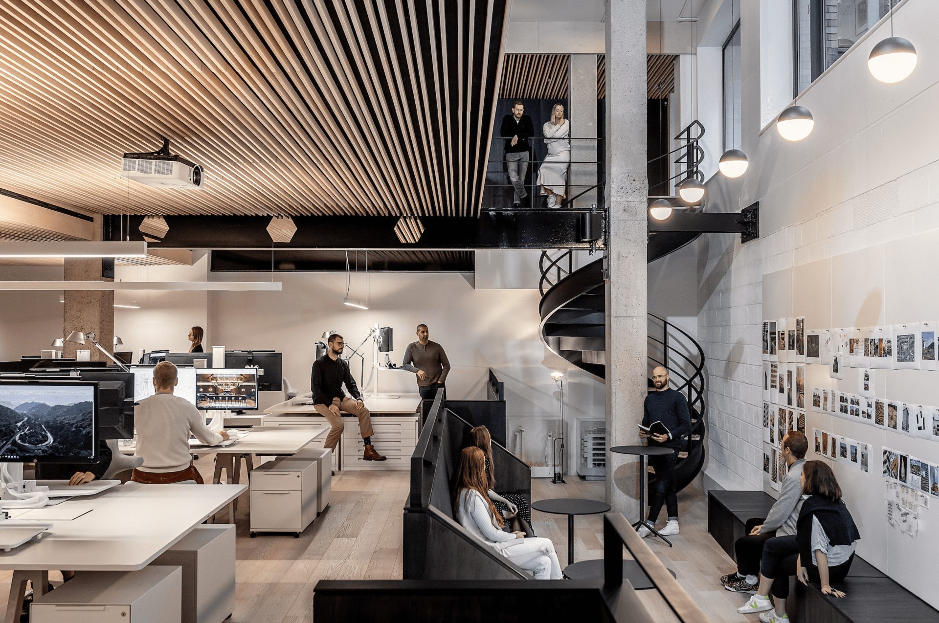
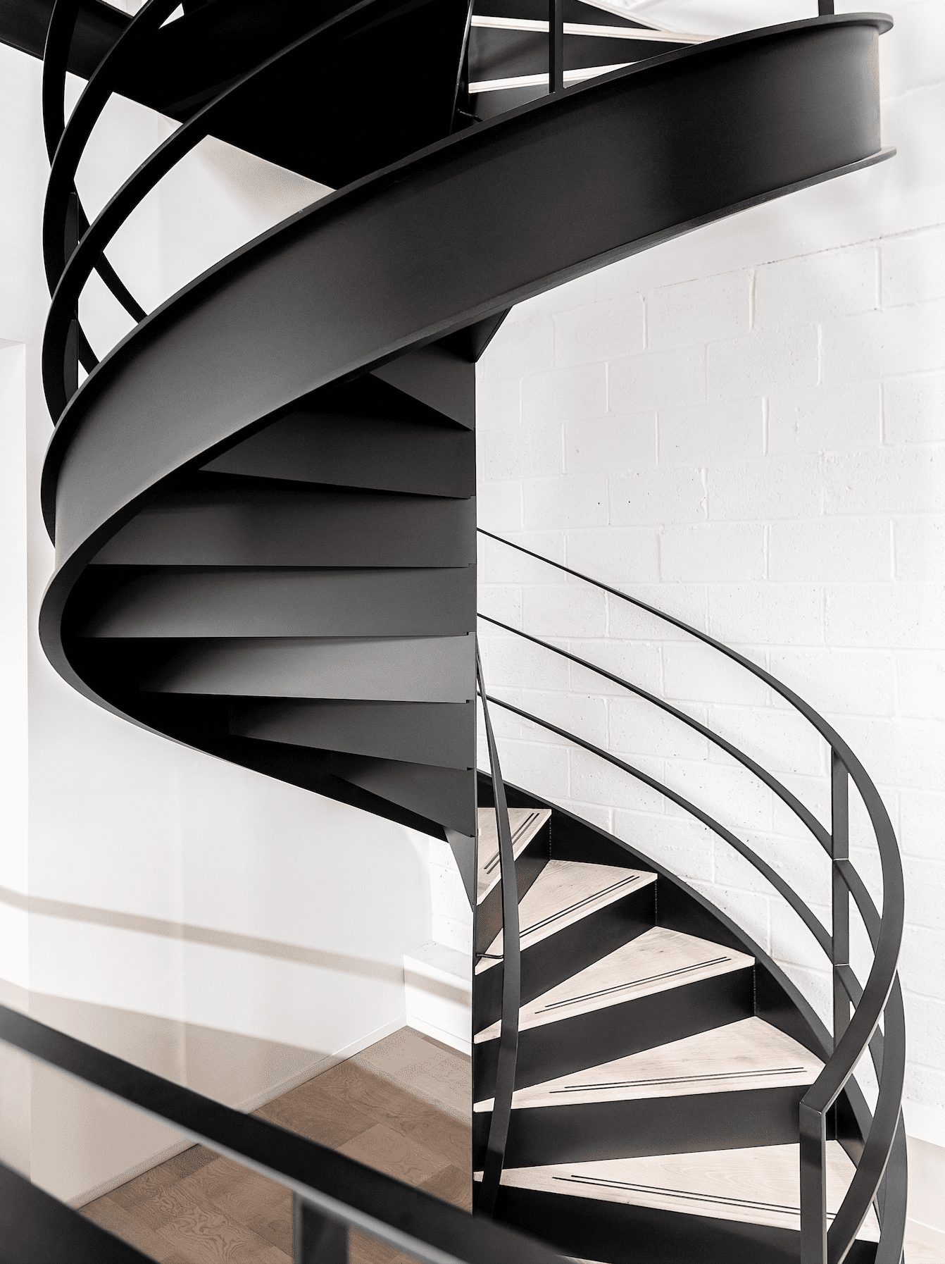
Situated on Great Sutton Street in the heart of Clerkenwell, the studio occupies the ground and lower ground floor of an existing building. At the centre of the space, spiral steel staircases show employees the way, which both connect the different workspaces and help flood the lower floor with natural light.
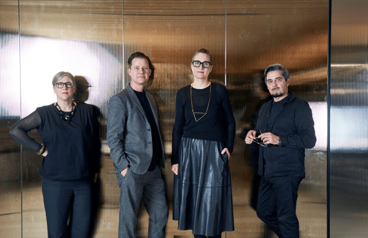
“The last 18 months have undoubtedly been challenging for us all, but they have also been some of the most re-defining months in our studio’s history,” says Tim Bowder-Ridger, Principal at Conran and Partners and design lead on the project.
“Moving to a new HQ, which we have designed ourselves to truly reflect who we are as a design studio, is a significant part of that. We are very proud of the space and are delighted to be back in the studio as a team doing what we love to do.
“Notwithstanding the largely successful remote working practices we have had to engage with over the last couple of years, I firmly believe that both creativity and productivity thrive most strongly when people come together to collaborate in person. So, creating a space in which people not only can, but actually want to spend their time in, was critical.”
Bowder-Ridger contines: “The pandemic has accelerated the blending of people’s lifestyles, and our new studio has been designed to offer a contrast with working in isolation at home.
“Crucially, the aim has been to provide a release from the claustrophobia of working in the spare (or not so spare) bedroom or the kitchen table and offering a variety of environments that enable us to come together as a team, collaborators and friends.
“All with a view to generate and enhance creative energy and to support each other. Our move also reflects our continued confidence and unwavering commitment to London, which we believe will emerge stronger from the latest and most extreme crisis, as it has over its history.”
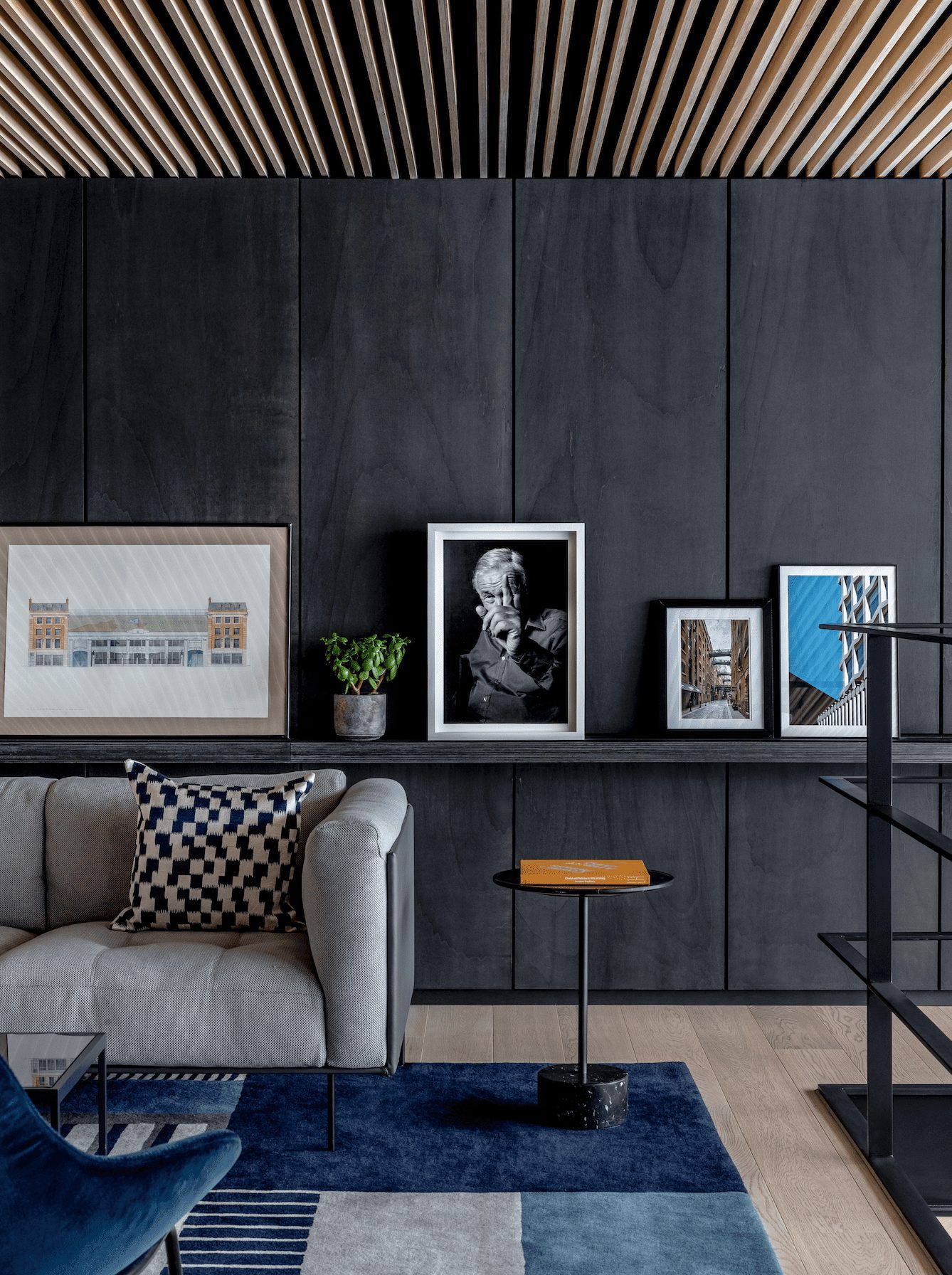
Upon entering the minimalist reception area downstairs, guests are greeted with double height spaces that create a light and airy feel with mezzanines overlooking the main working areas.
Whilst natural light penetrates from both ends of the studio, Conran and Partners has given a great deal of attention to the lighting landscape as a whole. Natural and artificial lighting, designed in collaboration with Into Lighting, is used to generate intimacy and cosiness, while the use of timber highlights the sense of unity and fluidity throughout the space.
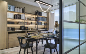
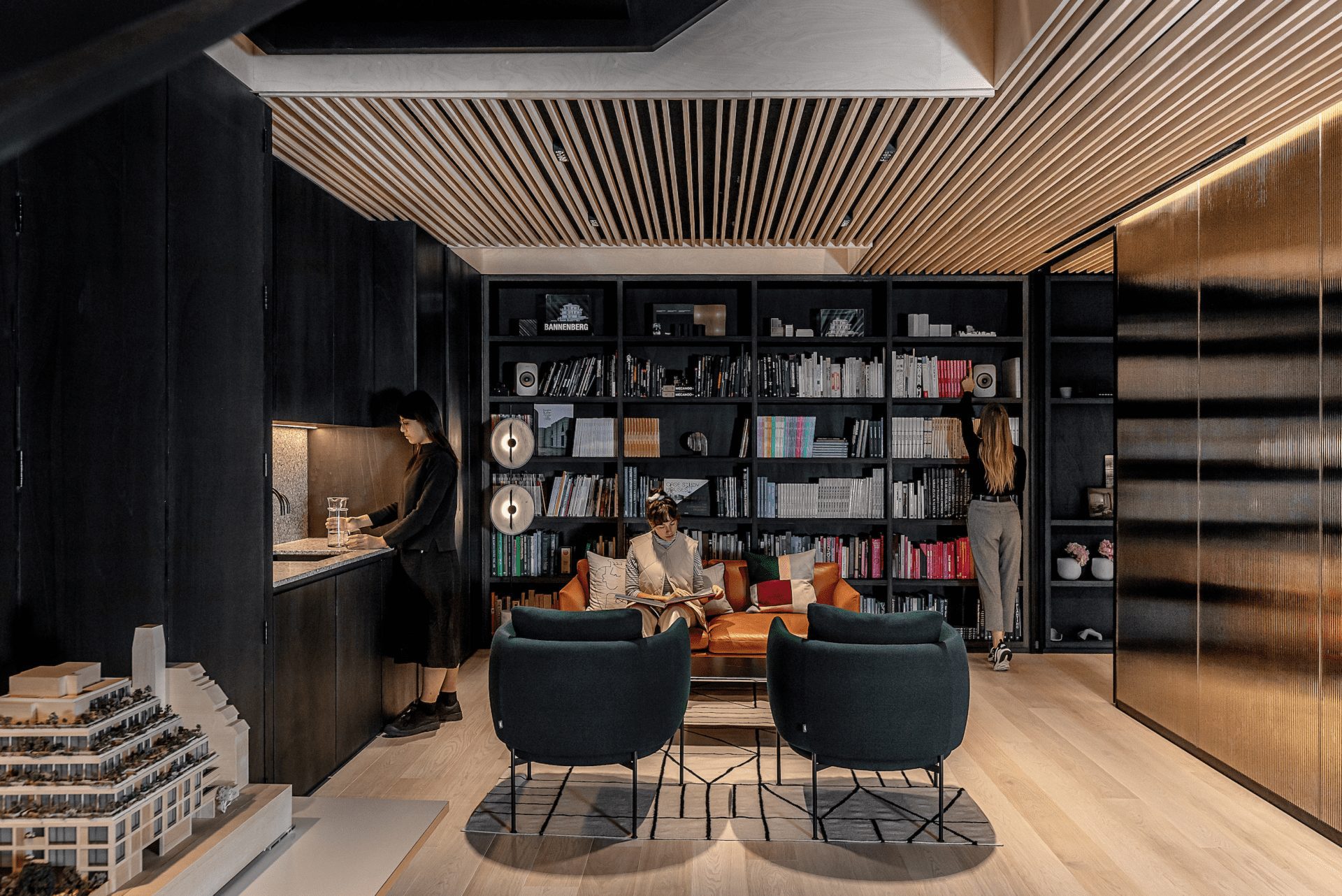
In contrast, the flank walls and shelving are constructed out of dark stained poplar ply, which adds a touch of sophistication, whilst the fluted bronze glass panels and screens create texture. The acoustics of the space are muted, achieved by a black acoustic fabric being stretched above the ply ceiling battens to absorb noise disturbance and to create a visually and acoustically calm workspace.

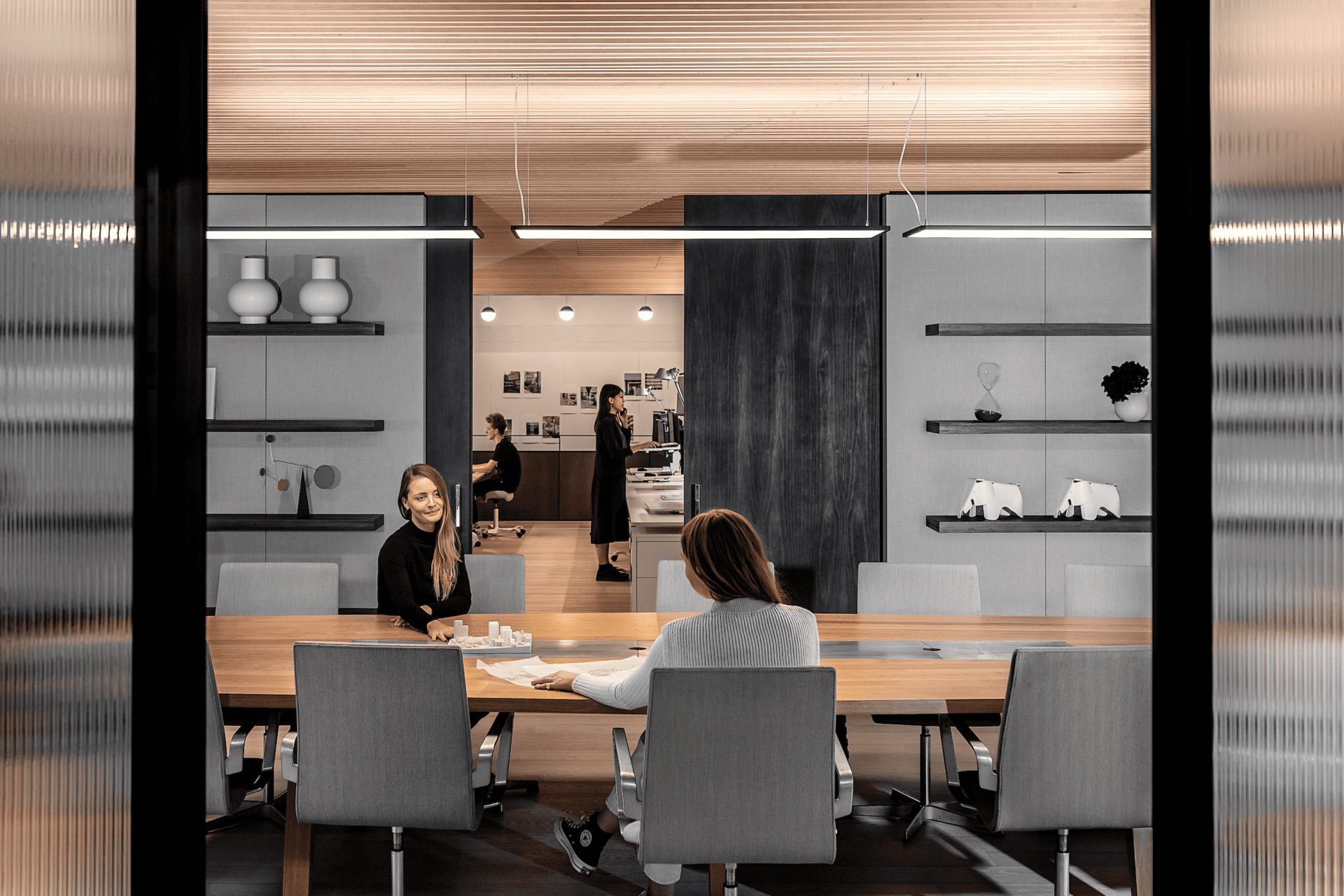
“The physical and visual fluidity is further enhanced by organising the space ‘enfilade’ with as few impenetrable barriers as possible”, adds Bowder-Ridger. “Meeting spaces that span across the width of the floors, are formed out of large, fluted and antiqued mirror glass panels, with wide full height sliding doors that maintain the sightlines through the depth of the spaces when open and appear as translucent screens when closed.
“The entrance is also deliberately understated – we didn’t want an imposing or intimidating reception or waiting area, or receptionists sat behind an outdated high desk. Architecture and interior design are, at their best, the most collaborative of disciplines, so our guests should feel as though they are part of our team from the moment they enter.”
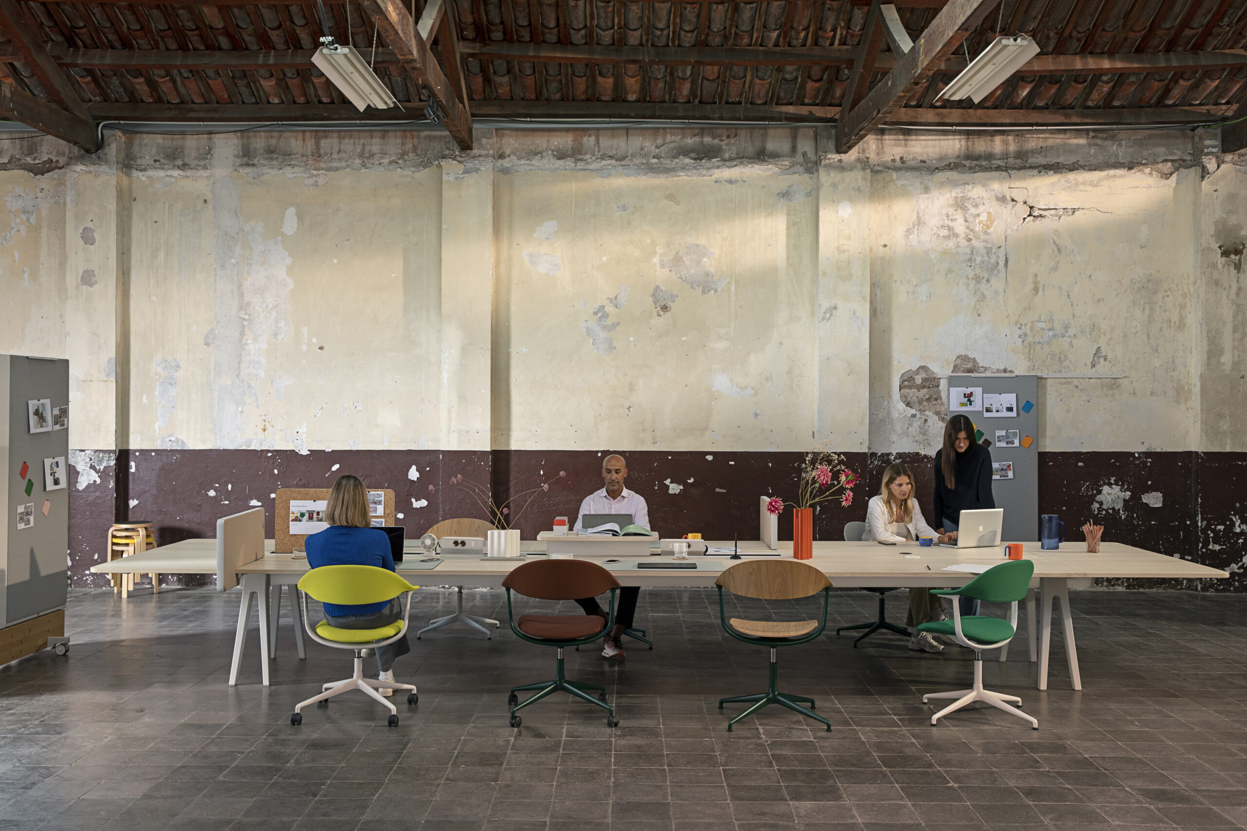
One of the key decision made at the outset was to avoid having any cellular offices, meaning there is no division between teams, and no hierarchical seating arrangements to suit more modern working needs. A mix of seating and desk space is provided, including dynamic sit-stand desks with a combination of desk lights and screen bars, to give each team member the tools they need to tailor and adjust their workspace though the working day.
Tim continues: “The meeting spaces can all be closed off, but importantly, they can also be opened up when not in use or when being used as a breakaway space. Animating the studio as a whole as vistas and occupation change throughout the day. Creativity is at the heart of everything we do, so we needed to ensure that all of these spaces would have the power to inspire, energise and delight all at the same time.”
“We don’t see ourselves specifically as ‘workspace designers’, any more than we like to be categorised as residential or retail or hotel ‘specialists’,” shares Bowder-Ridger. “In fact, we are often described more accurately by others as ‘lifestyle designers’. We are more comfortable with this, as our aim is to design for living – whether that’s for work, leisure, socialising, eating, playing, sleeping etc.
“It’s about an attitude that runs through all of our projects regardless of old-fashioned sector categorisations, scales or disciplines. This has always been central to our ethos and increasingly reflects modern ways of living and, we believe, will be key to encouraging people back together from the isolation of lockdown.”
Images by Taran Wilkhu


