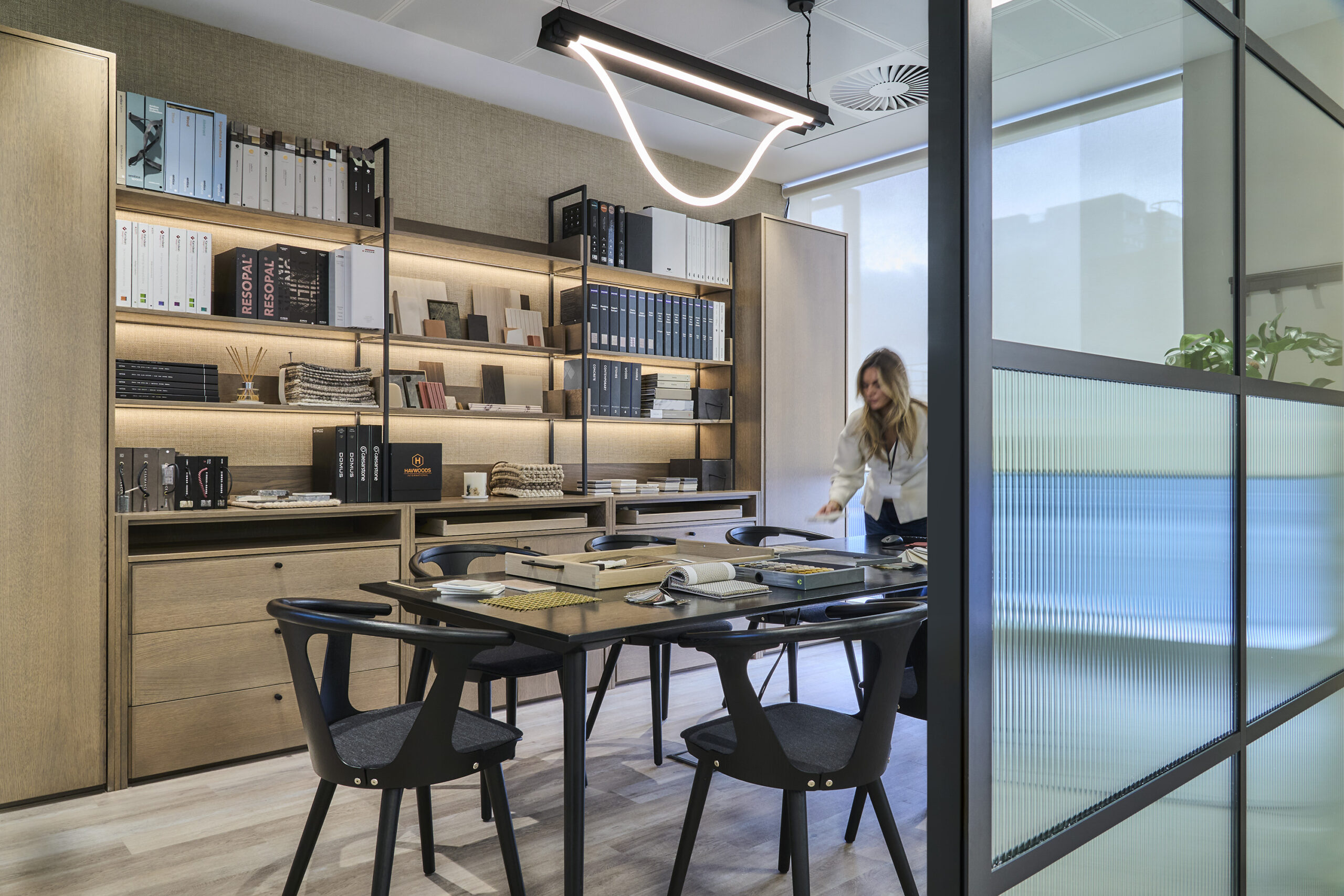
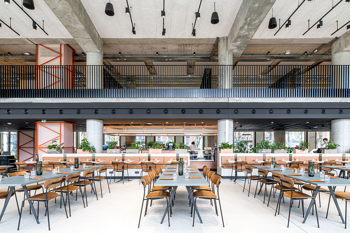
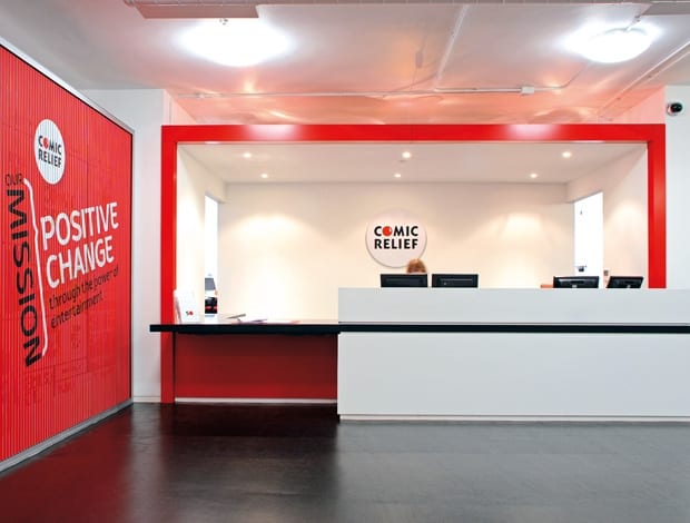
 A rotating ad sits alongside the reception desk, which introduces the red goalpost detail|A London Eye graphic sits above the new link staircase between the ground and first floors|The boardroom with red light fixtures, wall and seats. The Sagal Group supplied all the furniture in the refit|A new stair acts as a hub, with casual seating areas on the ground|Red circular manifestations on the glass wall of an editing suite|Open-plan workspace|‘Floating’ red box structures organise the space while maintaining a feeling of openness|Informal meeting point in the ground floor work area||
Britons generally equate Comic Relief with red noses, fancy dress in the office and Lenny Henry not being particularly funny. That may or may not be accurate but it’s in the same spirit of fun that the charity has reconfigured its offices in Vauxhall. The result, finished earlier this year, echoes certain fundamentals of the organisation: optimism, cost-efficiency and a heck of a lot of red. For more than 10 years Comic Relief was spread across the ground and fifth floors of an 18-storey tower on Albert Embankment. It wasn’t ideal in the sense that staff had to shuttle between the two, but it worked. However, a familiar problem arose when staff numbers started to expand. More space was needed and the lack of connection between the two floors became exceedingly difficult – eventually it was clear that something had to change. One idea was to find an office elsewhere. But by this stage the organisation had grown to love its location, which has views of the Thames and sits thrillingly close to the MI6 HQ. “There was an affinity to the building and the locality. It suits a lot of their staff,” says Andrew Locke, director of fit-out contractor The Interiors Group. “It’s known euphemistically as ‘Charity Towers’ because pretty much 100 per cent of it is occupied by charities and the landlord is very supportive of those sorts of institutions.” So from a practical and financial point of view, it made sense to stay put.
The Interiors Group was asked to pitch ideas for an office interior that was fit for purpose and adhered to a strict budget. “I think pretty much from the pitch process we hit the right note, because in being a professional charity there is a balance between the corporate and practical infrastructure of an office carrying 200-300 staff, with not being overly opulent or flamboyant when you’ve got your investors, partners and your trustees in and out of the space every day,” says Locke. During campaign periods building up to Comic Relief or Sport Relief, head count can jump quite dramatically, he explains, meaning that extra space is required. “After doing detailed analysis on the space planning we were able to show them how it could work to accommodate all of their staff, including the expanding head count,” says Locke. When the first floor came on to the market, Comic Relief decided to take it and give up its space on the fifth floor. The first floor, which has two wings, would now hold the bulk of the workspace and meeting rooms, and eventually be connected to the ground floor by a new staircase.
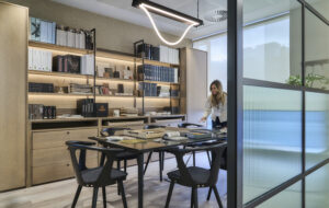
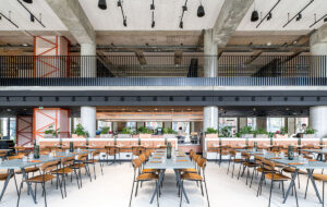
Partnering with Jump Studios, renowned for imaginative corporate office design for the likes of Red Bull and Engine, proved a wise move. “It was a heavy Cat A job, so previously there was a very tired fit-out that needed to be stripped out completely. There were no mechanical services, there was no air conditioning or ventilation in the space, so we needed to achieve the design criteria but also address the complex practicalities of the refurbishment,” Lock continues. On the first floor, Jump designed a series of red box-like structures to organise the space and work as the key visual element. The structures do not fully extend to the ceiling, preserving a sense of openness and light, and hold secondary facilities such as tea points, storage and editing suites. A hard shoulder of open booths for photocopiers and water dispensers sits along the periphery and performs a helpful role by keeping the working area clear. Upholstered bench units in bright red are used for informal chats.
Obviously, it was important to find simple ways to brand the space without breaking the budget. “The brief from an aesthetic point of view was relatively straightforward – as much red as possible,” says Locke. Glass walls of the cellular offices have circular red manifestations, while other key walls are painted red, as are the light fixtures in the boardroom. In addition, a red goalpost detail pops up over various doorways, recycling stations and the reception desk. The other main aspect of the brief was to maximise the floor-to-ceiling height in the open-plan area, which was a challenge because cabling required a raised floor. The solution was to strip everything back and keep the ductwork and fan units exposed, albeit painted white. “We had debates about whether they were a feature, whether we give a sort of industrial look or blend them into the background. What we’ve ended up with is a white-out effect that isn’t as jarring,” Locke says.
Using functional aspects of the office as a visual bonus was a key element of the design, it seems. The new staircase linking the first and ground floors has been vital to the flow of traffic around the office, but it also lends a bit of character with bold graphics and colour. “It is the focal point of the business – it’s the hub that brings three separate wings together because you have the two wings from the first floor and the third wing on the ground floor. It acts as a crossover and transition space where people meet,” Locke continues. A wall was removed in the area at the bottom of the stairs, which now holds soft furnishings and cafe tables and leads into a massive kitchen facility. “Because a lot of the staff work on a voluntary basis, the breakout areas and lunch facilities needed to be top-notch. We’re in the middle of Vauxhall, so there’s not a multitude of restaurants on your doorstep, and also people who are working on low salaries or voluntarily are more likely to need to prepare and cook their own food,” Locke points out. “As I said, it was getting this balance between this practical working environment while not appearing too opulent,” Locke states. It would seem that the challenge was also in translating the Comic Relief spirit into a workplace – and with clever use of colour and materials, as well as thoughtful space planning, they pulled it off.

