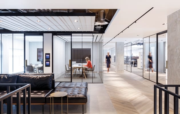
 Inside Dunhill’s London office|||
Split over multiple floors of a Regency terrace, squashed together in cellular offices, sitting at a mix of furniture, and with little natural light. This was the experience of Dunhill’s staff, who were bursting at the seams at their former address north of London’s Oxford Street.
Hardly a good representation of this high-end British menswear brand, which was founded in 1893 in London by Alfred Dunhill, and has more than 90 stores in 16 countries. It’s now owned by Switzerland-based luxury goods holding company Richemont, and is hence stablemates with the likes of Cartier, Piaget, Chloé and Montblanc. No wonder, then, that they called in the designers. But it wasn’t just about the unfit-for-purpose nature of the office space. Dunhill also wanted to bring its showroom (previously on New Bond Street) and office capabilities under one roof, and thereby to create a more cohesive UK workplace.
MoreySmith, whose recent clients include Sony Music, Moët Hennessy, Primark, ASOS, Coca-Cola, British Land and Argent, was appointed after a paid creative pitch. The firm, which opened an office in Northern Ireland last year, was appointed in September 2017, and Dunhill moved in the following September. The budget has not been revealed.
Once appointed, the designers got their hands on the third and fourth floors of a 1908 heritage building in the heart of Mayfair. The brief was to house Dunhill’s current 170 staff, while making the 2,000sq m space flexible enough for them to grow in numbers by 40%.
 A black steel stair links the two floors
Both floors have perimeter windows, with views over the rooftops. However, “The floors had very dated interiors with simple partitions,” says Dani Salamon, associate director at MoreySmith, “so as part of the lease deal, they were cleaned of partitions and left as blank canvases.”
The designers then went one further, exposing all the concrete soffits complete with builders’ pen marks. “Dunhill loved the idea of leaving those,” says Salamon. This increased the ceiling height, allowing MoreySmith to complement the raw exposed finishes with signature Dunhill bespoke elements. Meanwhile, to help with acoustics, “We dropped felt-clad rafts throughout the ceilings,” Salamon adds.
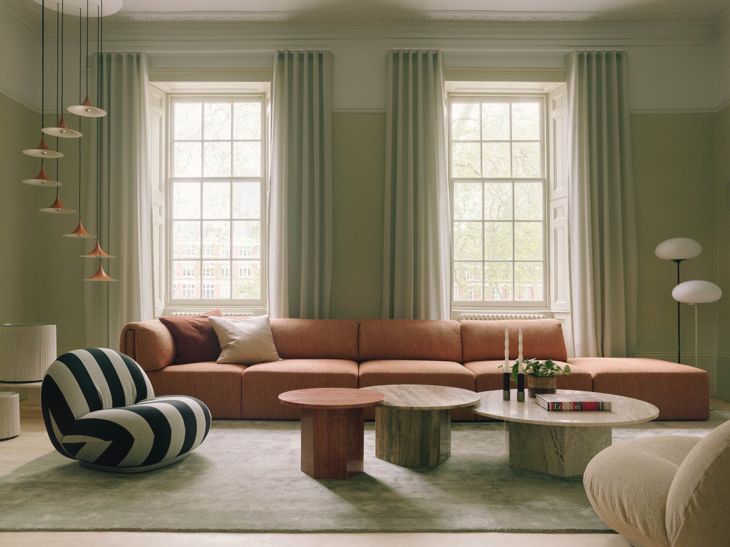
MoreySmith divided the space into a mix of open-plan workspaces, some private rooms, and showroom areas on both floors, joining the two with a new staircase. Visitors and staff alike arrive on the fourth floor via the existing lifts and staircase. They are greeted by a bespoke reception desk, which Salamon describes as a monolithic leather box of fumed oak and brass, with cricket ball stitching through leather.
This was made by British craftspeople – a theme that runs through the interiors. As is the use of on-brand materials like black leather, brass, ironmongery, tailoring fabrics, glass and woods. That explains the reception’s feature wall of horsehair panels, a material that tailors use for interlining lightweight tailored suits. “The client loved bringing in materials that were important to their industry,” says Salamon. “They wanted to focus on the future, so all materials and design elements are contemporary takes on classic items.”
Examples of this take are the oversized smoked chevron timber floors in the reception, showroom and connecting areas, supplied by White & White; Stellar Works’ Ren tables in black ash; McCollin Bryan’s Lens coffee table; and hand-blown, fluted glass pendant lighting by Tom Kirk. All this artisanship sits against clean, galleryesque plasterboard walls.
The teams are split up into neighbourhoods, and Dunhill is now an agile workspace, meaning there are fewer workstations than staff. But it’s never full, says Salamon, and the layout gives people variety and the independence to choose where they sit. As for the executives, “we encouraged more of them to move out of their personal offices, and they now have individual desks,” she adds.
With plug-and-play technology installed for this mobile workforce, the project pushed Richemont’s tech boundaries. “This is almost like a guinea pig project for them, in terms of new ways of working,” says Salamon. What’s more, the power layout has the capacity to accommodate future bigger teams or big events.
Transparency was another key theme, and this was achieved with internal Crittall-style glazing, integrated glass screens from Chelsea Artisans, and good sightlines – in contrast to the previous rabbit warren-style layout. This means that for the first time, the collections’ designers are visible, rather than being on their own floor, as before. “This is amazing for employees and clients, as they have exposure to the products and can see the designers walking around holding tape measures,” says Salamon.
 Ren lounge chairs and a Lens coffee table provide breakout space
Their design studio occupies a large room on the third floor, furnished with big benches, and stand-up drawing tables with dedicated task lighting, rails of clothes between desks and rotating screens. Designers also benefit from the double-aspect room, which boasts a new roof light above the void into the fourth floor.
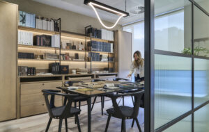
Along with MoreySmith’s three voids and the new staircase, another structural intervention is an extension on to the fourth-floor roof terrace. The new space houses the boardroom which holds SCP’s Peggy table with a grey top and ash legs. From here, users of the room have access to the remaining narrower terrace.
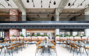
Entering the third floor via the spacious new staircase, visitors and staff reach the cafe-bar area with its bespoke lacquered unit. “This is the social hub and there’s always quite a buzz down here,” says Salamon. And on this floor is the second part of the showroom. When it’s not the fashion season, they can empty the showroom and use it for different purposes such as photo shoots or yoga classes, she suggests.
While much of MoreySmith’s work has been about the efficient organising of spaces (many of them dividable), it also had staff morale in mind. “A big element of this [project] was about the happiness of the teams, enhancing interactions and exposing everyone to the brand,” says Salamon. She describes creating a journey “where everyone is immersed and exposed to the end product [rather than being detached and divorced from it, as before]. Now there is pride and a sense of the end goal.” And by removing the sense of back-of-house, there is more equality and teams are better able to work and socialise together.
MoreySmith’s new London HQ for Dunhill takes inspiration from the fashion brand’s understated British craftsmanship

