The Campari European headquarters evokes the atmosphere of an inviting bar and celebrates Italian sophistication, challenging conventional notions of what a workplace can be
The workplace and bars rarely go together these days. Unless, of course, it’s the headquarters for one of the world’s most iconic spirits. Italian alcohol brand Campari – which is known for its distinctive red colour and infusion of bitter herbs, aromatic plants, and fruit – has recently opened a new European headquarters in Brussels. The interior fit-out by Antwerp-based design studio WeWantMore is themed around Italian sophistication and the brand’s motto: ‘toasting life together’.
“The goal was to design an inviting space that stimulates interactions between co-workers, connections, and clients,” says Ruud Belmans, co-founder and Creative Director of WeWantMore. “We wanted to recreate ‘Italian moments’ and Italian heritage, and we liked the idea of aperitivo.”
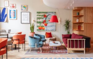
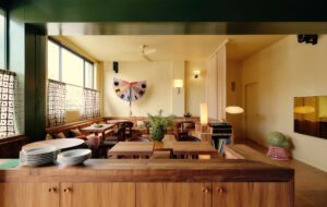
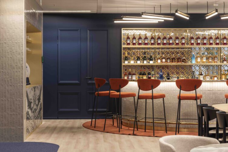
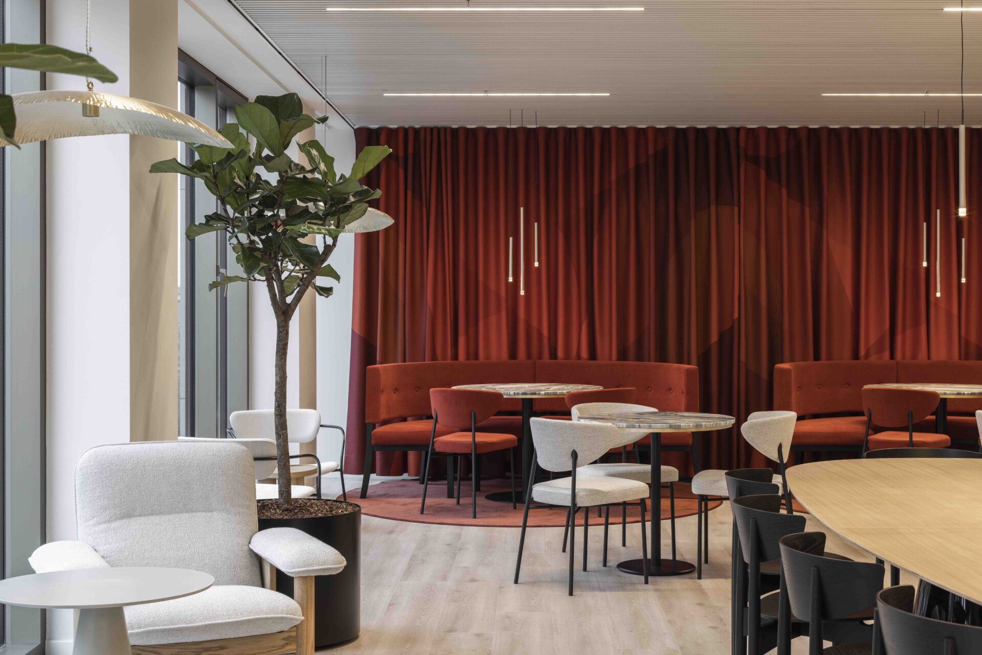
With this approach in mind, the heart of the space is a bar that offers a place to gather over coffee during the day and an aperitivo in the evening. Signifying the importance of hospitality to the Campari brand from the moment of entry, the bar is the main element that defines the fit-out. As in a typical bar, there are a variety of spaces to gather, including a cosy lounge area in front of the enormous windows that frame spectacular views over the Palais de Justice.
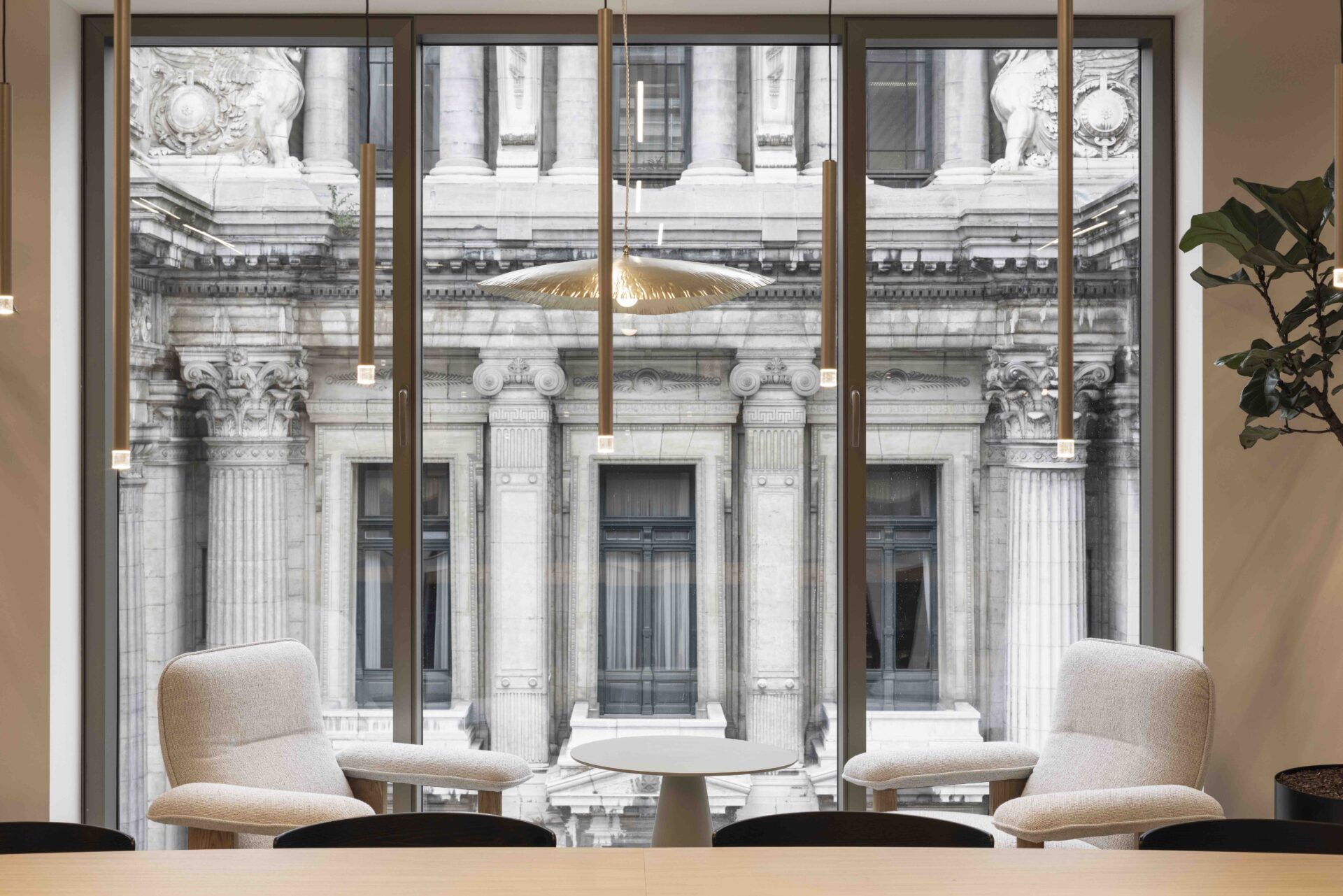
To bring the brief for “Italian sophistication” to life, the material palette is a luxurious medley of marble, ceramic tiles, and textured fabric in fiery red that references the colour of Campari.
A metal grid of interlocking ‘C’ shapes behind the bar is an elegant yet playful interpretation of the Campari logo mark. “We wanted to create a moody Italian atmosphere and for the space to not feel too ‘office’ like,” explains Belmans.
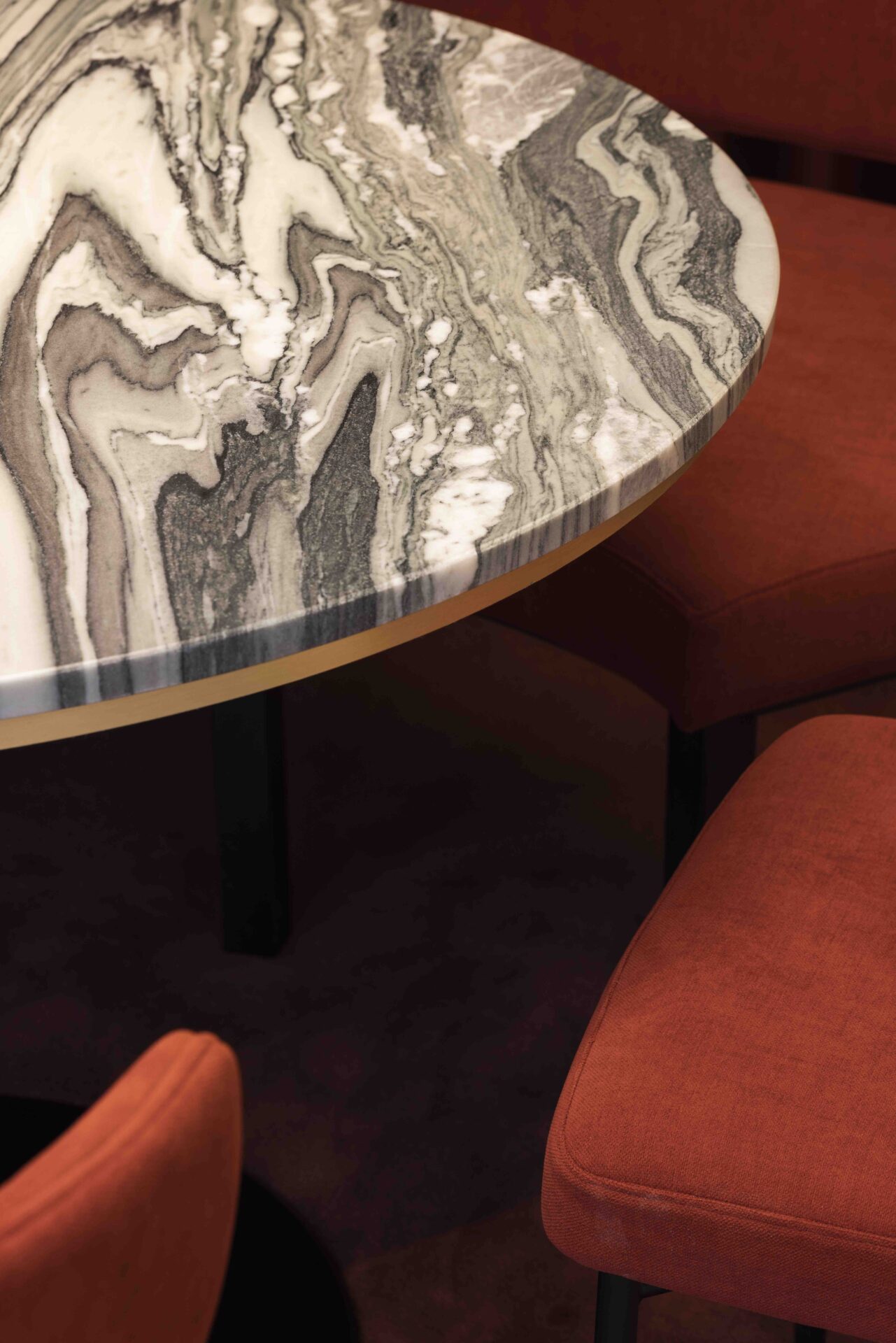
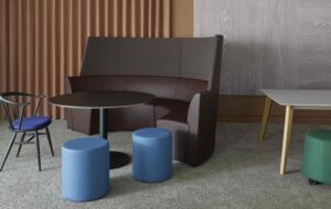
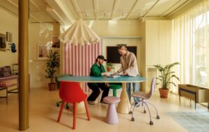
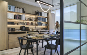
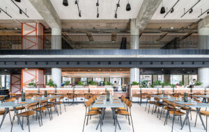
The bar sits at the rear of the mostly open workspace, with a large meeting room accessed via a hidden door that playfully echoes the secrecy of a speak-easy. A large communal table by Andreu World in front of the bar area encourages collaboration, interaction, and lively discussion, while cosy custom booths offer more private spaces for informal meetings.
“It’s a very large space and we didn’t want it to feel empty,” reveals Belmans. “So, we created different zones that introduce dynamism. The result is a surprising interior that makes you feel special – particularly the ‘speak-easy’ meeting room. It will be the start of many conversations.”
Images by Tijs Vervecken
Enjoyed this article? Read more: MXCF Architekci designs collaborative headquarters for Red Bull in Warsaw

