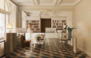
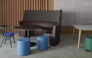
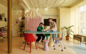
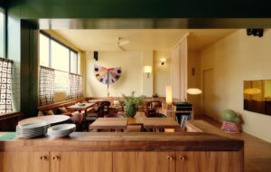
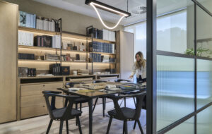
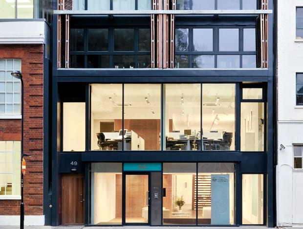
 Full height windows offer an eye onto the charity’s work|The ground-floor entrance, lit to gallery standard to display the foundation’s important art collection|A meeting room, furnished with paintings by Portuguese artist Angelo de Sousa, opens out to gallery space|Furniture in the entrance area can be cleared for parties and functions|The first-floor corridor (with Desso carpet) leads past the director’s office and into the open-plan work area at the front of the building||
Portuguese charity the Calouste Gulbenkian Foundation needed a revamped image fit for the 21st century. The answer? A move from Regents Park to Hoxton Square
If Hoxton Square is a hub of the east London art scene, then the recently finished UK headquarters for the Calouste Gulbenkian Foundation is perfectly placed. Nestled next to the White Cube gallery, the new building’s ground-floor exhibition space is visible from street level. A full-height glass frontage invites passers-by to peer in at the foundation’s impressive collection of British and Portuguese art, including works by Paula Rego and Henry Moore.
Hoxton was a decisive change of scenery for this cultural and educational charitable trust, founded in 1956. For 40 years, it had offices in a stucco-fronted building in Portland Place. It was with the arrival of new director Andrew Barnett, who joined in 2007, that the decision was taken to find a more contemporary space and embrace the creative buzz of the East End. Hoxton Square was a logical choice.
“It’s about creating an equal relationship with the people who we exist to support,” Barnett explains. “And the windows are windows through which we can see and be seen. They are windows on to our world.”
The brief called for a ground floor with exhibition space and meeting areas, and a first-floor level with open-plan office space for 12 people plus private offices for directors. Architects Soraya Khan and Patrick Theis, of Theis and Khan Architects, had their work cut out for them with the existing new build shell, however. Despite a skylight toward the back of the L-shaped structure, the larger area leading onto Hoxton Square was narrow (29m by 4m) and dark, with the only windows being at either end facing the square and a smaller side street.
“Our greatest challenge was to create a sense of space and light,” says Khan. “The idea was to keep it very simple but open it up as much as possible.”
To that end, Theis and Khan carved out a slot in the first-floor slab to allow natural light to filter down from the skylight. This also created a double-height ‘art wall’ along the west side of the building, where the exhibitions take place. A combination of spotlighting and recessed fixtures from Zumtobel bring lighting up to gallery standard.
To visually open the space, the original staircase was moved from the front, near the windows, back toward the centre of the double-height void, facing away from the main entrance. Open spacers allow for even more light to filter through and reference the foundation’s main headquarters in Lisbon. The Lisbon building, opened in 1969 in the tradition of Portuguese Modernism, was a key influence in the design.
Bespoke timber joinery made of smoked ash veneer provides a sleek storage and services pod along the east side of both the ground and first floor walkways. This, together with Portuguese stone and smoked ash flooring throughout the gallery space, are also nods to the Lisbon building.
.“Those Portuguese architects had an amazing palette of materials that we tried to reference on a much smaller budget,” explains Khan. “I think it’s the timber that really gives the space a feeling of quality.”
This perhaps, and the artwork that sits in every office, corridor and meeting room. At the time of viewing, Bartolomeu Cid dos Santos etchings lined the ground-floor back corridor; on the walls of the back staircase leading up from the loos was a collection of works based on London birds by Paula Rego, Norman Ackroyd, Craigie Aitchison and more; and the first-floor back corridor contained a portfolio of tree etchings by Henry Moore.
“It’s about creating an equal relationship with the people who we exist to support. The windows are windows through which we can see and be seen”
Leading Portuguese artists are well-represented too: Angelo de Sousa in the boardroom and Nikias Skapinakis in the open-plan working area, which sits on the first floor near the front windows. Simple Bene work stations and task chairs accommodate 12 foundation employees, while the directors are in offices with sliding glazed doors at the back, near the circulation hallway that holds the kitchen. The original wooden desk belonging to the charity’s founder, oil baron and philanthropist Calouste Gulbenkian, sits in one of the offices, and is a terrific contrast to the newness of the building.
“If you sit behind it, you too could make many billions,” quips Barnett.
The only kink to be ironed out, it seems, is coming up with a solution to control acoustics in the open-plan working area, which is essentially a mezzanine over the potentially echoing events and gallery space. Still, the move from cellular offices in Portland Place to an open-plan set-up, totally visible to all of Hoxton Square, is in line with the 21st-century Gulbenkian culture Barnett wants to promote. Sometimes you’ve just got to move to get things done.
“It’s completely worked. It is absolutely what we wanted all along,” he says. “I always knew that there were tricks I could have played on employees to get them to work more closely together. But I also knew that by moving, there were all sorts of tricks I didn’t need to play.”

