What happens when you marry the practicality of a utilitarian building with the theatricality of dance? A seductive Montréal café that is thoroughly en pointe
The Wilder Building, a landmark in Montréal’s Quartier des Spectacles, was first unveiled in 1918. Nearly a century later, in 2017, the industrial warehouse was converted into a LEED-certified cultural centre, housing four dance companies and strewn with offices, studios and performance venues.
One of these esteemed organisations, Les Grands Ballets Canadiens de Montréal, wanted a lively new hangout on the premises, a place for guests, staff and artists to gather.
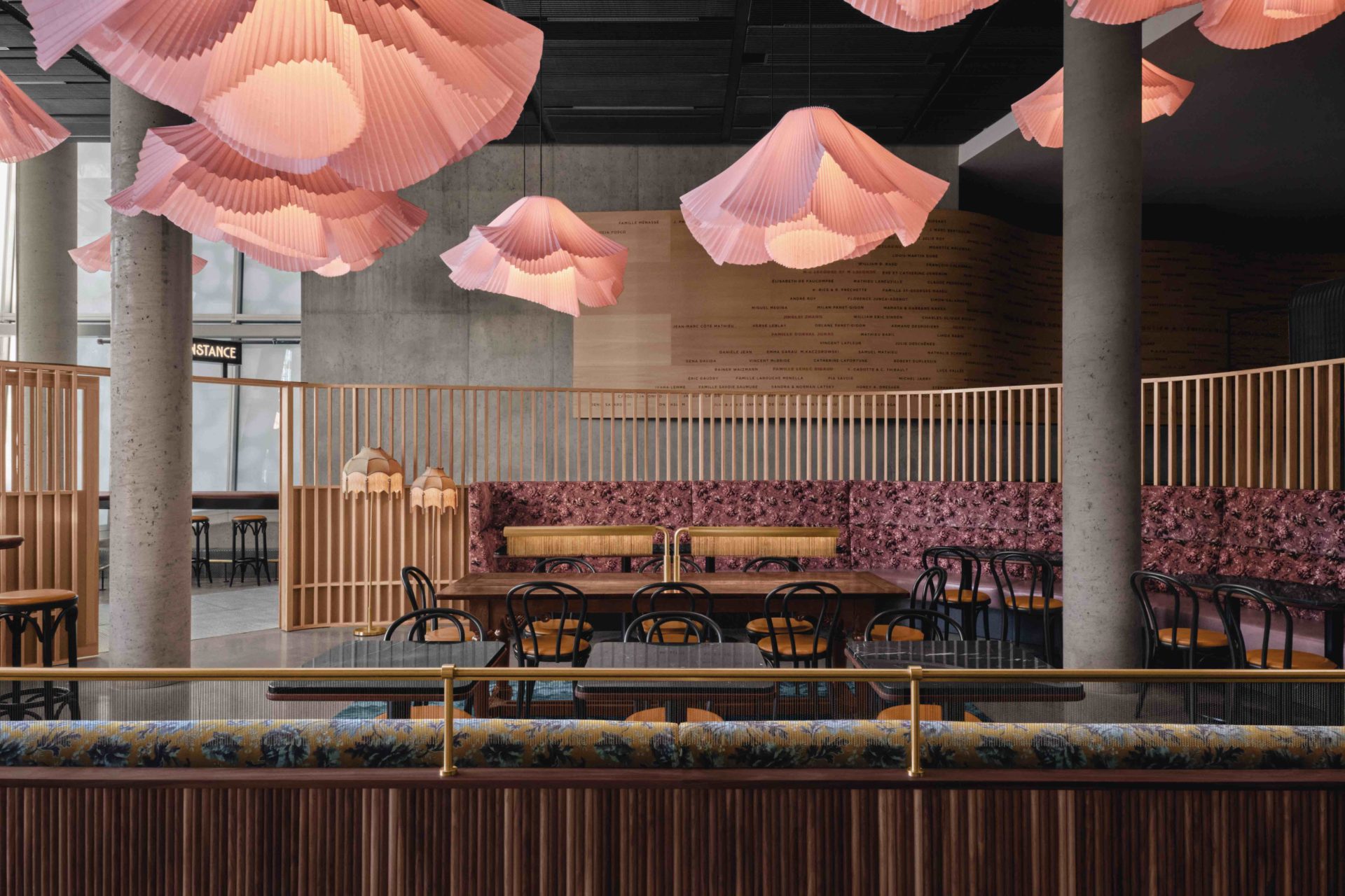
Café Constance, a 130-square-metre lobby retreat, is the result. The handiwork of hospitality-driven local firm Atelier Zébulon Perron, it is an ode to Constance Pathy, a renowned patron of the arts and the ballet’s former president. During the day, it has the air of a buzzy coffee shop; by evening, it morphs into a destination for pre-show aperitifs.
A bright, energetic juxtaposition to its more austere surroundings, Café Constance, says Zébulon Perron, the founder and creative director of his eponymous practice, is “unexpected in a contemporary, but institutional context. There’s always this choice as a designer to go with the flow or to contrast.”
Perron took the latter route, embracing a more colourful, warm approach over a predictably minimalist one in the unusually laid-out space. “For a café, it felt like it was out of scale. The
ceilings were too high and there was too much concrete and glazing. We needed to create a moment here – to make it more comfortable and, as we say in French, sympatique,” he continues.
Perron took a risk by inserting a fairy tale into ‘a more serious architectural proposition’. As he explains, “We felt we had the opportunity to add more whimsy, something fantastical. There is this whole universe around ballet, and I think
that was key to the project, making it magical and improbable, an imaginary world.”
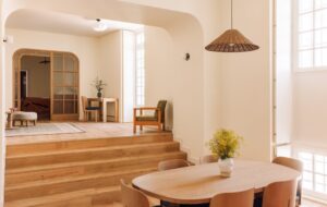
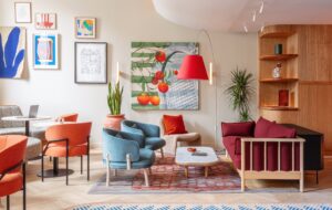
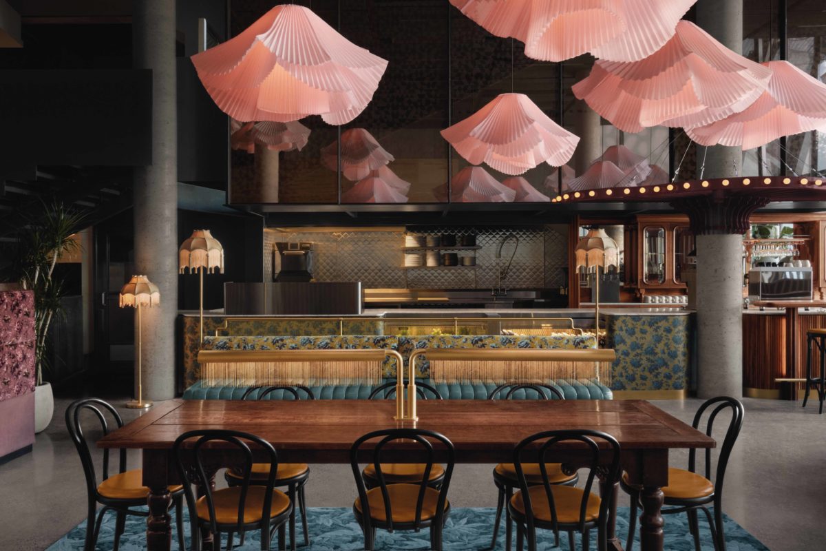
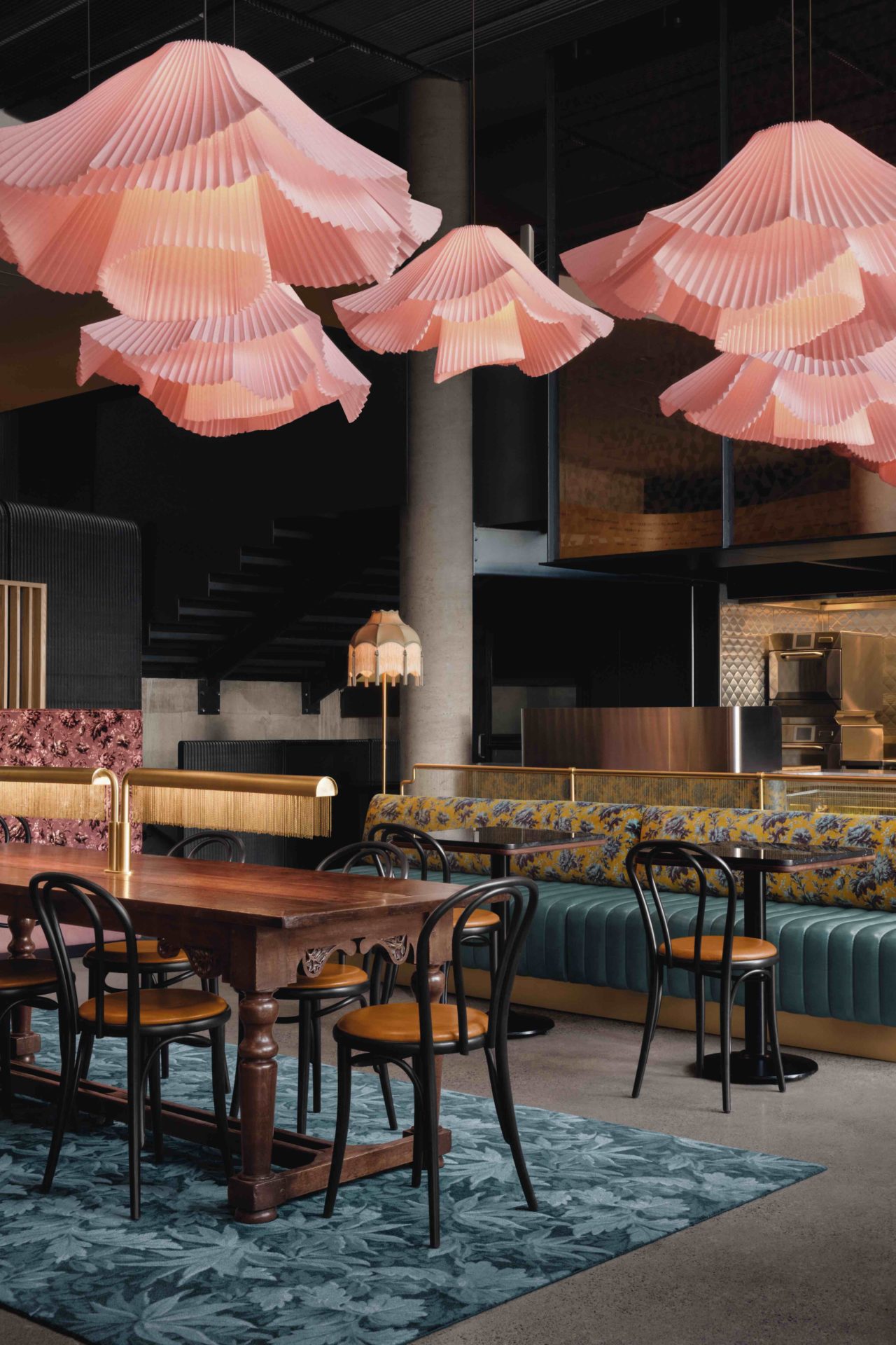
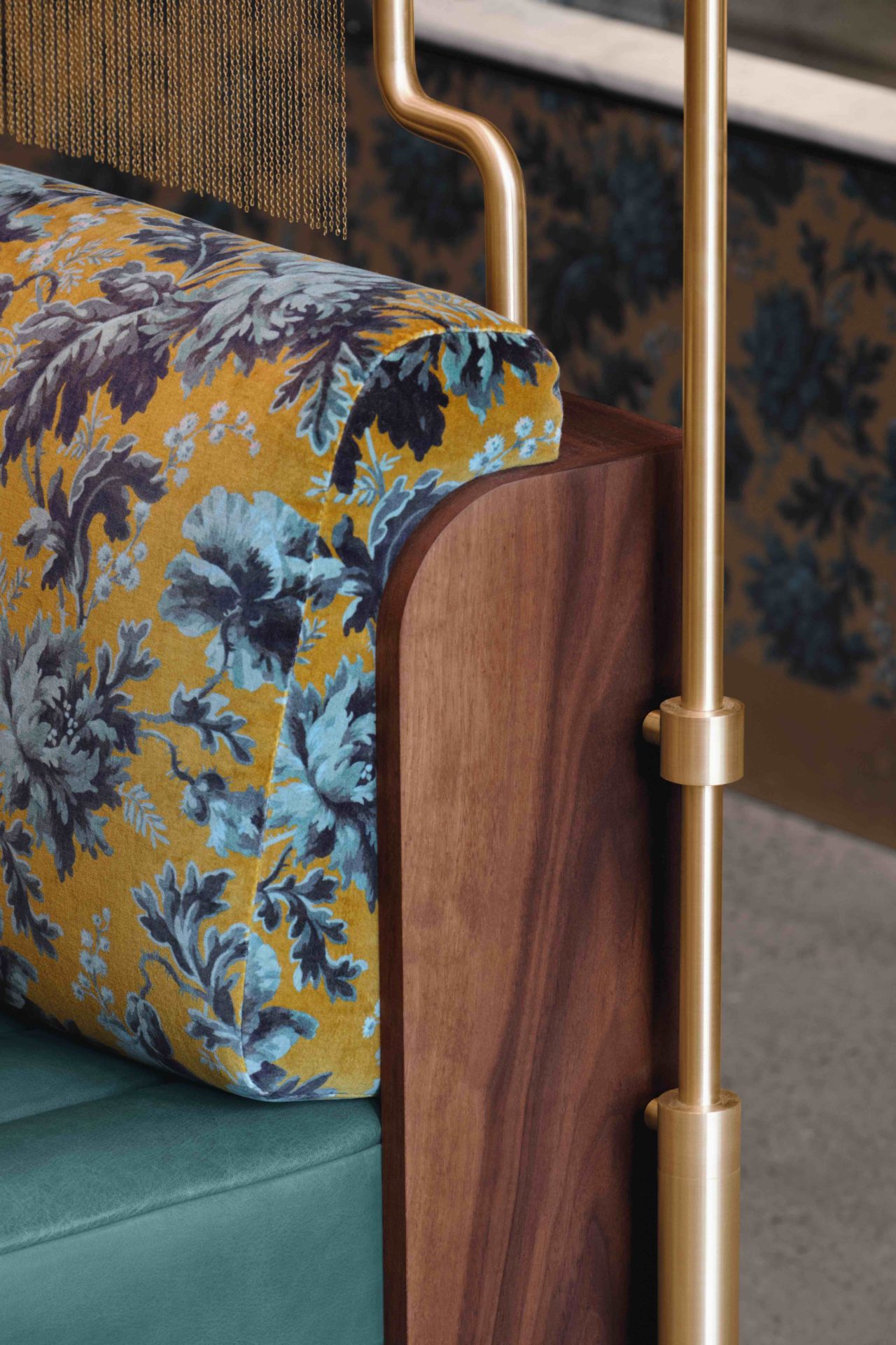
Inspired by the Wes Anderson-designed Bar Luce inside Milan’s Fondazione Prada, Café Constance has an uplifting, bygone aura that melds classic materials such as velvet, brass and bevelled glass with fringed lampshades and leather banquettes, buoyed by a brazen swirl of florals. Thonet chairs and an imposing communal table sourced from England are also part of the eclectic mix.
“We like to bring in antique or vintage items when we can. As pieces get worn down and patinated, they should beautify,” Perron points out.
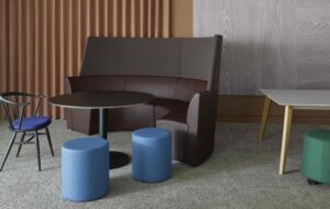
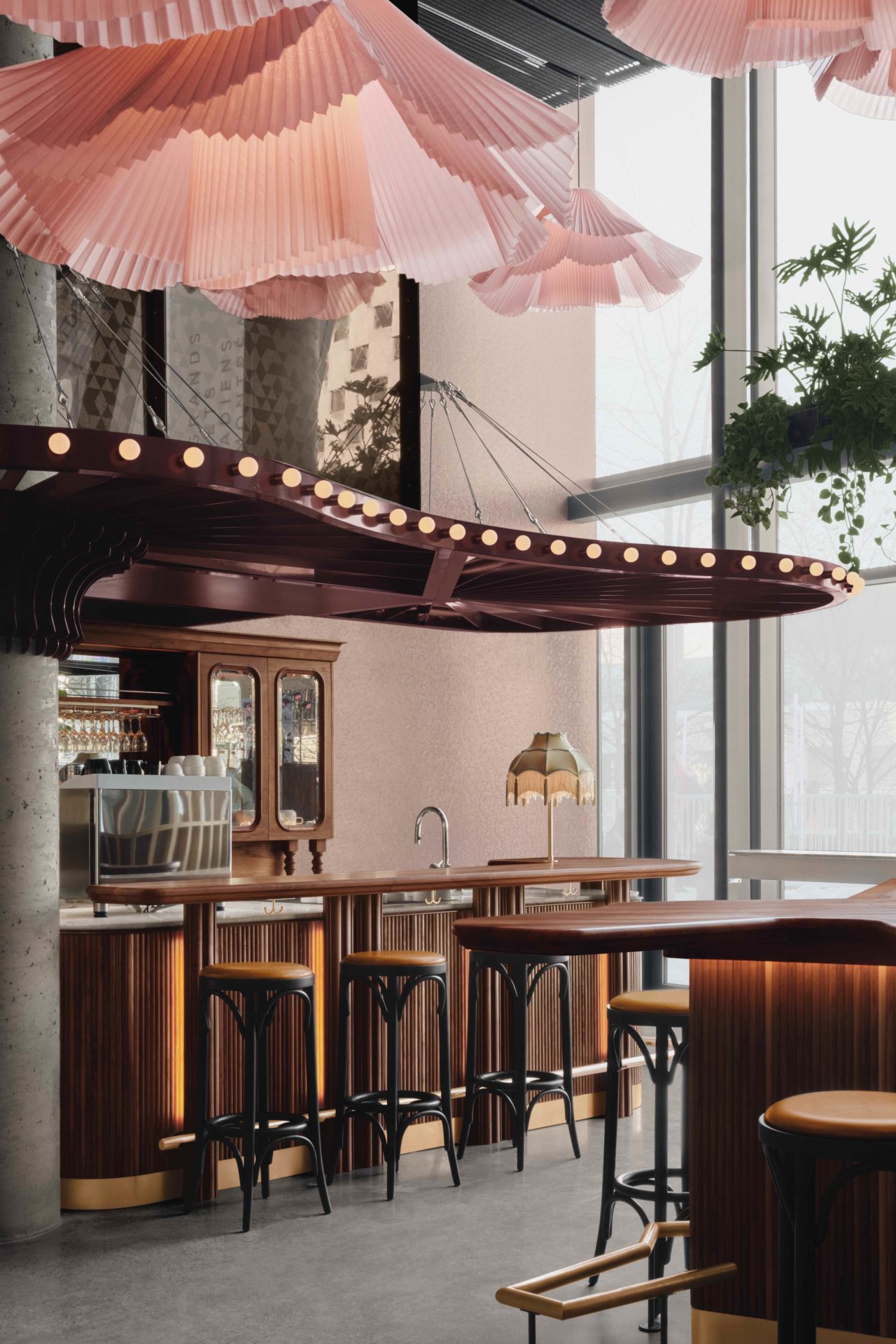
This joyful spirit is balanced with functionalism. Consider the powder-coated steel canopy floating above the bar that elegantly minimises the space’s soaring heights. Slatted ash screens behind the banquettes, salvaged from the café’s original build-out and bolstered with thin, painted plywood infill panelling in the lower portion of the claustra wall by Perron’s team, provide he café with a cocooning layer of intimacy.
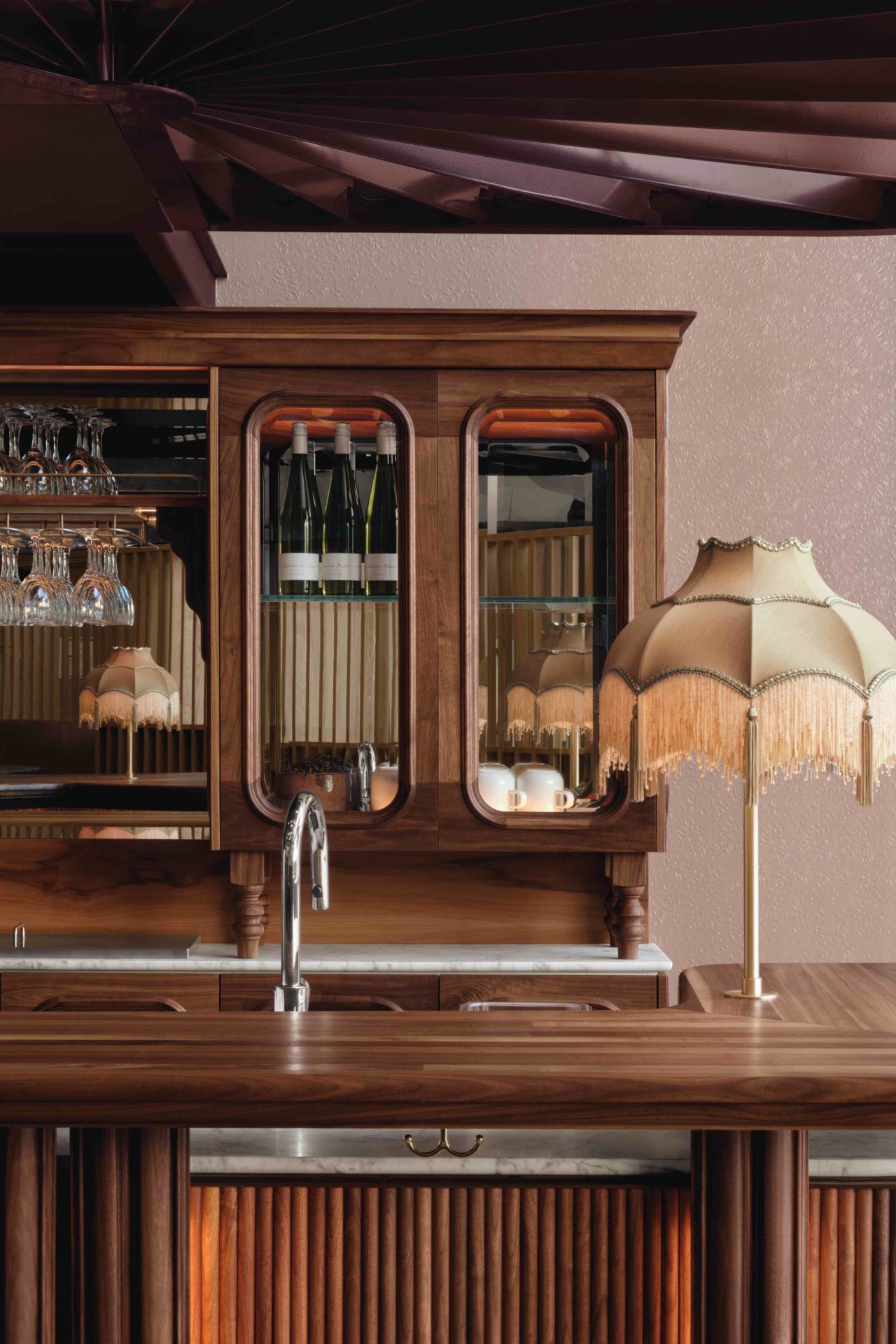
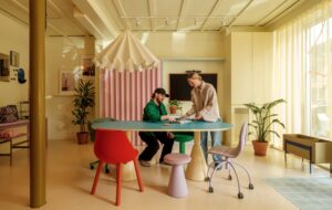
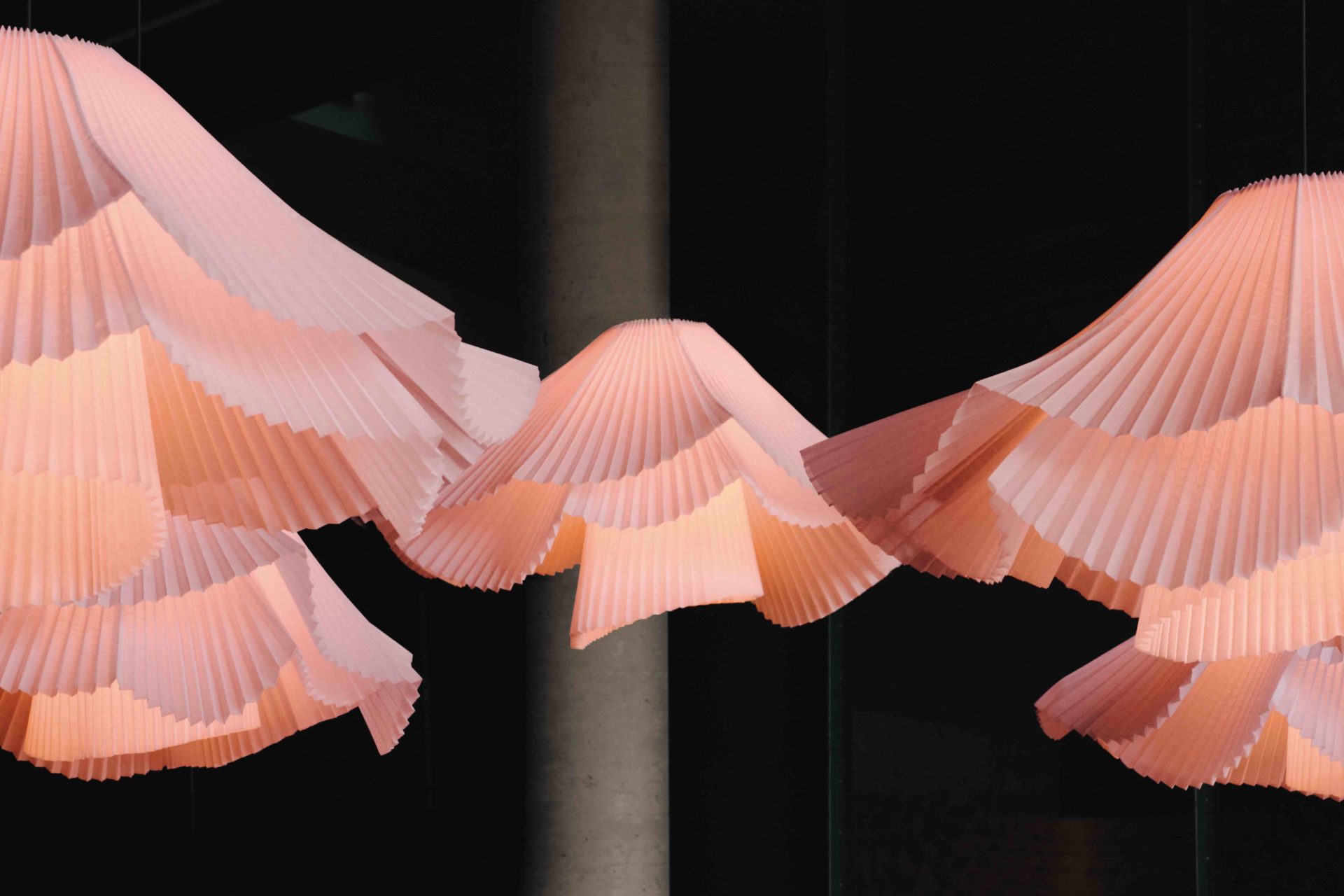
Since Café Constance’s design stems from the vision of a child enraptured by the ballet, “we were allowed to go very literal and bring this almost dollhouse quality to it”, says Perron. Along with bar backlighting that appropriately conjures a backstage dressing room, there is a stand-out assemblage of seemingly fluttering pendants.
Each one is rendered in a slightly different shape and crafted from pale pink crinoline, the same structured fabric used to make a ballerina’s tutu. Like the bar counter fashioned out of solid black walnut that takes the organic form of an amoeba, there is a dynamic interplay to these lamps.
Throughout the creation of Café Constance, Perron kept returning to the oeuvre of Eadweard Muybridge, the English photographer celebrated for his pioneering animated filmmaking techniques.
“It’s fascinating to see motion cut up like that into moments,” says Perron, noting how this custom lighting installation further softens the room from a utilitarian perspective, but is also meant to symbolise an art form that is defined by its grandeur and agility. “It’s hard to refer to ballet without kinetics and sequencing,” Perron elaborates. “We tried to convey the grace of movement.”
Images by Alex Lesage
As featured in OnOffice 160, Autumn 2022. Read a digital version of the issue for free here

