 ||
||
Most workplace design projects can be split into two camps: speculative space for a developer, and bespoke space for a tenant. For the overhaul of British Land’s Marble Arch headquarters, MoreySmith found itself somewhere in the middle.
 The addition of a central staircase makes staff movement between floors a little more fluidThe firm accidentally stumbled into the project when founder Linda Morey-Burrows was touring the offices, in their pre-existing state, with British Land’s chief executive Chris Grigg, with a plan to merely spruce up its reception area.
By the end of the tour, the two had agreed that a wider transformation was in order. MoreySmith set about revamping the entire three-floor office (including a major structural rejig in the middle) and its working culture, to better align the space with British Land’s evolving nature.
“They want to walk the walk, not just talk the talk,” says Nicola Osborn, MoreySmith’s design director, describing the developer’s shift to more modern workplace philosophies. “We probably took them two steps ahead rather than one, but they’ve really embraced it.”
The long, thin floorplates were previously clogged with walls, creating dark and narrow “tunnel-like” corridors. Despite being an awkward shape, the upside, Osborn says, was the opportunity for a dual-aspect view. Though staff already had views to Hyde Park on one side and Marylebone on the other, the design largely neglected the opportunity for employees to have both views at once, not to mention the natural light it would introduce.
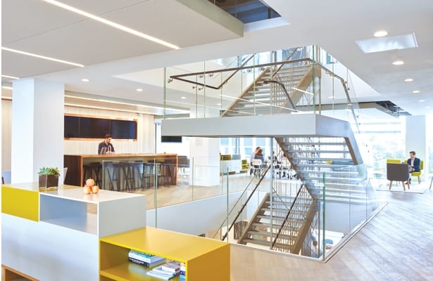
MoreySmith’s interventions therefore pivot on making the most of this opportunity. The firm’s most dramatic act was to knock a hole through the centre of all three floors to create an atrium stairwell, allowing for more fluid connections between the levels, which were previously siloed.
 Internal walls have been removed to create shared space; the chairs are Naughtone’s HushOn the central floor, this new feature staircase is now surrounded by a superbly light, airy, open-plan communal area stretching the width of the building, affording panoramic views out both sides from anywhere in the space.
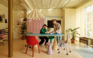
It is free to be used by all 280 staff, who for the first time have a huge variety of breakout areas, such as lounge seating, casual meeting tables, private booths and a kitchen counter, to gather and collaborate. It is also the site of a monthly, company-wide catch-up meeting, which previously took place in a formal seated auditorium; the change has apparently made the meeting much more casual and upbeat.
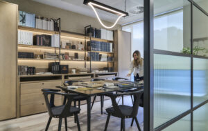
For the floor below, MoreySmith faced a quandary – how to deliver that same open-plan feel without Closed-off perimeter meeting rooms are now glass fronted, so all staff can enjoy light and views changing the existing cellular layout of meeting rooms. Its solution was to install floor-to-ceiling “shop windows” on the front of each room, inspired by British Land’s retail work, allowing light to travel from the glazed facade through to the corridors, and allowing glimpses of the panoramic view from the atrium.
This idea of exposing the inner workings of meeting rooms was met with trepidation at first, says Osborn, for fear of lost privacy and security, and on our visit she seems pleasantly surprised to find them still intact, which means the employees have adopted the new practice. In fact, there’s even talk of using them to display development models in future.
Up on the top floor, a smaller communal area borders the atrium, featuring yet more gathering space for staff, including lounge areas, meeting tables and booths.
 Small meeting areas are tonally themed, with Vitra’s bare-bulb Potence lights overhead In an effort to shed British Land’s corporate persona in favour of a more personable, high-end feel, MoreySmith has developed a sophisticated palette of materials.
“It was very dated, so we elevated a lot of the materials,” says Osborn, describing how details were made bespoke wherever possible to give character and avoid the look of a standard rollout, as well as making staff feel more comfortable.
The project is also on track to achieve a BREEAM Excellent rating, an accolade of particular importance to British Land so it could practice what it preached. Virtually all the materials are not only high-spec, but sustainable too, and around 90% of the furnishings have been designed and manufactured in Britain.
Where much of the core structure, such as the wall partitions and the mechanical bones, has been kept, the finishes were zhuzhed up. Outside the meeting rooms, brown leather walls and brass panels (hosting the room-booking technology) give a warm and luxurious touch. Stair treads are made from Cumbrian stone, and floors are oil-finished British oak.
An eco-friendly leather wall in reception was developed in collaboration with London-based leatherworker Simon Harcourt of Harcourt London, with a geometric relief that “adds dimension” says Osborn. This is one of many features throughout the interior with a geometric motif, giving an architectural feel that is softened with differing textures.
“It’s not a logo but more of a design hook,” says Osborn.“A subtle and classic element that we could build upon and link through the space.”
This reappears in understated fashion on the staircase metalwork, where lines of pale-coloured metal criss-cross like those on an architectural plan drawing; and in the sandblasted triangular decorations on the small glazed meeting rooms.
 Small meeting areas are tonally themed, with Vitra’s bare-bulb Potence lights overhead
It pops up again in the formal meeting rooms, which are given individual flavour with varying triangular patterns and colours of felt on the acoustic walls. Some of these are traditional set-ups, with chairs round a conference table; a couple are less formal, with sofas and armchairs.
“This room, as a step change, was massive,” says Osborn, as we stand in one of the new, living-room-esque conference rooms, “but it’s always booked out. People love it. Meetings in these rooms generate a different type of conversation; they give people a comfort level to have more animated, relaxed discussions.”
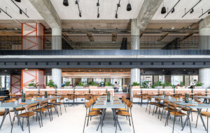
The desking areas are bright and open, with intervals between the cores allowing more panoramic  Senator desks have minimal partitions, opening up sightlinesviews. Storage is low and situated at the end of desk banks, not between, to add to that openness; lockers have also been built in to futureproof the space for more agile working. Even the Senator desk systems have been subtly tweaked, responding to employees’ requests for “no white desks – too Ikea,” and are instead “mushroom” or “peppermint”.
Finishing off where it all began, we return to reception, a space that has now been opened up to become a showcase of the developer’s work. There’s an interactive table, on which visitors can place small wooden models to activate screens showing various projects from British Land’s portfolio. The layout, materials and animated screens,
Osborn says, convey a “vibe” of all three facets of its developments (retail, residential and commercial). “Before, it could’ve been any company,” says Osborn of the previous entrance space, “so we’ve brought together what they do and what they believe in, in a more animated, welcoming space.”
Carefully but confidently, MoreySmith has nudged British Land into the new era of workplace design. Without too many bells and whistles – but enough to shake up office habits – the interior finds a common ground between corporate practice and modern culture.
British Land develops prime commercial property, but its offices lagged behind its own high standards. A redesign has corrected all that, with a focus on open, shared space

