 Ukrainian firm Azure went for a literal translation of their name into three dimensions|Ingo Maurer’s Silly-Kon lights mix with origami-like chairs made by the designers|Custom-painted Vitra House Birds, against a backdrop of undulating nutwood wall panels|Corian walls appear to peel back, revealing timber shelving|Colour is used in a more toned-down way in working areas|Clean cut: the simple concrete and timber washroom||
In the current drive to demonstrate austerity and up space efficiency, the element of fun in office design often seems to fall by the wayside. Which is why looking further afield, to more unexpected places, can often pay dividends. It is the bold use of colours, materials and shapes found in Azure’s new offices in Kiev that many of us have been missing. The big allure of this project is its playfulness and imagination. Sergey Makhno, the designer behind it, has worked on many projects across Ukraine over the last ten years, including apartments, country houses, restaurants, shops and offices; of these, Azure contains the most variety, and the most vibrancy. This is very much down to the client, whose company produces design accessories, and who wanted the office space to directly reflect the business.
The space adheres to no single aesthetic but draws on many – living up to Makhno’s website, which name-checks a number of favourite stylistic trends including minimal art, neo-brutalism, art deco, art nouveau and neoclassicism, to name a few. Makhno graduated from both the Kiev National University of Building and Architecture and Moscow’s Academic School of Design, which explains the broad range of design influences on his work. Now based back in Kiev, Makhno and his co-designer Vasily Butenko use their own distinctive furniture throughout the interior, ranging from streamlined and refined contemporary pieces to something more bold and retro.
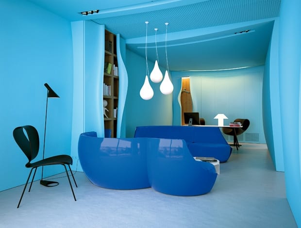
Despite the mix of design classics and original furniture, the most striking thing about the space – which consists of a meeting room, presentation area, terrace, restrooms and storage – are the walls, which are made of a mixture of Corian and wood. In one room, rigid vertical timber panels create a meandering, wavy wall, while in another, cool blue Corian walls appear to flex and peel away in places. In another working area, the walls bulge outwards as if buckling under the weight of the architecture. In one instance, coat pegs appear tucked behind a fold in the wall, and in another, a lip in the wall surface becomes an opening for a bookshelf. It’s functional and fanciful rolled into one. These were not easy ideas to achieve, Butenko confesses, but the process was helped by the fact that this was not the first time that the designers have used Corian and wood to play with wall surfaces in this three-dimensional way.
The lighting, which is as prominent in this project as the furniture, is a mix of recessed ceiling spotlights and low hanging pendants. Teardrop-shaped lights by Benjamin Hopf and Constantin Wortmann create an installation-like feel in the presentation area. The black pendant lamps, which drop down from cables and create an intimate environment around the main meeting table, are by Ingo Maurer, and use thin silicone reflectors to soften the atmosphere with glare-free light.
The origami-like chairs are the creation of Vasily Butenko, as are the bulbous blue sofas. Perched on tables are Vitra House Birds by Charles Eames, custom-painted in exactly the right shade of blue – a fitting finishing touch to the domestic-like interior, with its many flights of fancy. The most successful thing about the project is its character, Butenko asserts, which is fun, but not overbearing. The workspaces themselves are left relatively sparse so the combination of design-heavy furniture and architecture does not detract from getting things done. The wood used throughout the office is nutwood, which is warm, and complements the many hues of blue that live up to the project’s name. And the all-blue palette allows for the mixing and matching of soft and hard surfaces, round and angular shapes, and natural and synthetic materials. The use of drop lights, sculptural furniture and unusual surfaces is a combination that the design duo has also applied to a newly opened restaurant in Kiev, Twister. It features a room where the ceiling and wall surfaces are made entirely out of thatched sticks, creating a nest-like interior. It seems that walls are no longer what they seem with these two on the scene. And as we’re pretty sure that they will be continuing to branch out and find new ways to subvert the ordinary, we’ll be watching Kiev closely in the future, for more offices with a touch of Ukrainian design daring.

