 |||
|||
London’s Camden Market is renowned for its hustle and bustle and a history of both industry and bold counterculture, from punk to Britpop to wide-eyed tourists. Such a diverse clientele continues to this day, yet the area has grown up. Businesses, entrepreneurs and agencies all rub shoulders with their more stereotypically “Camden” neighbours, and this is only set to increase with the launch of a trio of huge new co-working spaces in the area, collectively known as Interchange.
All three spaces are designed by Barr Gazetas, working alongside Tom Dixon’s Design Research Studio, which mainly took on the lighting and furnishing of the space. Atrium is the largest of the bunch, with Utopia in nearby Primrose Hill currently in development, and Triangle, nestled just behind Atrium, which opened last year. The space is aimed at startups and creatives, and the design looks to foster a more collaborative approach to co-working. It’s that typically modern mix of stylised – the angular seating, the shiny finishes, the polish – and rawness, with exposed brickwork areas and durable wooden flooring.
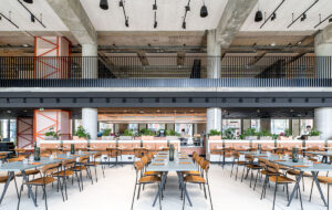
 Communal areas look out over the Camden streetscape
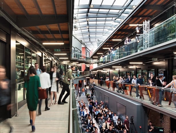
Wide ramp walkways encouraging people to “walk and talk” as they navigate the space spiral round a central, well, atrium, making for an environment that manages to bring the outdoors inside, reminding even the most industrious worker that life exists away from a screen. The huge central ground floor area uses a section of reclaimed brickwork flooring, and capitalises on an original tunnel-like seating alcove as both a resting spot and design feature. This space can host up to 3,000 people, and is frequently used for events and parties in the evening, while offering ample room for presentations or screenings during the day.
“We’re trying to design a community,” says Barr Gazetas project director Jon Eaglesham. “A community works when everyone’s together, and social, and everyone interacts. But just like when you’re at home, you need your own time and space. The communal points are always in the same place on each level, but the office is like a sanctuary.”
 An open atrium with wide walkways brings the outdoors inside
Taking Camden as both its location and as its atmospheric touchstone, Atrium is a co-working space that amplifies community and diversity. The four-storey hub’s site-specific approach utilises its market home to its full advantage, referencing the vibrant colours with subtle interventions, like a feature wall, and inviting food traders to set up pop-up eating offers in the communal spaces operating alongside the site’s own Atrium Kitchen restaurant. When we visited, some little mannequins in various states of undress had also taken up residence in front of one of the exposed brick walls; local retailers can also apply to set up temporary mini stalls.
These tiny slices of market life aren’t entirely by design, or as deliberate quirks to please the startup crowd. The building was originally created as an indoor/outdoor marketplace, but fell into disrepair when the project was scrapped as a result of the 2008 financial crisis. The shell of the building was intact, and each level was divided into shop spaces. This turned out to be a boon for the designers: as a retail space, the layout forces users to cover as much ground as possible – toilets are slightly further out than they would be in a traditional office, for instance – and so intermingling with other tenants is a happy inevitability. “The fact it was originally an indoor market was such a strong point for the building that we decided it would be the main feature,” says Eaglesham.
 Startup style is brought up to date in simple airy office units
Throughout the space sit a number of “casual zone” areas that break up the more traditional co-working spaces, meeting rooms, private offices and kitchen amenities, with the entire plan built for flexibility. If a company begins with a four-person space and grows, for instance, it’s easy to open up the office by knocking through to the space next door.
So while there might be the obvious signifiers of startup culture – a table-tennis table here, foosball there, cutesy illustrations on the glass office fronts – practicality is at the forefront of the design considerations.
 Robust finishes thoughout refer to the building’s past
“We did a lot of research and spoke to people about what they want out of a workplace, and people just want a space that works,” says Eaglesham. “It’s got to be really robust and flexible. For a practical office space you want to be able to lock the door properly, have good lighting, a good quality environment, a good desk and a nice view. All the colourful finishes, the feature lights and the fun elements are more in the community spaces. If you have too much of that in an office it becomes distracting. These guys might be startups, but they’re very serious about what they do.”
For a site in the middle of a market in one of the capital’s busiest areas, Atrium feels surprisingly serene and airy. Natural light floods in through the central glass roof, and each level offers ample views across the market. It’s also incredibly quiet, despite offering a range of activities for users from yoga and HIIT (high intensity interval training, for the uninitiated) classes to a “speakers corner” that offers a platform for people to share their knowledge out loud at lunchtime. Topics so far have included fashion, creativity, advice from company CEOs on starting a business and insights from DJs and music producers.
 The ground floor area is used for events and parties in the evening
The look and feel of the space references both this idea of looking outward to the local area, and fostering diverse and creative conversations. The wooden decking-style flooring is a subtle nod to the visible nearby train tracks, and the colour scheme and fittings are pitched at a contemporary, dynamic audience.
“We wanted to be anti-corporate, so no white,” says Eaglesham, whose team used black throughout the space. “The colours are about having fun really, so there’s lots of rich gold in there. The Interchange buildings themselves are in the middle of Camden so you have to respond to that. It’s not a pastel colour area.”
Barr Gazetas gives a disused Camden Market building a vibrant new life as a co‑working business community

