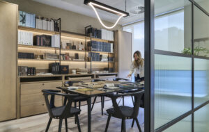
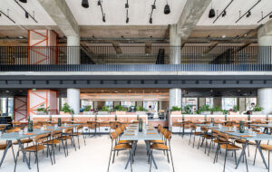
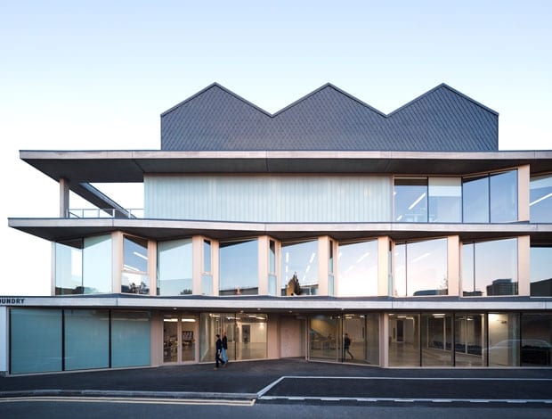
 The Foundry in Vauxhall, south London|The zigzagging roofline of the new extension echoes the factory’s original look|The layout includes smaller open-plan offices alongside communal facilities|New materials – concrete and timber – contrast with patinated brickwork|Architecture 00 collaborated with the Alliance for Inclusive Education to ensure the building’s accessibility|A deck with mesh fencing provides secure outside space; there are also publicly accessed roof terraces|Generous glazing on the ground floor is the material embodiment of the concept of an open, inclusive space||
At Monday’s award ceremony, The Foundry by Architecture 00 was named RIBA London’s Building of the Year. But what was it about the South London hub for social justice organisations that made it stand out from the other nominations?
The south London hub for social justice organisations represents the next generation of co-working – where sector-specific bodies share knowledge and resources. Many casual passers-by might barely register The Foundry in Vauxhall, south London. From the street, this contemporary, understated building doesn’t look out of the ordinary or arrestingly modern, but familiar.
Its zigzagging roof recalls an archetypal factory, while its muted palette of materials – glass, concrete, wood and zinc tiles, the latter cladding the roof in a decorative though subtle diamond pattern – is neutral, inoffensive.
Yet there’s nothing accidental about its highly considered design, undertaken by Architecture 00.
This London practice was approached by the company Ethical Property, which provides charities with modern, affordable and flexible workspaces, to convert an early-20th-century former shoe-polish factory into offices and other spaces for voluntary and charitable organisations in the social justice and human rights sectors.
Architecture 00 and Ethical Property have collaborated in the past and this time worked together closely to find the 5,010sq m, property, whose previous incarnation was a labyrinthine warren of artists’ studios.
“We then jointly created a brief and vision, which we presented to a group of UK-based charities and foundations,” explains architect Lynton Pepper.
Developed in tandem with The Alliance for Inclusive Education, which campaigns for the disabled to have access to mainstream education, the interiors were also designed to be appropriate for tenants and visitors with limited physical mobility and “from diverse socio-economic and cultural backgrounds”.
The philosophy and design of the impeccably right-on Foundry – described as a social justice centre – seem profoundly utopian. It’s conceived both as a complex of offices for its 380 or so tenants (current occupants include Traidcraft, Solar Aid and Engineers without Borders) and as a space where local residents and the wider public can drop into its cafe, see an exhibition, make use of its wi-fi and take part in meetings and presentations.
“The cafe in the ground-floor atrium is designed to provide cheap food for the tenants and local community,” says Pepper. “There are also roof terraces where both tenants and community groups can do beekeeping and cultivate allotments even when the building is closed, thus making it continually ‘open’ and part of the community.”
Even the Foundry’s largely transparent, generously glazed street-facing facade is designed to make the building look accessible. The facade is pleasingly cohesive, thanks to its restricted palette of materials, its three, strong horizontal lines separating each storey and zigzagging roofline mirrored by the concertina-like arrangement of windows on the first floor. There’s a reason for the latter: they’re angled to face away from neighbouring residential buildings so the latter aren’t overlooked.
Yet this unified exterior belies the interiors’ comparatively complex design, which dovetails the original brick building with a new structure adjacent to it, built in a derelict service yard. While the old factory’s interior has been radically reconfigured – “its labyrinth of partitions was removed to create an open-plan space that can be subdivided by the new tenants to suit their changing needs,” says Pepper – the new addition houses an atrium, stage areas, meeting rooms, a reception and the aforementioned roof terraces and cafe.
To help knit the old and new buildings together, one of the factory facades doubles up as an internal wall in the atrium, its window openings remaining. What’s more, the new annex has taken its aesthetic cue from the factory, many of whose original features have been kept and restored.
“The old factory has a beautiful, robust quality that is hard for modern buildings to match,” says Pepper.
“We wanted the new structure to reflect the existing building’s industrial nature by keeping its structure exposed, hence the new extension’s bare concrete soffits and raw-looking materials, such as MDF, timber battens cladding staircases and recycled carpet tiles used for flooring.”
Meanwhile, many of the old building’s vestigial, industrial features have been retained, although more for practical than aesthetic or nostalgic reasons. True, its exposed brick walls have an undeniably industrial-chic, romantic appeal – as does the very name The Foundry. But several original elements have been cleverly repurposed to fulfil purely functional needs.
Some steel blast doors (doors resistant to explosions, found in industrial and government buildings) have been reused as office partitions. More original still has been the conversion of existing chimneys, once used as flues during the shoe-polish manufacturing process, with extractors added to turn them into part of the new ventilation system.
Sustainability was a key concern for Architecture 00, particularly when it came to finding ways to keep The Foundry cool or warm. “We insulated the old building and its roof to make it achieve the same thermal performance as the new extension,” says Pepper. “The whole project has been designed to have very low U values.”
The concertina-like windows are orientated north and south, with the smaller panes facing north in order to reduce solar gain at the hottest time of the day. What’s more, blinds on the windows reduce glare in the workspaces inside. Otherwise, the solar gain from the glazed elements on the exterior of the building as a whole help heat it in winter. In hot weather, concrete soffits projecting over the windows on the first floor provide those walking underneath with shade.
Just as the building is designed to be accessible to the wider public, so its interiors, down to the smallest details, are intended to foster a community spirit as well as interaction and collaboration between the organisations occupying them.
“The building is designed with psychological nudges to encourage interaction and the exchange of ideas,” says Pepper. “Its timber-clad bridges are wide enough to accommodate meeting tables adjacent to tea-making facilities” – i.e, the places where people are more likely to stop and have a chat – “and corridors incorporate wider areas that allow for impromptu conversations.”
One particularly symbolic, and witty, example of this aim for sociable space is the reception desk in the atrium, which can be converted into a banqueting table for big, convivial meals. So, not only does The Foundry’s design promote a certain informality and spontaneity but it also intimates that there’s a thin dividing line between work and play.

