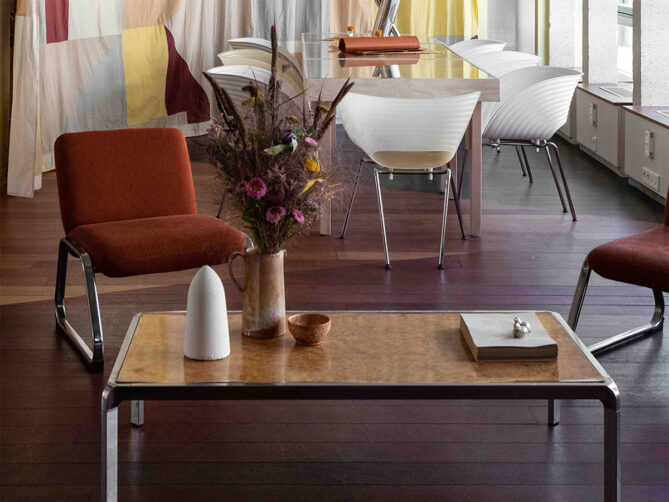
Beet combo: Parisian architect Jules Brisson has fashioned a rural oasis in the eighth arrondissement with his imaginative refurb of the offices of a trade magazine for the French sugar beet industry
Since 1952, Le Betteravier français has been the go-to French publication for the robust sugar beet industry, packed with in-depth articles illuminating economic and agronomical issues. Yet the historic trade journal’s Paris headquarters, tucked inside a 1970s building in the eighth arrondissement, was a stark, urban departure from these rural roots.
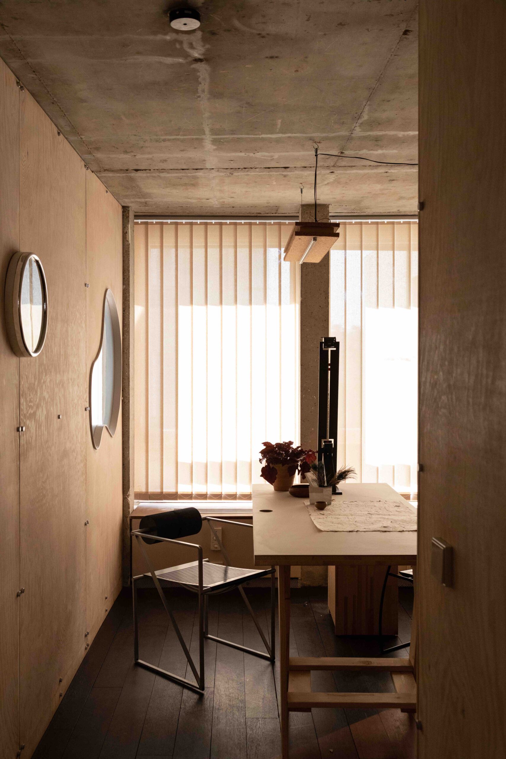
Realising it would be far more beneficial for the editorial team to work against a soothing backdrop that conjured the beet fields they were covering day after day, Le Betteravier français sought out local architect Jules Brisson to infuse the 215sq m office with a more fitting pastoral vibe.
Brisson, who is behind numerous residential commissions, firmly centred his design narrative on the sugar beet itself, with the crop’s conical form and neutral hue acting as guiding inspirations for the renovation. Sugar beets, he says, “remind me of the landscape from my childhood. My grandparents were farmers, and this project is a tribute to the agricultural world.”
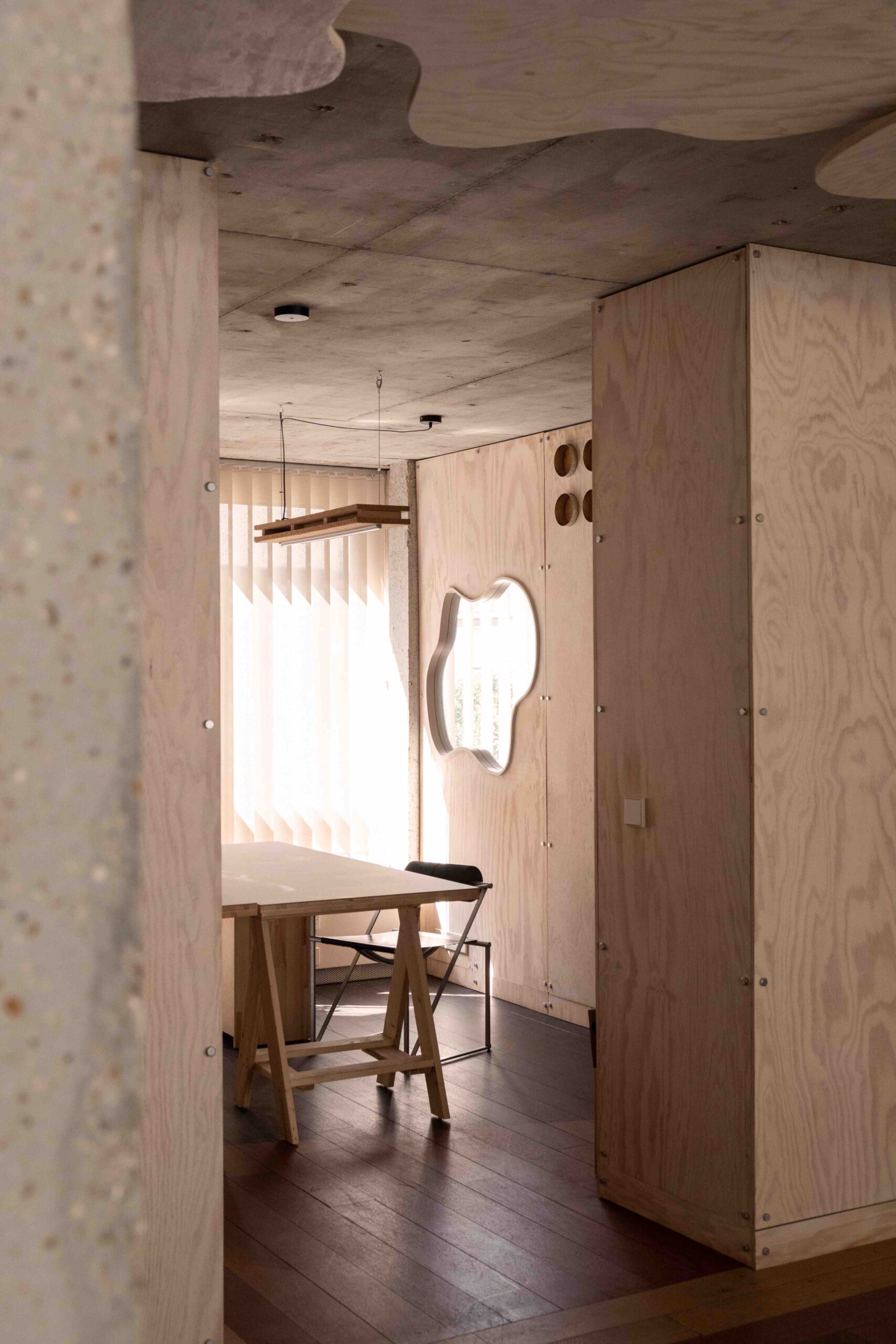
At every turn, Brisson enlivened the raw, exposed concrete structure with locally produced renewable or sustainable elements like a water-based white colourwash, cork and natural-dyed linen. Not only do they reinforce a deep connection to the land, but create earthy, dreamy vignettes that allow city life to further recede from employees’ minds.
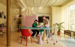
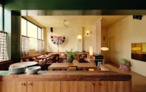
Dressing the walls, for example, are textiles emblazoned with motifs that echo the countryside while the recycled floorboards meandering throughout the space are tinted red, ochre and black to recall the fertile soil from which sugar beets are sprung. Repurposing when possible was also important to Brisson, who sourced vintage furniture for the project and incorporated objects salvaged from the original office to showcase a layered, curated sensibility, not unlike a well-worn farmhouse.
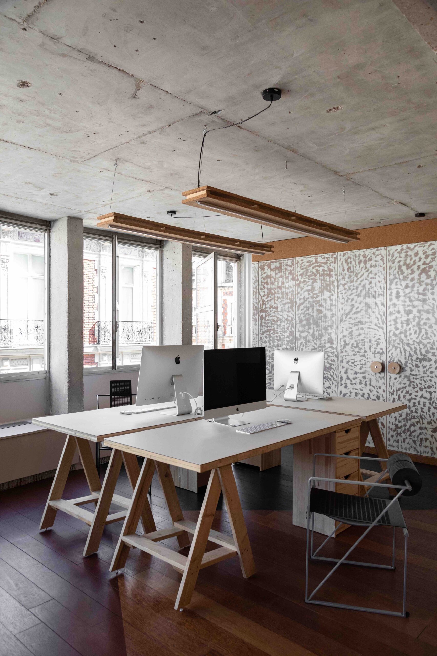
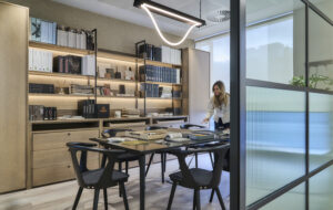
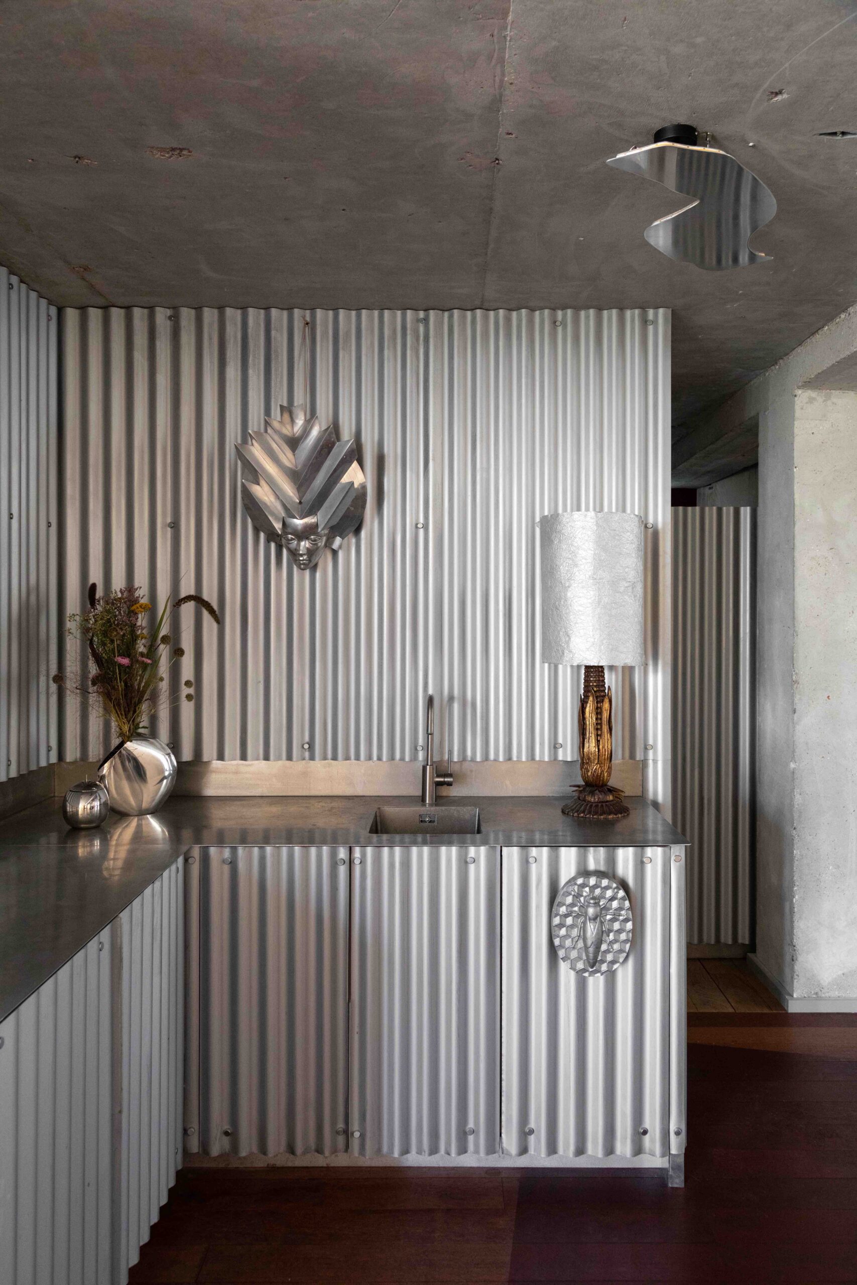
When staff are focused on writing, editing and designing they retreat to the comfortable trestle tables topped in pine and adorned with plant leather mats that are reminiscent of hardy farm workbenches. Afternoon breaks, on the other hand, unfold in the cosy tea corner. Outfitted with industrial sheet metal and armoured glass, it resembles an outbuilding found on a sprawling farm.
Expanding upon the theme are partitions that evoke waving stalks of wheat, as well as amorphous mirrors, windows, light fixtures and even cables that mimic fantastical clouds and shimmering lakes.
The washroom is yet another opportunity to celebrate the farmhouse. On the floor, Brisson united ceramic tiles in five different shades, calling to mind a patchwork rug that would add a homey touch beside a roaring hearth.
It’s a grounding workplace, with an easy-to-recognise palette. “It’s an open space that shows personality,” as Brisson describes it, “where the interior setup refers to the imaginary, to the expression of nature through shapes, colours and materials.”
Beyond the construct of this bucolic fairy tale, however, Brisson has ensured that the office is both functional and conducive to colleagues’ wellbeing. Previously, the layout featured a series of small, box-like offices leading off a corridor that was deprived of natural light. Rather than maintain these dark, enclosed lairs, the Le Betteravier français crew desired a more fluid configuration that lent itself well to spontaneous socialising and brainstorming in between the hours spent at individual workstations.
Once closed off from the outdoors, the offices, now semi-private, overlook the courtyard. Likewise, the common areas, such as the kitchen clad in galvanised and stainless steel, maximise views of Rue de Naples.
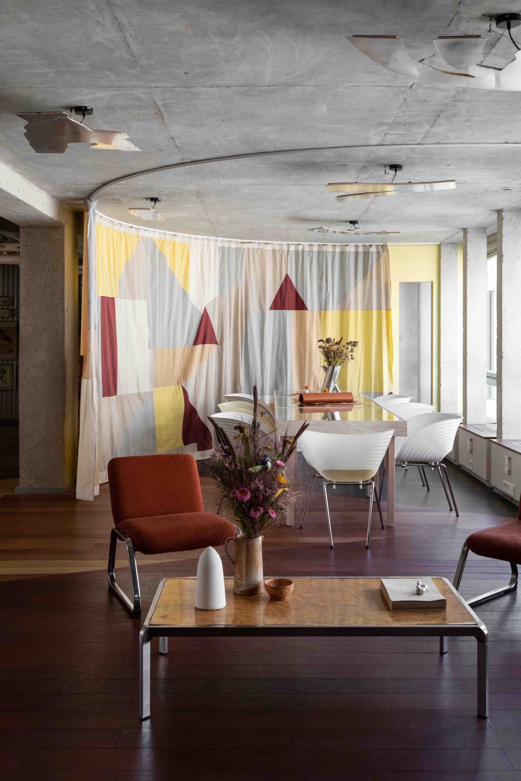
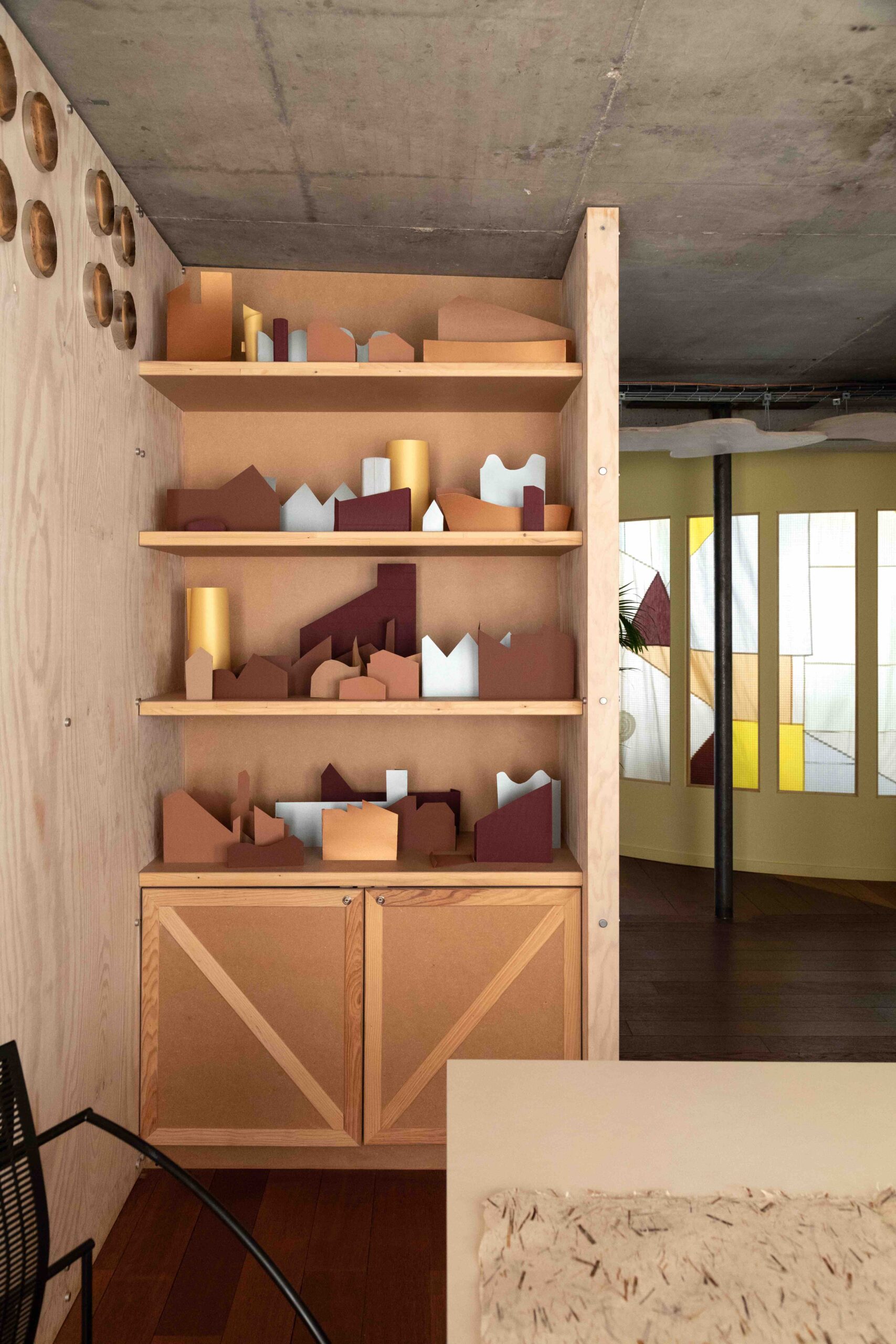
Minimising the presence of doors was key to Brisson’s accessible design plan, although two swinging barn-style ones make apt cameos. Then there’s the meeting room. A zone that is typically defined by privacy, in this office it makes innovative use of transparency by deftly weaving in a flexible curving curtain juxtaposed with armoured glass. Designed in partnership with local visual artist Albane Gayet, it is covered in a graphic pattern, a melange of triangles, squares, and rectangles in white, grey, yellow, cream and cinnamon that reinterpret the classic barn vernacular and, as Brisson adds, “looks like a painting” in the process.
For Brisson, it is the merging of place, purpose, light and “different points of view to the city”, as he puts it, that make the office of Le Betteravier français stand out. “Each piece forms a whole and the whole tells a story.”
Images by bcdf studio
As featured in OnOffice 163, Summer 2023. Read a digital version of the issue for free.


