 ||
||
San Francisco-based interior design firm Studio O+A is an integral part of the tech-workplace design story. Set up in the early 1990s, it helped spearhead the creation of urban, open-plan, collaborative workspaces to facilitate start-ups and venture firms alike.
Since then, like its original client base, it has matured – and broadened its mission. When global data company Acxiom decided to open a California office in Redwood City as a counterpart to its Arkansas HQ, Studio O+A was the natural choice to help create the new space.
The function of the West Coast office was to be slightly different from that in Arkansas. The office would be more engineering based and more research driven. There were to be less of the sales-based workforce and more developers, making new products to sell. The emphasis was on attracting engineering talent.

“Acxiom had seen work we had done and liked our approach,” explains Denise Cherry, Studio O+A’s director of design.
“The main offices in Arkansas are large, and relatively conservative. The executive group saw that we would be able to help them to break down some of the barriers they were used to, and achieve the shift in corporate culture and workplace strategy they needed for the new branch to work.”
“We have tried to build in different spaces within each floor, without the use of walls”
Acxiom was seeking something more sophisticated than the traditional Silicon Valley aesthetic, however. “At the same time as expressing enthusiasm for the future, it wanted an office space that would reflect the maturity of the firm,” Cherry says. “The client was clear it wanted a serious company office – nothing that looked juvenile, or like a playground.”

The first major difference in the California office was a 75% reduction in size in comparison to the Arkansas HQ. “To make the most of the space we reduced the allocation of personal office space and introduced a more communal approach, with a variety of workspaces; for Acxiom it is a huge departure,” she adds.
The space had formerly been occupied by Sony, which used it as an HQ in the early 90s. “It still very much carried that dated feel. It didn’t feel like a building where cutting-edge activity was going to necessarily take place,” Cherry recounts.
“To begin with it was more of an exercise in removal. It was about editing and taking things away, to give us a great, crisp and fresh starting point – and then being incredibly strategic about what we put back in.”
The project was very budget sensitive and the team had to be very considered about where it placed its design work and how it invested in materials to ensure a coherent overall finish.

The first step was to strip the whole interior back. “We ripped out the tile floors to reveal the concrete, peeled off panelling from over windows, and then put down a uniform, clean, white base coat throughout,” says Cherry. “Then we set about tempering this inherently minimal look with warm and natural materials and fabrics.”
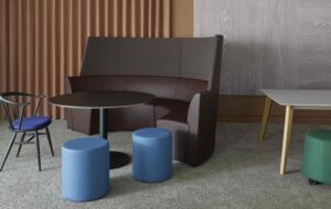
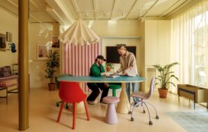
There is colour throughout, but it has been kept very tonal, with cool shades of lilac, blue and grey to communicate clarity, confidence and calm. The solid wood furniture, which has been made from white ash, has a deliberately matt finish to bring out the grain.
“We wanted to accentuate the authenticity of the materials, and to bring out the craftsmanship in the project,” Cherry explains. “We didn’t want it to look too slick and shiny, or like a veneer. It’s a workplace, and should be a place where people feel comfortable.”
The existing angular architectural features of the building were odd and challenging but also opened up opportunities and inspired key aspects of the design.
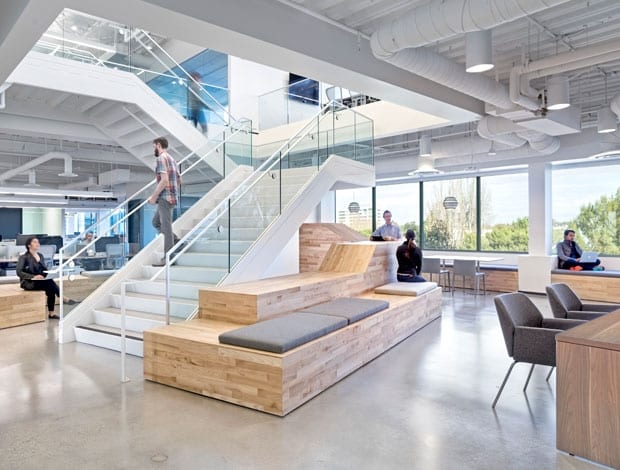
“The building needed softening,” Cherry says, “which is why the benches have material covers, for example, and why there is soft backlighting in a lot of the areas.
“We have tried to build in different spaces within each floor, without the use of walls. The change from hard flooring to carpet, or from bright to soft lighting, for example, can be a visual cue to people to change their behaviour.”
She adds: “The use of light is another way to make the office like an experience – a journey – that has been very carefully curated.”

Places to duck away, in house-like wooden pop-outs, make the most of spaces that were previously used purely for circulation, and LED lights within give them an ambient and inviting glow.
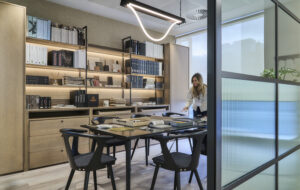
Even in the meeting rooms, solid walls are avoided in favour of glass. “It’s partly about letting natural light in, so everyone gets the sun on them while they work – but also it’s about transparency,” Cherry explains.

“It wasn’t the architecture itself that posed the greatest challenge, but getting the people who were going to work in the office spaces to see that open-plan working is not a scary thing, and to take the executive team on that journey.”
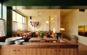
The main breakfast bar, and social gathering space, takes a central position next to the main staircase, in the middle level of the three-floor project, forcing circulation around the building.
The front desk and feature wall were made bespoke for the client, as were the wooden benches that populate communal areas.
“It’s very difficult to find something that is exactly right for the client and right for the space, which is why we chose to get key features custom-made – but we had to achieve this without creating a huge hit to the budget. These features are all created from bought wooden flooring – which comes ready finished and is less expensive to install,” says Cherry.

“We work in a very interdisciplinary way; the project managers are very design-minded and the designers are very time and cost focused. It is through this kind of strategic thinking and co-working that we managed to achieve this richness and high-end finish on a limited budget.”
When US data giant Acxiom wanted to bring about a shift in its corporate culture, it called in San Francisco’s Studio O+A to give its new California office a stripped-back aesthetic

