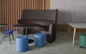
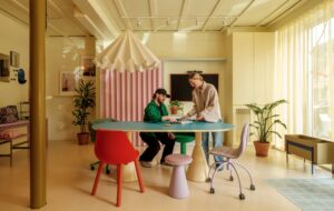
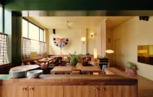
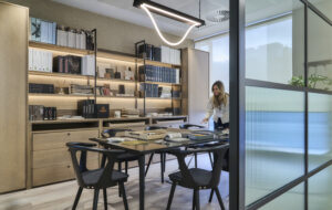
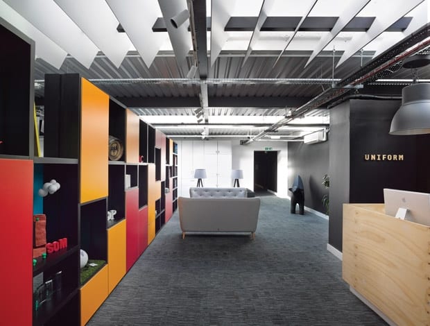
 Free-standing cupboard doors brighten up the fixed elements of the reception areas.|Bright storage with removable panels gives a glimpse in to the workspace|Top-lit studio space given a rough, textural look with OSB wall panelling|The plywood reception desk sets an informal tone for the workspace|Separated by cloakroom space, the booths are a popular spot with staff|Konstantin Grcic’s Miura stools for Plank help to up the design credentials|Mismatched dining chairs were cribbed from Uniform’s former office|The desks are arranged in two rows sitting directly under the rooflights||
Snook Architects has created a versatile and adaptable office space for Uniform to fit with the creative agency’s multi-disciplinary nature.
“There’s nothing wrong with a bit of chipboard if it’s set out in the right way,” says Snook Architects‘ Neil Dawson before we meet at the office of creative agency Uniform in Liverpool. Quite right too: who needs to spend a fortune on workplace design when a bit of ingenuity on the part of both designer and client can have results this good?
“The space naturally lends itself to a reception,” says Dawson as we enter Uniform’s home on the third floor. A storage wall here, composed of aforementioned chipboard, makes a colourful first impression.
“It gives enticing, cheeky glimpses of what they do. They often have as many as 20 projects on the go at any one time. The colour palette’s not too rigid and they can chop and change the removable panels to create these picture frames.”
There are various client-related ephemera and awards placed in the various niches here, to reinforce the strength of the brand, and on the other side, the structure functions as a library.
“We worked around quite a simple space – they needed something fluid, as they’re free spirits”
The other immediate point of interest when visitors enter the space is the flip dot animation display – the kind you get on old messaging boards in train stations – behind the plywood-clad reception desk. It has been coded by Uniform’s boffins to give a satisfyingly analogue shuffle sound in order to switch from displaying the time and date, Twitter updates or even an image from a webcam.
“It’s representing digital media in a slightly different, unusual way,” explains Dawson. There’s also a version of the Superlambanana sculpture: originally designed by Japanese artist Taro Chiezo, this strange beast – half lamb, half banana – represents the trade between Liverpool and the Americas (the original 5m-tall yellow version sits on Tithebarn Street).
Eagle eyes may have spotted that the mismatched buttons on the sofas in reception are echoed in the seating in the booths at the far end of this side of the office. The booths, which have cloakroom space with colourful coat hooks space nestled between them, have proved one of the most popular parts of the workplace.
They answer the part of the brief that called for quiet places to work – other than that, says Nick Bentley, one of Uniform’s directors, the emphasis was on coherent expansion: “We were growing and needed more space, more meeting areas, some workshop space and also a communal kitchen area.”
Dawson adds: “We worked around what was quite a simple space. They needed something fluid, as they are completely free spirits.”
The office’s former use was as a storeroom for furniture in a late-1950s building, with retail spaces below. It is located on one of Liverpool’s coolest streets, just a stone’s throw away from the Foundation for Art and Creative Technology (FACT) cultural hub, and in the midst of boutiques, record stores, the odd designer furniture shop, and enough socialising venues to make it a trendy barfly’s paradise.
The agency has five different areas of expertise including architectural visualisation – producing the kind of glossy images without which property developers would be lost. Then there’s the film and animation department, the guys responsible for design and branding, a research strategy and insight team, and the digital and experiential department (they came up with the flip dot display).
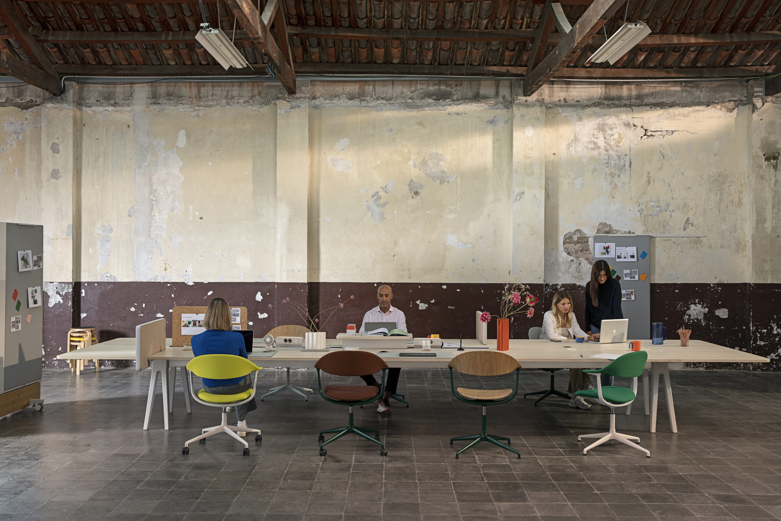
The dining table and refectory areas offer up the opportunity for the various team members to interact in relaxed circumstances. There’s also room for a projector and to hold team meetings detailing the activity to be carried out that week.
Having such a wide cross-section of creative skills at its disposal also helped Snook solve one of this workplace’s design problems. A series of roof lanterns provided plenty of daylight but there were issues with solar gain – it would have been an uncomfortable place to work, and the fact that excess glare on computer screens, where accurate colour and detail are essential to the job, was hardly ideal either.
“It’s representing digital media in a slightly different, unusual way”
Having done some research into the optimum angles and distances, Uniform and Snook decided upon a series of large internal louvres, “so nobody gets the sun on their face or on their screen,” explains Bentley. Additional lighting is mostly provided via desk lamps.
Much of the furniture was taken from Uniform’s old offices with some expertly mismatched recycled chairs in the dining area, combined with a couple of pieces from the nation’s favourite Swedish superstore. Snook also dropped some designer style into the mix, with Plumen lighting and Plank’s Miura stools, designed by Konstantin Grcic, in a breakout area, facing a series of frameless Anthony Burrill prints.
“In a sense, it’s more of a studio than an office,” says Dawson, and this is certainly borne out by the space reserved for photography shoots or the workshop area, complete with its own 3D printer and space to tinker away with model making or prototyping. The project room is where groups of up to half a dozen people can busy themselves on specific bits of brainstorming.
Movable screens with whiteboard on one side and cork on the other help the creative juices flow. A main meeting room has the option to hang and clip on display boxes, yet another low-cost solution to dress the room for presentations or provide inspiration.
“They are constantly putting stuff up and ripping it down,” says Dawson. “Nothing is that precious.”


