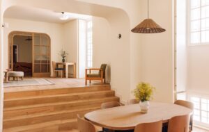
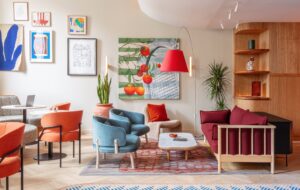
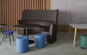
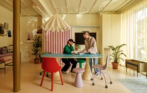
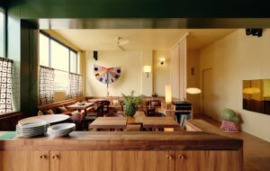
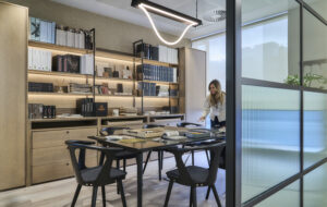
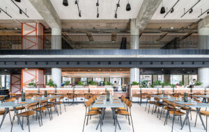
 Fabric, laminated between the glass panes, adds privacy|Glass stair treads help throw the light from top to bottom|Channel lighting cleanly delineates the atrium boundary|Oak joinery unites the various spaces across the whole office|Moroso’s patchwork Joy stools lend a non-corporate exuberance|Oak detailing makes the cafe/lounge area feel more intimate|Moroso’s Field sofa; furniture was all procured by Publicis|Publicis’ lion logo pops up in some unexpected places|Steel windows are sympathetic replacements|A streamlined white kitchen blends in with the wider office||
Comms giant Publicis has moved into a remodelled Baker Street building, a cordial union of three separate spaces
When Lazari Investments commissioned Forme UK to redesign a Baker Street building, the developer’s brief was to connect three separate buildings into a cohesive space, create as many rentable office spaces as possible and improve energy efficiency.
The original structures included the former Marks and Spencer HQ built in 1904 and designed by Robert Lutyens, as well as two further wings. Forme UK introduced a new glass atrium with an interconnecting glass staircase in the middle of what was formerly the original service yard, which would become the internal focus of the whole building.
“The building didn’t really have a heart to it or central activity,” says Mark Twigg, director at Forme UK. “We decided to make this a much more exciting space and give it the heart that the building needed; that’s why we came up with the idea of reusing the courtyard.”
Forme UK partnered up with Marks Barfield Architects to develop the concept and the atrium was built to link the three buildings, as well as to add in additional floorspace and act as the social heart of 82 Baker Street.
The frameless atrium was constructed using a double-glazed laminated glass that allowed natural light to flood into the offices. Because the atrium is quite close to residential units, the glass has a slightly opaque ‘veil’ – a fabric sandwiched between the panes of glass – to give it an element of privacy. Internally, it creates a shaft of sunlight that descends into the centre of the building and marks out the atrium as its focal point.
“The atrium design had to act as a central interactive hub for the building,” said Ian Rudolph, director of Marks Barfield. “[Before] people could have worked on different floors and not interacted with one another so we removed some of the walls around the courtyard and opened it up.”
When the atrium stairs were added, one of the challenges was not to lose the transparency and lightness of that glass skin. The staircase was designed to look equally ephemeral, so open glass treads were specified to give a feeling of lightness.
During the building’s extensive refurbishment, advertising agency Publicis signed back on as tenants. The company was returning to 82 Baker Street, having previously moved out to allow the works to happen. However, it had grown since it was first housed there and would now be occupying the second to sixth floors. The agency brought in some ideas on how to make the space jive with its branding, and Forme UK and Marks Barfield worked to develop these ideas further.
“The main concept in the reception was make it feel like the advertising agency had taken over this corporate identity and enveloped itself inside it,” says Twigg.
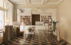
Accordingly, in reception, there were some natural materials juxtaposed with quite corporate ones. Alba Perla stone is paired with a stressed oak panelling system that wraps itself around the core. The panelling is continued throughout the ground floor and is evident in each of the office floors and in the conference suite on the sixth floor.
“In the main reception you can see the corporate appearance of stone on the floor and some of the walls, which then dovetails with the more rustic and timber approach and anti-corporate feel that Publicis has,” says Rudolph.
The reception area also features a specially commissioned work by surface design specialist Giles Miller, who recreated the Publicis lion using 12,000 bronze angled ‘pegs’ that were individually crafted. The lion logo is subtly peppered around the office in unexpected places – carved into the joinery and across the tea points, for example.
While the lion motif represented the principal approach to corporate branding, Publicis also needed to account for the series of sub-brands within the office, each of which had its own distinct identity. A flexible interior space was designed so each section could create its own aesthetics.
“The brand for each team was [expressed] through the furniture; the spaces were all pretty much the same throughout the actual office spaces,” says Twigg. “We provided a canvas to let the brands evolve.”
Off to one side of the reception is a client entertaining area, which includes a canteen, a kitchen and breakout spaces. There’s also a cafe area that transforms into a bar, with DJ points for social activities and client entertaining.
On the lower ground floor, six brainstorming rooms were added, as was a graphics room, additional client meeting space and a recording studio for voiceover work. Prior to the refurbishment, the lower ground floor lacked natural lighting, so to combat that, a large slab was cut through the floor at reception to allow daylight into the rooms below.
A biodiverse roof and roof terrace has also been added, to create some additional social and entertaining space. The roof garden features a wildflower meadow that has been planted with 24 native species, specially chosen for their wildlife-friendly properties as well as their
low maintenance.
The roof terraces can be accessed at various points in the building, including the new presentation
suites that are sited on the sixth floor.
“When you’re standing on the terrace, you see the biodiverse roof on almost all sides,” says Rudolph. “The views are of Baker Street one way and the West End the other way. It’s quite unusual to feel like you’re surrounded by a meadow in such an urban environment.”


