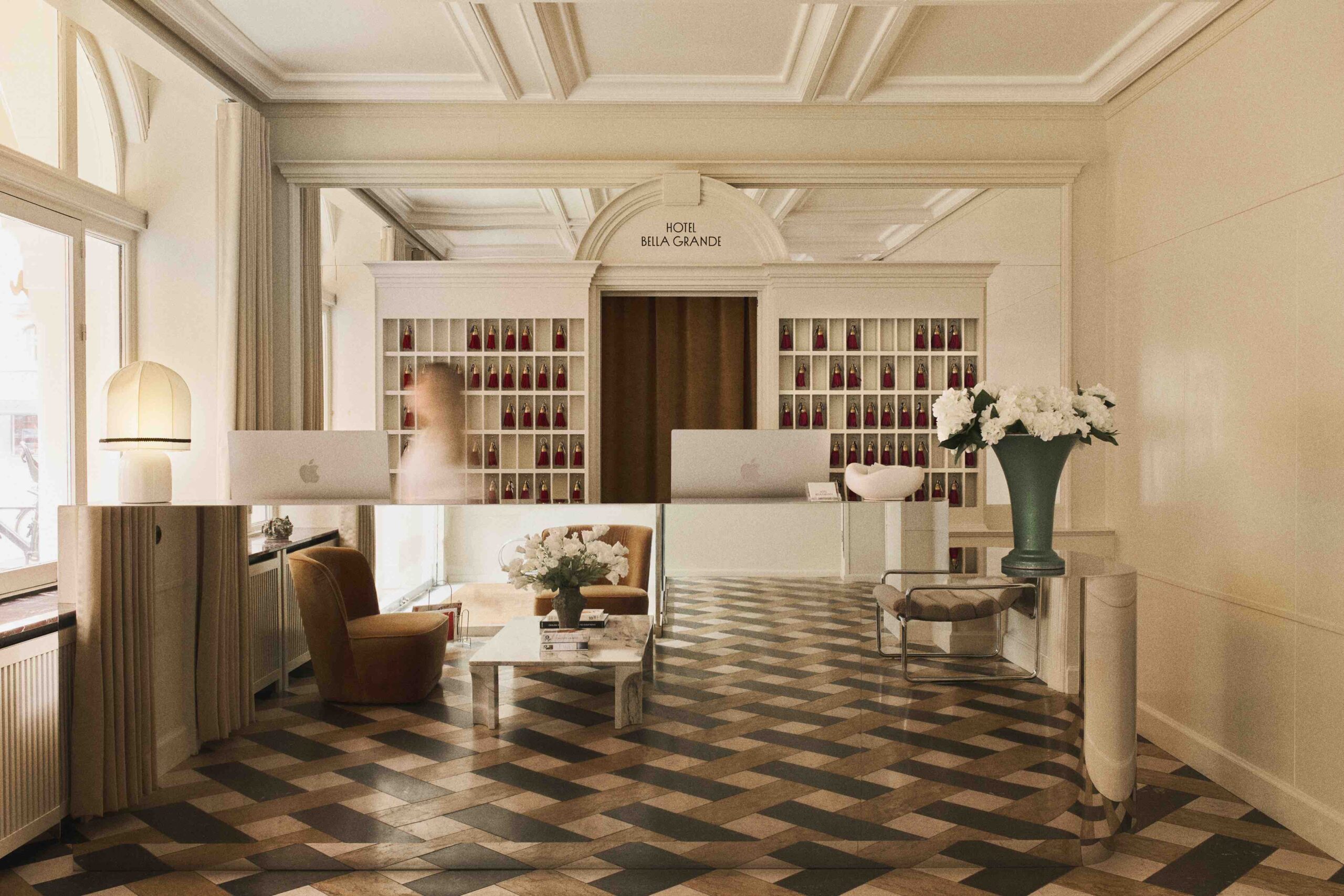
 Vast proportions in the lounge make for a dramatic setting|The design plays off the building’s history giving eccentric twists to traditional features|We designed our plasterwork but made it enormous|Prowling leopards and jumbo plasterwork in the reception corridor|The restaurant incorporates emerald-green upholstery with materials such as wood, brick and white panelling|A glass-enclosed fireplace links the lounge to the courtyard|The colour scheme is a modern take on historical palettes||Restful bedrooms temper the exuberant common areas|Hotel Zoo is based around the corner from the Berlin Zoo|||
Powerstrip Studio’s Dayna Lee and Ted Berner used to be movie designers before they switched to interiors: hence the opulent theatricality of their fit out for Berlin’s Hotel Zoo
“It’s designed to be like a home, but with a little bit more,” says Powerstrip Studio‘s Dayna Lee of her design for Berlin’s Hotel Zoo. But that’s an understatement: the renovation plays off the building’s history as a private residence (built in 1891), giving eccentric twists to traditional features. For instance, the fireplace is transparent and the ceiling roses are vastly oversized. This is all in the spirit of surreal, almost fantastical escapism.
“We drove around Charlottenburg [the hotel’s West Berlin neighbourhood] and I would look inside people’s homes when they opened their doors,” says Lee, “and the first thing I’d see is all the plasterwork. So we designed our own plasterwork but made it enormous. We love great proportions; we feel they send you to a different place.”
The historic building, on the well- known street of Kurfürstendamm, round the corner from Berlin Zoo, has been given an opulent but contemporary new interior, beginning aptly with a large, double-height glass-infilled stone entrance. This leads to a dramatic internal passageway, where an emerald-green catwalk-like runner adorned with crawling leopards leads visitors to the reception desk.
Created by fashion designer Diane von Fürstenberg, the runner is perfect for the space, fitting in with the hotel’s name and its quirky personality. Lee says she was attracted by the leopards’ wild look: “They are moving animals, not captured trophy animals brought back; they’re animated.”
Powerstrip Studio’s exaggerated plasterwork looms overhead, and is combined with exposed brick and white panelled walls, dark wood floors and clusters of potted plants, giving a colonial feel.
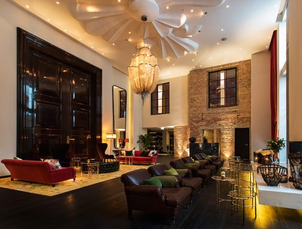
The lounge – called Living Room, riffing on the domestic feel – is home to a two-tonne lily-shaped ceiling moulding, a giant chandelier by Terzani, 7m-high industrial windows framed with red velvet curtains, and huge black lacquered doors. These theatrical environs are telling: Lee and her business partner (and husband) Ted Berner previously worked as designers on feature films, which is why Lee says they based room layouts on sightlines and lighting.
So the glass-enclosed fireplace creates an alternative view from the Living Room to an enclosed courtyard garden, and vice versa, and the garden also acts as a lightwell for this and other spaces, such as the hotel’s restaurant, Grace.
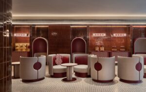
The interiors follow the concept of mixing traditional glamour with modern design. In the Living Room, sofas and armchairs by George Smith, Baxter and Tom Dixon are upholstered in plum or red velvet, or aubergine-brown leather, with walnut floors and clean white walls. “The colours are old but fresh… a modern take on palettes from the turn of the century,” says Lee.
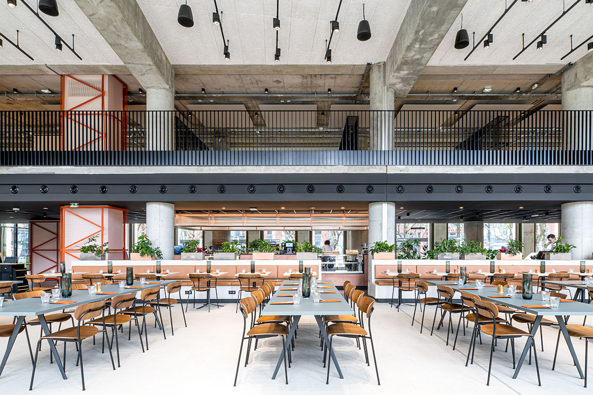
The restaurant uses emerald-green upholstery teamed with the same wood floors, white panelled and brick walls (“to play with relief and shadow”) and statement industrial-theme lighting.
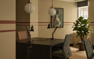
The 145 guest rooms vary in size and shape, with some located behind the historical facade and others in a new glass-box extension, so standardisation wasn’t an option. Each was designed individually with an underlying “townhouse feel”, using neutral colours on the upholstery and linen, walnut cabinetry and a punch of colour on the curtains, specified in orange, green and plum.
The rooms, therefore, seem non-generic, something that can be said of the whole project. Lee sees this as a silver lining to the dark cloud of project delays: due to hold-ups with planning, the refurbishment took eight years, during which the couple spent so much time in Berlin that the interiors gradually evolved alongside their understanding of the city’s culture.
“I think the absorption of Berlin was almost like a maturing process,” says Lee. “We let go of early ideas and touristic cliches, so the project was able to mature.”

