 Photography by Sarah Cresswell|||
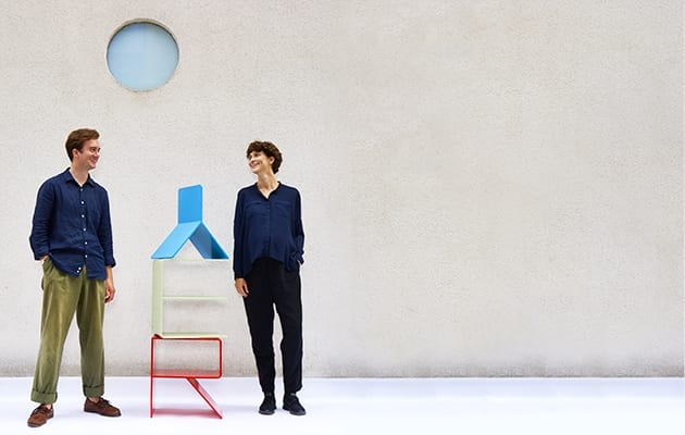
Design practice Kellenberger-White’s functional outdoor seating Alphabet is set to be one of the hits of this year’s London Design Festival, with the brightly coloured aluminium lettering placed across Finsbury Avenue Square in Broadgate and left for the public to interpret. A primary school Scrabble set for people to lunch on, lounge in and arrange into their own words – this piece of simple design quietly shows off years of practical learning.
Eva Kellenberger and Sebastian White, who met at the Royal College of Art in London, have become known for their use of typography in graphic design, so it makes perfect sense that their most high-profile 3D design project since founding the practice in 2009 should be based on lettering and partly inspired by paper. Prototypes for the lettering sit atop shelves in their top-floor Shoreditch studio; imagined in paper and glue, their naive form belies the in-depth knowledge that has gone into each one.

“For the last year and a half we’ve been doing more furniture-making projects, where we’ve had the opportunity to make temporary furniture for exhibitions,” says White. “The process of making is becoming more familiar.” One such project was a commission to work with Turner Prize-winning artist Elizabeth Price at the Natural History Museum in Berlin, with the folded paper of their information leaflet and the folded aluminium of stools eventually providing a prototype for Alphabet’s finished look.
“She asked us to design a concertina leaflet,” says Kellenberger. “We thought: how can you make furniture that is folded too, in aluminium rather than paper? So, we looked at the Ulm stool, which was developed by Max Bill for the Ulm School in 1955.” Each student had to make their own, which they would carry to class. This revolutionary-yet-simple piece of design was used to teach students basic woodworking skills, but it also instilled a taste for the practical, which the pair have adopted.

In the world of print design, they learned that following a project from laptop to bookshelf was the surest way to stay ahead of problems and develop their craft. Educating themselves about ink, paper, trims and print means that they are in control of the whole process, where others are happy to press “send” and wait for a courier to arrive at the office with the results.
Alphabet allowed the pair to maintain this hands-on approach, as Broadgate is just a five-minute walk from the Kellenberger–White studio, which employs two permanent staff alongside its founders. Field trips to the site were as simple as wandering out to one of the area’s numerous coffee outlets. It also means that lunchtime visits to see how the public interact with Alphabet may be hard to resist. “I quite like how we could change someone’s lunchtime,” says Kellenberger. “People might spell something out, or make a new letter as they sit down. There are so many opportunities for interaction.”

The practical part of the design for Alphabet was partly inspired by architect SOM’s 1990 bridge-building hybrid Exchange House on Broadgate. The ten-storey office block was built around an exposed steel bridge, showing off its practical bone structure. The bridge also harks back to a project the studio is undertaking in Middlesbrough, using the colours from the famous Transporter Bridge in a branding and identity project for Middlesbrough Institute of Modern Art, and tracing flakes of ancient paint back to their industrial palettes. Indeed the Transporter bridge’s vivid Cornflower Blue also makes its way into Kellenberger-White’s Alphabet letters, which demonstrate a variety of paint colours chosen because of their use in industrial metalwork.
But the seating itself draws on much of what makes the pair tick. As well as the Ulm stool, it reflects on their own learning as makers, as well as the work of sculptor Bruce McLean and designer Bruno Munari. Both are huge fans of Munari’s work. “There is a project we really like by Munari, Seeking Comfort in an Uncomfortable Chair,” says Kellenberger. “It’s a playful comment on modern furniture. We also looked at McLean’s ironic pieces with a reclining figure on a plinth. We were also inspired by the Bauhaus metal workshop from the 1920s.”
Zurich-born Kellenberger and Bristol-born White come from quite different backgrounds. Kellenberger was brought up next door to Ulm stool designer Bill and was drawn into a design background, whereas White grew up painting with family and was eventually drawn to textiles.

Humour and playfulness has always been important to the pair and it was this common language that sealed their friendship in 2008, when they teamed up for a student project. Mooted as a glance at their future final show, the pair decided to base it on potatoes.
“We found out it was the year of the potato,” says White, at which point one of the studio staff stops work and turns around with a quizzical look, before laughing. “We made an animation of a potato. Everything was black. But you could see everything, like in an eclipse. There was also a solar eclipse that year.”
As they worked together so well, they both started to think about what life post-college may look like, drawing up lists of dream clients and eventually formalising the practice as a company. “I try to compare our studio with other relationships or conversations that you have with other people,” says White. “We don’t always agree with each other, but the conversation is always moving forward. We talk, we go on visits and field trips, we still surprise each other. I think our backgrounds and knowledge are a bit different, so we talk about a book we’ve read, a scene in a film or the element of a design project.”
These differences are certainly something that Kellenberger-White celebrates, although the lines are more blurred than at first. “I think in the beginning it was more clear-cut,” says Kellenberger. “He couldn’t use InDesign because he was a textile designer, and I didn’t have any colour theory. So we taught each other.”

Constant collaboration with other creatives, institutions and clients ensures that the learning continues, as well as the inspiration that minor differences can provide. Although Kellenberger-White like to offer as much inspiration as they take.“We’ve found it’s really useful to make that conversation public,” says White. “We might have a presentation showing our influences, which is more than a mood board, it’s a series of moments or artefacts that are connected to the client, area or place. We try to make that useful for everyone involved in a project.” This method ensures that everyone is learning on the job, with architects or artists welcome to learn the processes that the studio uses too.
“I think we’re just trying to constantly learn from the other disciplines and bring that into it,” says Kellenberger. “For example, for an exhibition that we designed at the Tate Liverpool, we worked with a sign painter who would paint all the graphics straight on to the wall, but the way he divided the space up, the rules, was very much like we’d divide up a page in a book. We do think of graphic design in quite a spatial way.”
With a new branding and identity commission for Goldsmiths CCA – the new centre for contemporary art that opens in south London this autumn – the practice will continue this approach, with typefaces based on visits to the converted Victorian swimming pool that will house new studios.

With the studio running at full tilt, the question of what comes next could well be answered by pointing to the back of a large queue, but the pair definitely have ambition, as well as a taste for surprises. “We say things like, ‘Oh it would be great to do an airport wayfinding system’,” says White. “Or we’d like to create a piece of public furniture that can be used across the country, but it seems so abstract. We’ve talked about doing a playground.”
What about office design? “We’ve always liked Vitra,” says White. “We’ve got lots of their books and old catalogues. All these real projects, and assembly halls with 3,000 chairs. These publications are design projects in themselves.”
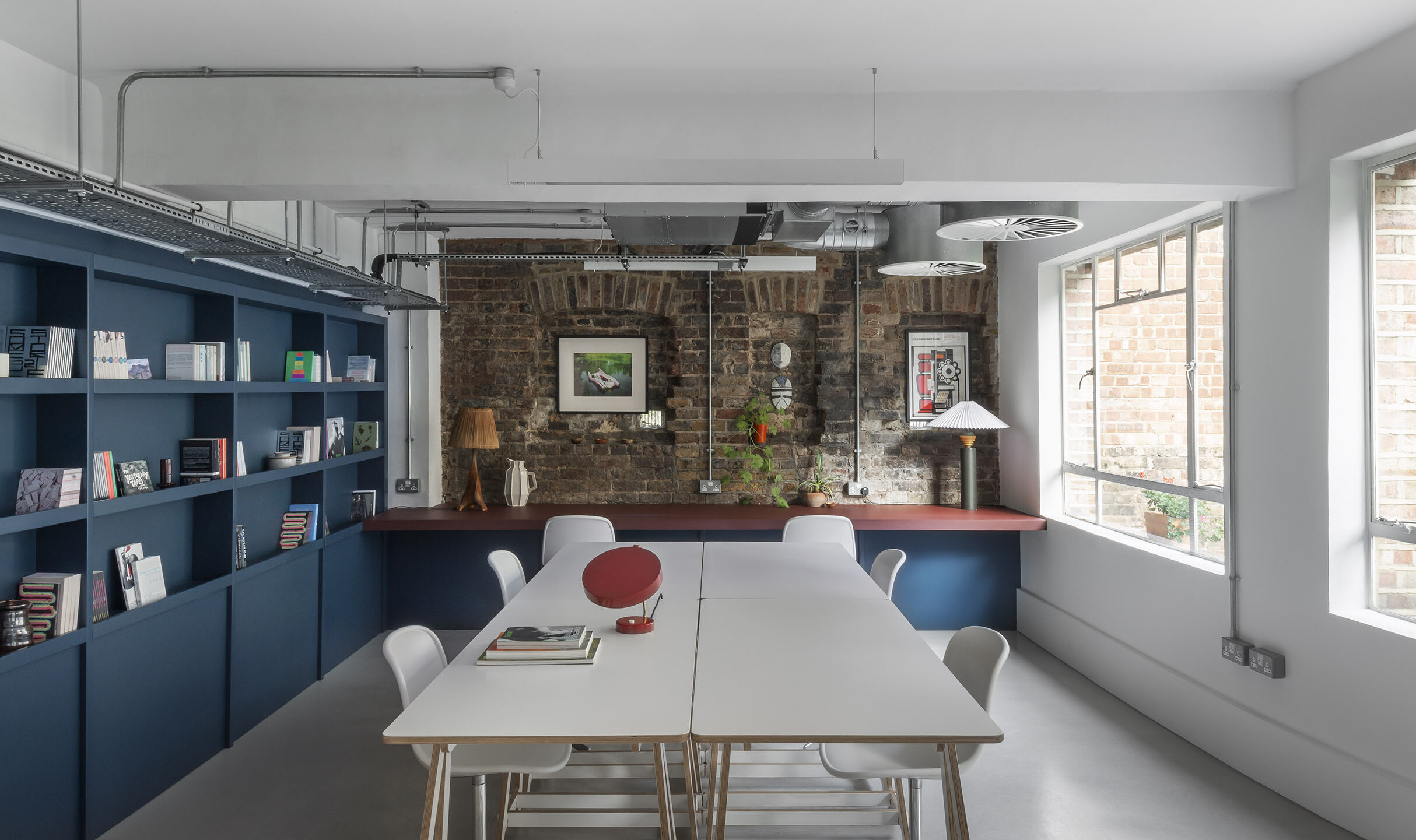
Kellenberger–White’s own studio was designed by friends Faudet-Harrison as a skills swap of graphic and web design for furniture and styling, although the boardroom table we chat around is Swiss shuttering board that was driven to the UK by Kellenberger’s mother, before being turned into a table by Felix de Pass.
The bright green splashes of colour are the pair’s own touch, using Porsche Frog Green after being inspired by an article about the colours of the 911 model. “Not that we can afford one,” says White.
This may well be the case for now. But with their profile and workload, it won’t be long before both partners in Kellenberger–White can. Or, even better, before Porsche approaches the studio for new graphics, factory wayfinding or even office design for a new HQ.
Kellenberger–White’s Alphabet is set to draw a crowd at this year’s London Design Festival. OnOffice visited the studio to find out more

