 |||
|||
This is a place where people draw on the walls and sit in corners. But rather than being a nursery environment, it’s a grown-up office hoping to help its inhabitants and their clients imagine the future.
Fjord London was bursting at the seams at its Fitzrovia address: two Georgian terraces knocked together to form 500sq m. And, with its lease coming up, it was time for the design and innovation consultancy to relocate. When its parent company Accenture bought Karmarama in 2016, it was noted that there was an office in the independent creative agency’s Farringdon building that would suit Fjord.
The third floor, which is a split-level floorplate, is double the size of Fjord’s previous home. But size isn’t everything, and the existing 1980s-style interior left a lot to be desired. “It had basic carpets and lights, a low ceiling, and was completely open plan,” says interior designer Jenny Jones, “and the narrow staircase between floors created a bottleneck.”
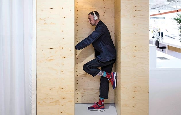
 A smart sodium lamp renders things in black and white
Jones, who had worked with Rem Koolhaas and Richard Rogers, and was most recently on the board at Conran & Partners, set up her practice four years ago. Fjord appointed Studio Jenny Jones having built up a relationship with its founder over breakfast. After doing a breakfast talk at Fjord, Jones was asked to explore how the Fitzrovia office could be improved. When Fjord later decided to move, it took Jones and the insight she’d gathered. Just 11 months lapsed between the appointment of Jones’ eight-strong project team and completion, so her earlier involvement saved the project time.
Fjord, which designs digital products and services for clients including Finnair and Unilever, is a network of 27 offices worldwide. To soak up its corporate atmosphere, Jones took field trips to three outposts: Berlin, Stockholm and Helsinski. “We looked at how the project spaces were working,” she says. “They ran the full gamut from fully open plan to rooms.”
Fjord London’s studio lead, Celia Romaniuk, explains her priorities for the new space: “For us, the real focus was less about the materials and more about how the space would work for the 100-strong team.”
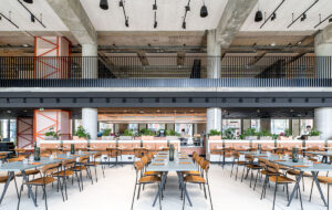
 The Marketplace area looks on to Farringdon Road
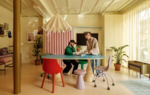
Jones’ instinct was “to keep it open plan, after the cellular rooms in Fitzrovia. But we soon realised we needed walls and corners”. The designers wanted to create acoustic and visual separations to aid and inspire staff.
Like every ideas-based business, this one is seen to need a plethora of different zones for “activity-based working”. But the days of the easy, playful cues of beanbags, slide-stairs and vintage-vehicles-as-meeting-rooms are behind us. And, perhaps because this is Jones’ first workplace client, certain cliches were avoided.
Through her research at the Fitzrovia office, Jones identified three types of work: project teamwork carried out at monitors or on walls; getting together, from quick one-to-one catch-ups to organised meetings; and touch-down working, meaning grabbing a space and working at a laptop.
 Houseplants in clay pots made by the staff act as a divide
Jones’ solution was to introduce variety through curtains and walls, “nooks you can dive into”, and discretely designed rooms – a layout that has seen the number of corners rise from 14 to 88. She took inspiration from Make Space: How to Set the Stage for Creative Collaboration by Scott Doorley and Scott Witthoft of the Hasso Plattner Institute of Design at Stanford University. The book attempts to show how space can be intentionally manipulated to ignite creativity.
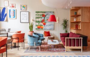
Fjord’s front door opens on to the client-facing floor, starting with an entrance area with seating near the window, which looks on to Farringdon Road. A long white counter doubles as a reception desk and bar for events. Potted plants abound and are a theme throughout the office, having been selected by “botanical stylist” RoCo. As well as the health benefits, the plants create a wall between the entrance area and the breakout space behind. Jones put down a cork floor “because it’s natural and it fitted with the idea of the earthing of the plants”.
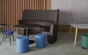
This big space gives on to the Marketplace. It’s normally set up with Okidoki foldable desks on wheels, and Vitra’s Tip Ton chairs for informal meetings and work. But it can be cordoned off by a retractable wall that is half glass and half solid, so that it can be drawn on.
 A wide “slow stair” gives staff more space to interact
To the right of the marketplace is a project room that can be given some privacy by drawing an off-white Kvadrat drape. As well as a meeting room with one wall painted bone china blue and linoleum on the floor, this floor houses a lockable client room.
Now, instead of the narrow staircase, a wider and deeper “slow stair”, is meant to foster chance encounters. The steps lead down half a level to the staff kitchen and dining area, and more project rooms. This floor is dual aspect, and by putting the kitchen and some enclosed spaces in the centre, Jones has created a circular route around it.
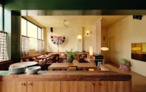
“The idea is that the gardens link through shared spaces,” says Jones. However, there wasn’t the budget to make the kitchen area green. So instead Jones “made the Fjordians the gardeners” by bringing in ceramicist Stephanie Buttle. She ran a clay workshop where staff made their own plant pots. This activity was intended “as a segue to move into the new space”, Jones adds. Each staff member was given a houseplant, and these sit in their owners’ pots on an open-framework shelving and act as a divide between the kitchen and the workspaces. In front of the kitchen is a set of bleacher seating, and a mini-platform for a set of DJ decks.
 Services and the exposed soffit have been painted white
Jones also drew inspiration from art. Among the smaller rooms is one that’s standing-only and has handrails along two walls. The walls are wipeable for idea-generation, but the innovation is in the lighting. A sodium lamp gives the room a very low colour rendering, so occupants see things in black and white. The intention, says Jones, is to help people “see things differently”. She got the idea from visiting an exhibition in 2007 in San Francisco. There, Olafur Eliasson’s Room For One Colour was on show. Serendipitously, the piece arrived at London’s National Gallery when the office was on site, and she took the contractor to see it.
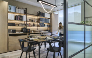
Other one-off rooms are a larch-panelled one, reminiscent of a sauna, and the library – a dark blue room with a banquette long enough and wide enough to double as a day bed.
Jones tackled the low ceilings by raising the level of the lighting, and painting the whole lot, including all services and the exposed soffit, white. “Getting rid of all that silver has made the ceiling feel less oppressive,” she adds.
 A white counter doubles as a reception desk and bar for events
On the day of OnOffice’s visit there are people scattered throughout the spaces, but it certainly doesn’t feel as if they’re all in the office. Despite their nomadic nature, Jones admits that “there was a tension between the number of fixed workstations [and hotdesks]”.
Romaniuk adds: “We don’t have the space for everyone to have their own fixed desk,” and the number settled on was 68. This is regarded as an improvement on Fitzrovia, where “we were often two to a desk”, she adds.
Studio Jenny Jones, which is exhibiting at this year’s Venice Biennale, has made a tricky floorplate work hard. And with the functional layout and light touch, has created a work environment which should see Fjord into the future.
Jenny Jones Studio’s office for Fjord London breaks with the clichés of open plan to offer a plethora of nooks and corners for private work

