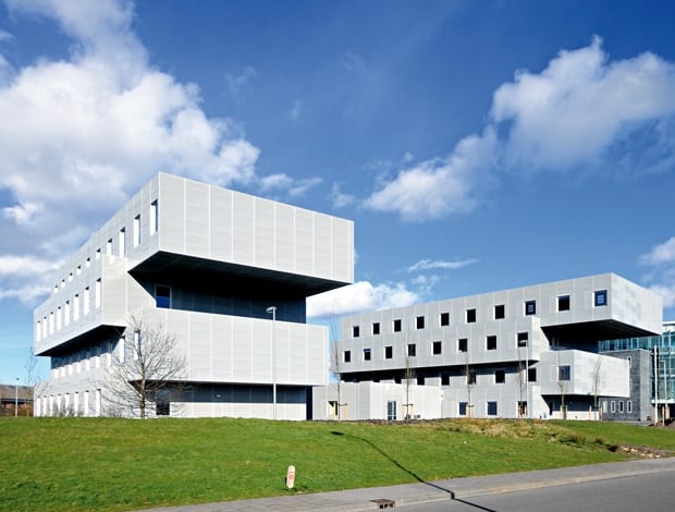
 Yushi Uehara’s Shaken Office scheme, designed in 2001, was only completed this year due to changes in the property market|Innovation within the rigidity of modernism|The interior is configured to maximise the floor space available to the companies that occupy it|Despite having different exterior shapes, the geometry of the two buildings is complementary, and the interior floor plans are identical||
Concern for the user and a building the viewer will look beyond rather than at, inspired Zerodegree’s Shaken Office development in Groningen
Yushi Uehara has a manifesto with three main statements: firstly that architecture should be a logical construction to materialise the experience of the user’s activities; secondly that shocking colours change little – to make an impact you need to scrutinise the form; and thirdly, he pursues architecture that is the built equivalent of blue jeans. Got it?
Luckily his buildings are a lot clearer to read. Monolithic, cantilevered structures, such as his latest office building, Shaken Office in Groningen, conclusively echo functionalist designs.
The Japan-born architect, whose studio Zerodegree is based in Amsterdam, has worked for and with many of the world’s leading architects over the course of his career, including Rem Koolhaas, Daniel Libeskind and Toyo Ito.
And while Uehara holds high admiration for Koolhaas’ style, for instance, he is determined to develop his own philosophy. On a quest to overcome the “lack of authenticity” he sees in postmodernist architecture, Uehara started shaping a concept almost a decade ago that he has since labelled “super-functionalism”. And Shaken Office is the perfect example, a visual manifestation of his approach.
In 2001, Zerodegree designed an office that followed the modernist blueprint, with its stacked form following the function of a multi-tenant office space that was to house both lab facilities and small office segments for two-to-three people. Groningen is home to many small pharmaceutical and medical off-shoots and Uehara set out to create a future workplace for them.
This initial commission fell victim to the crash of the Dutch office market in the aftermath of 9/11, and it wasn’t until 2009 that the UK-based office provider Regus reactivated the brief, and the construction of the original designs was completed early this year.
“The client wanted a space that could be changed within 15 minutes,” Uehara explains. “The aim – to maximise floor space for either two or three-people clusters – became the purpose of the different depths in floor plates, which visually translate into the cantilevered exterior.”
As a result, the two building blocks have transposed floor plates stacked on top of each other, identical grey facades and interior floor plans, despite having different outer shapes.
“Experience for the user is central to the next generation of architecture”
What makes this office ‘super’-functionalist is Zerodegree’s focus on the user experience of the space.
“Experience for the user is central to the next generation of architecture,” Uehara preaches with full conviction. “Mostly the experience of a building is associated with the interior, but for me it’s about walking around the building, passing in front of it, driving past it on the nearby highway.” The notion of the public realm is the key to his office architecture.
While the building looks like a concrete monolith from afar, the facade is actually a composition of perforated metal sheets.
These steel panels with 5mm holes create a translucent skin which you can see through from the inside. The panels are mounted onto a corrugated steel frame that remains invisible.
True to its functionalist fathers the shapes are uniform, with no unneccessary ornaments. But Uehara shares the postmodernist viewpoint that traditional functionalist buildings are often cold and soulless, as they are all about the object and not concerned with the subject – in other words, the users.
“My architecture is like blue jeans!” he exclaims.
To understand this somewhat contrived metaphor we must delve into Uehara’s world of bottom-up and top-down architecture.
“In the past, bottom-up architecture was common in domestic regional builds, while top-down, fascist architecture was a more abstract statement,” he explains. “My design gives the bottom-up approach an abstract element, a voice. It’s similar to certain genres in music which don’t subjugate themselves to power. Likewise, architects should be the voice of the people and still play with rigidity.”
Uehara wants architecture to be like jeans: constantly reinvented, a rigid yet varied clothes item for the masses as well as providing the freedom for individual interpretation.
“What is interesting about blue jeans is that the designs rarely betray the comfort of the wearer,” he says. In the same way, super-functional architecture should always have the user’s use of space in mind and at heart.
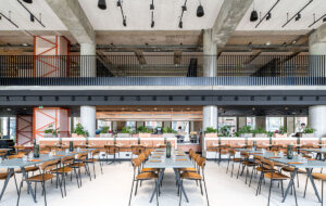
In essence, Zerodegree’s buildings are driven by a social functionalism which produces an aesthetic that Uehara feels is very Dutch. The Shaken office is a grey chunk of a building and sadly – as with many bold office new builds (like the Vodafone office in Portugal – see onoffice cover story, issue 40) – the interior lets the whole concept down. Hideous carpet and standard glass panelling ruin the myth of the ‘experience extraordinaire’. Unprompted Uehara speaks of the “pity that this kind of process of development [with commercial office developers] seldom allows for more specific design features inside”. Not that thought hasn’t gone into it.
“My architecture is like blue jeans!”
“In Dutch offices they like a lot of colour, it’s linked to dynamic conditions,” he explains. Hence the carpet, I suppose!
The completed building is not as holistic as the underlying concept, but ultimately, only the user’s experience of the space can realise its potential. Again, Uehara digs deep into the philosophical currents of contemporary architecture when he differentiates his focus on and definition of the “user experience” from phenomenologists (such as Steven Holl). “I design clean but neutral buildings such as this office, so that people will look beyond the building not just at it,” he states.
Without viewing the building ‘live’ in its surrounding context, it’s impossible to conclude whether or not it fits the super-functional bill.
Nevertheless the striking shape, clear-cut lines and clever facade make it a convincing contemporary office build. And given that the budget was relatively tight, Zerodegree has proven exceptionally creative to build a workplace free from excess.
It doesn’t need a philosophical category to be recognised as smart. Its name, The Shaken Office, is easier to decipher.
Uehara refers to the experience of his design plans repeatedly being sold and bought and sold again over the last decade (2001-2009) as a “shaky” experience. Despite a melange of doctrines, and users questioning whether the cantilevered structure will hold, one thing is certain: the Shaken Office itself is firmly rooted to the ground.

