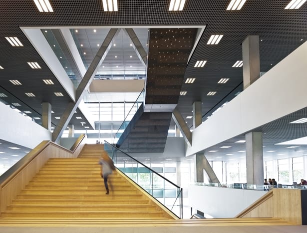
 The concrete cross and bamboo staircase create visual drama||
Piercing through the middle of the new Victor J Koningsberger building, part of Utrecht University’s science campus Uithof, is a giant 35mx25m concrete cross, a bold feature that creates a puzzle of angles and shapes wherever it intersects with the interior structure. It is a beautiful by-product of the overriding architectural concept – an X-shaped reinforcement for this seven-storey tower’s hollowed-out core.
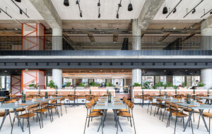
Ector Hoogstad Architecten needed to pack plenty into a narrow site: three lecture halls, study space for 300 people, 17 teaching labs (it houses three science faculties) and parking space for 1,750 bicycles. The most logical outcome was a tower, but the architect didn’t want that to impact the building’s openness and community feel, so designed the tower’s interior to emanate from a central atrium.
 The tower’s lower floors provide a social hub for local students
The practice also planned to make this structure the nucleus for a cluster of neighbouring buildings, connecting the red brick Minnaert site by Neutelings Riedijk Architects (currently being renovated) and the modernist Buys Ballot block via a tunnel, further amplifying the importance of its communal space. Project architect Lennaert van Capelleveen describes the building’s first three storeys as a student landscape, with open-plan study and social areas that are connected by the project’s other visual landmark: a wide bamboo staircase dotted underneath with a sea of LEDs akin to the night sky. This aims to draw students in and create a hub so buzzing they forget about the lifts.
“If you try to make an energy-efficient building and then the elevator is going up and down all day, you’ve made a big mistake,” laughs van Capelleveen, explaining that the sustainability-focused university had asked for a BREEAM Very Good rating for the building. “We put the lift core in the back, almost trying to hide it, and then made this big void in the middle of the tower. So students have a really nice route through the building, with great views and interactions. It’s a real experience to go up.”
 Green accents have been used for a light, open environment
The top half of the building is home to laboratories, study rooms and offices, therefore more closed, so the staircase transforms accordingly. This one is more subtly carved into the wall, which opens up the atrium to be naturally lit by the roof light above and, as van Capelleveen explains, is more sympathetic to those afraid of heights.
The concrete and steel structure is enveloped in glass, with solar gain controlled by metal external blinds that vary in distribution and size across the façade. This, along with the atrium’s glass roof, lets in lots of natural light, contributing significantly to the site’s low energy consumption. The transparency of the façade also influenced a natural material choice inside, says van Capelleveen, where every possible opportunity to use natural materials, particularly bamboo, is taken, and where green is the colour of choice on carpets and other surfaces.
The result is an indoor/outdoor scheme that blends with its surroundings and creates a light, open, yet warm environment for the students to gather. “It’s a really dynamic atmosphere,” concludes van Capelleveen. “I would really like to give students energy from the building.”
Watch a drone tour of the building below
{Vimeo}144751024{/Vimeo}
A dynamic atrium opens up a Dutch campus tower into a student hub


