 |||
|||
Much like its bad counterpart, good design, in its widest sense, is everywhere. But once in a rare while, amidst the beautiful and the functional, there comes a space that knows not only the value of design, but that of the end user too.
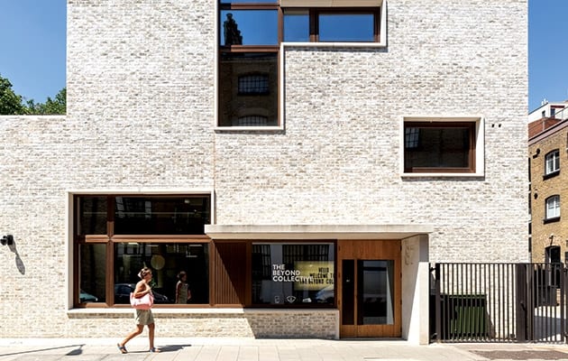
A short walk from London Bridge station, The Beyond Collective’s new headquarters at 87 Weston Street has lots to be proud of. In many ways, I can’t help but draw a parallel between the chosen design approach within the space and the behaviour of a nurturing, trusting parent with high aspirations for their beloved child.
For one, everyone involved takes visible pride in this project. Designed by Stirling Prize-winning architect Allford Hall Monaghan Morris (AHMM) in collaboration with developer Solidspace and interior design studio Jackdaw Studio, the new home of this micro-network of specialist companies sits in a brick-clad, mixed-rise building with windows reminiscent of a game of Tetris.

“It was mutual knowledge that we’re working together towards a collective thing,” says Alex Cleave, director of Jackdaw Studio, backed by Jane Ashe of AHMM, who asserts: “Solidspace had a very clear idea of what they thought the space should be, and that was the bridge between [Jackdaw] and us.”
As for The Beyond Collective, CEO Zaid Al-Zaidy says the agency was “built out of the need to offer our clients a more diverse offering” and, with companies spanning PR, media, advertising, strategy and production under the same roof, The Beyond Collective believes in the power of bringing “unusual suspects” together – something the company calls “the atomic soup effect”.
Coming back to the parent analogy, one of the main strengths of this space lies in its understanding that, in essence, good design can encourage good behaviour. And as Jackdaw co-founder Pippa Roberts explains, this can be attributed to the studio’s top down approach. “We start with functionality and then we work backwards.”

The brief required a deep understanding of the client. “If you give them the correct tools, people will start to understand how they operate within the space,” says Cleave, adamant that in order to implement all criteria, “the space had to work really hard”. And work hard, it does.
By utilising the L-shaped open interior, Jackdaw treated the corner as a turning point in the visitor’s journey. After entering through an almost domestic-sized door, a neon sign salvaged from the agency’s old premises welcomes you into the space. Look to the left, and you will see the rounded edges of a blue reception desk poking its head behind the corner, which in Roberts’ words, is like “the prow of a ship” luring you in.
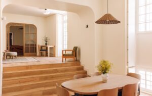
Once past an informal seating area, the 4.5m-high office appears in its full glory. We sit on a bespoke shared work table dubbed “The Perch” and take in the space. A concrete wall with timber board marking runs along the left side and turns into a galvanised steel display wall further into the space, while American oak with flashes of stainless steel feature on the right. These flashes of steel lead to the bathrooms and private meeting rooms. As for the oak, look a little closer and you might notice the timber wall hides integrated lockers with no demarcation other than a delicate key hole.

Small as though it may seem, this decision shows that both The Beyond Collective and the designers of its space know to trust the end user. “You build a muscle memory of buildings,” says Roberts. “They’re not gym lockers. It’s saying: something is really practical, let’s make it really beautiful.”
This belief that rituals and day-to-day requirements should be celebrated and not hidden away manifests itself again furtherinto the space, where Jackdaw decided toleave facilities such as the printer out in the open, in keeping with the exposed services above. “If you hide these things, they become filthy and no one takes responsibility for them,” says Roberts.
This sense of ownership is present throughout the rest of the space, too. From the unassigned desk concept and the agency’s clean desk policy, to the shared resources in the canteen-cum-boardroom, there is understanding, and there is respect for a space, which is considered a home. And as Roberts points out, “the space is alive, because people look after it”.

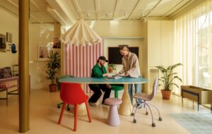
Interestingly, and though the office was designed to accommodate 100 workers, it only offers 50 desks, drawing on the agency’s projected occupancy rate of 50% of the workforce on any given day. “Some days, everyone’s out and you don’t want the space to feel empty,” says Cleave, who placed a lot of emphasis on versatility and future-proofing the office by ensuring that “every flat surface has multi-functions”. As such, the desks aren’t demarked as individual workspaces and this is made possible by the lack of legs. Reminiscent of long sharing tables with support only on the far corners, these pastel-pink, Forbo Marmoleum-finished desk surfaces were designed to cater for the “ebb and flow”.
“It’s about thinking about those surfaces as not just desks,” says Roberts. “Everything multitasks and the space can transform from workspace to event space.”
The breakout-cum-kitchen area is a perfect example of both the versatility of the space and the sense of ownership permeating the company culture. The kitchen features a bespoke worktop with wood chips embedded in for a terrazzo-like effect. “You need these points of creative opulence to counter this utilitarian style that we’ve got elsewhere,” says Cleave, highlighting that materiality within the space was born due to a very tight budget.
Adjacent to this tea point is the canteen, which doubles as boardroom and where two sets of orange tables can be pushed together or apart as required. Access to this room reflects the duality too, with sliding glass doors connecting it to the kitchen as well as the main workspace.

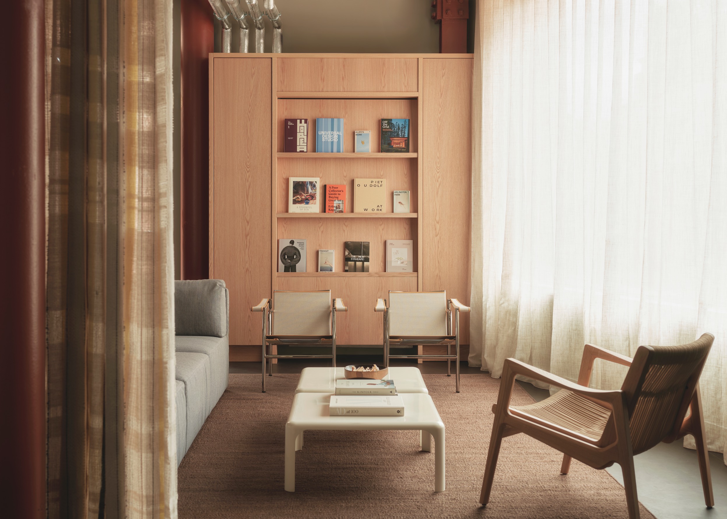
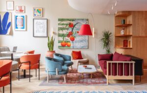
Back on the work side and at the top of our imaginary “L”, just opposite the canteen, there lies an area of soft seating where Jackdaw created a breakout area that doubles as review space, complete with a magnetic display surface lining the back wall. On both ends, the designers have now installed a pair of curtains for client confidentiality, but also to allow for a theatrical reveal during presentations.
The location of this soft seating area isn’t accidental. It not only sits comfortably at the back end of the office, it also takes full advantage of an overhead light silo carved out from the concrete ceiling. “The oculus is critical in this space,” says Roberts – and critical it is, for most of the natural light in the office comes from this oculus and two narrow skylights along the length of the space. With the concrete wall cast along an existing Victorian wall, AHMM had to resort to overhead openings to let light into the space.
As we stand under this light silo, a thick beam of light cuts through the space like a knife through butter, reminding us of the astounding backdrop provided by the Stirling Prize-winning practice. “What AHMM did was an incredibly beautiful canvas to work with, it felt like an honour and a terror taking it to the next step,” says Jackdaw’s founder, whose studio has not only taken it to the next step, but to the next level.
Jackdaw Studio’s functional and beautiful Bermondsey offices for The Beyond Collective never lose sight of the end user

