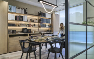
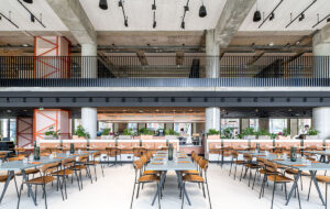
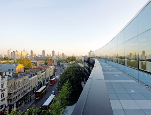
 The roof level offers panoramic views across the City|Canted windows on the top floor were inspired by the reflection of trees|The fifth floor was seen as a white box crowning a black plinth|The double-height internal glazing and exposed concrete finish are the building’s defining features|An installation by Ian McChesney Architects extends up to the roof|Artwork by Sachiyo Nishimura in front of the ground-floor reception desk|A meeting room on the newly created fifth floor|Sunken break-out areas are a feature of the atrium. All lighting provided by Zumtobel|Exposed concrete gives an air of calmness and humility||
“I wouldn’t call it a refurbishment – it’s really more of a reinvention,” says Wade Scaramucci, a lead architect for the newly revamped Angel Building designed by Allford Hall Monaghan Morris. He’s right. Anyone who saw what previously stood on the corner of London’s Pentonville Road and St John Street would attest to the scale and extremity of this transformation. In its previous life as the Angel Centre, an early 1980s office block cut off from the street by a segment of awkward landscaping, it was arguably the most loathed building in the surrounding area. “A boil on the bum of Angel”, was how one unnamed architect who lives nearby once described it. But after tenants British Telecom moved out in 2006, developers Derwent London acquired it and, together with AHMM, resurrected it as the Angel Building – now a clever bit of modern architecture with a Breeam “excellent” rating – much more suited to this prominent corner site in Islington.
AHMM’s two key initial ideas were to strip the building back to its concrete frame and extend it towards the street on the eastern facade, explains Scaramucci. The internal finishes hadn’t aged well and the whole scheme, which now has a gentle curving frontage, had to be woven back into the street. “That’s what made this project really interesting to work on – the building had space to it,” Scaramucci says. “Plus the way they designed buildings in the 1980s, there was quite a bit of spare structural capacity. That allowed us to do a lot of things in terms of keeping the old building. We saved 300,000 tonnes of CO2 emissions just by retaining the frame, not to mention all the programme advantages because the structure was already up – so it was just a matter of extending it.”
There were sound sustainability grounds for keeping the existing frame, but the plan had other benefits: the generous floor-to-ceiling heights of the original structure were maintained, and the time and money saved meant a fifth office floor could be added to the top of the building – envisioned as a white box atop a black plinth. This new level, recessed behind roof terraces with panoramic views of the City, was a coup for the client because along with the eastern extension, it increased net lettable space by 9,300sq m, or 40 percent.
An internal courtyard, rarely used except as a goods delivery route, was closed off to create a top-lit atrium and reception, fed into by one new public entrance – instead of the three disparate ways in from before. The architects gave a lot of thought to how to connect the inside and the outside, Scaramucci says, and the entrance, now flanked by two retail spaces, helps to do that by opening into a kind of promenade from the street to the atrium – the new heart of the building, buzzing with a cafe, sunken break-out areas and a striking installation by Ian McChesney Architects that extends nearly all the way up to the concrete grid of the roof.
“It seemed such a strange thing in a city that’s so dense to have had all that space that wasn’t used, like the courtyard. So it was finding ways of taking what you’ve already got and making it work better,” Scaramucci says.
The atrium’s double-height internal glazing and exposed concrete finish – apparently tricky to get right and eventually poured in situ – are the Angel Building’s defining features. The architects liked the idea of using an honest material, says Scaramucci, and with all the tie holes left as is, the calmness and humility of Louis Kahn’s Salk Institute comes to mind. “Using exposed concrete is a pretty brave move for developers. It’s not normally done,” Scaramucci says. “That’s why I’ve got a lot of time for Derwent. They’re happy to push ideas and try things that are a little bit different, even when agents are warning against it.” The reception desk is to the rear of the ground floor, behind which is a hidden stair leading to break-out areas on the first-floor mezzanine. This level holds most of the conference rooms, but the second and fourth floors also have little break-out spaces in Juliet balconies open to the atrium. The effect, looking down from one of the top office floors, is reminiscent of a cityscape. “We learned that if you’re going to have atriums, unless you find ways of making them active, they become very cathedral-like. People whisper as they walk through. So the idea was about creating lots of opportunities for people to use space,” Scaramucci adds. Up on the office floors, relics of the Angel Centre can be seen in the strange caps at the tops of columns and weird corners that once shaped the building. “Most people would put a suspended ceiling in but by opening the space up, it’s much cleaner and simpler,” he continues. It’s certainly much more energy-efficient – the building uses a low-velocity underfloor displacement system so the 3m-wide windows can open for ventilation. One of the other big questions for AHMM was how to reclad the structure considering its new position in the street. They took inspiration from the modernists: “Manufacturers Hanover Trust Bank [Manhattan, 1953] by Gordon Bunshaft is a perfect example of how buildings can sit on a street and get all the things right about reflection, translucency, transparency, depth and shadow,” says Scaramucci. “Mies van der Rohe obviously had nice ideas about how to articulate structure and we reinterpreted some of those ideas too.” The canted windows along the top floor were inspired by the reflection of a group of mature trees along the side of the building, he says: “When you read the facade, it’s mainly the reflection of the trees, a lot of black and green contrast. We thought it would be nice to break that reflection at the top.”
But after three years of work, and some quite complicated architectural and engineering acrobatics – would it not have been easier to knock the Angel Centre down and start from scratch? Scaramucci balks at the idea: “It’s not always done well, but I like the idea of doing interesting things with old buildings. In terms of redeveloping cities, it’s the right thing to do,” he says. “I believe there really are no buildings that can’t be made good. And the Angel is a great example because, although it may not be for everyone, it shows how a pretty bad building can be completely reinvented.”


