The bold office is a celebration of thonik’s community-minded ethos
Dutch Graphic design practice thonik has just opened the doors to its newly self-designed and built studio on the Wibautstraat in Amsterdam. Marking the firm’s first foray into three-dimensional design, the HQ is a spatial manifesto of the brand’s design philosophy, characterised by social commitment and a playful take on the heritage of modernism.
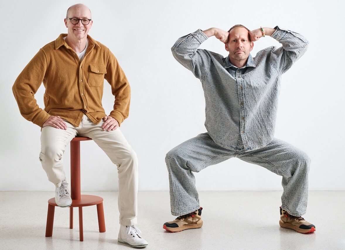
Founded in 1993 as a mostly analogue graphic design practice and led by design duo Nikki Gonnissen and Thomas Widdershoven, thonik rapidly evolved towards digital ever since its inception by using moving images as a starting point for all forms of expression. Studio thonik is the practice’s latest creation.
“Designing and building your own workspace is still an experimental alternative in the current economic reality. For thonik it meant operating within a tangle of rules and constraints and having to soften up institutions and experts to get the right support. And it required a completely different attention span to a communications campaign. In fact, the process, from start to finish, took 12 long years.” Thomas Widdershoven explains.
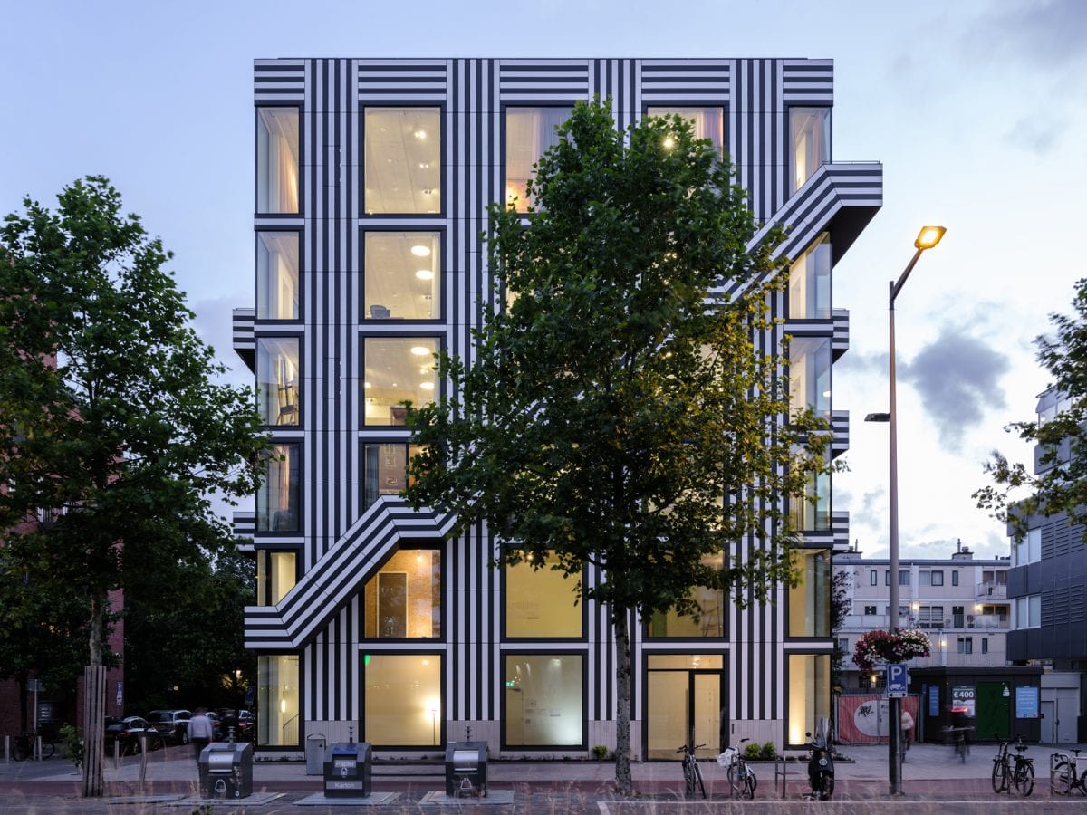
The 300 sq m expanse is housed in a mixed-use development which features a striking façade that celebrates thonik’s graphic roots as the lines of the exterior make a bold reference to Mexcellent, a typeface thonik designed for the 1968 Olympic Games in Mexico. Making a strong visual impact with a mix of horizontals, verticals and diagonals, the graphic cladding consists of 1 cm-think panels of Trespa® Meteon® Lumen mounted directly on to the insulation material.
“This sheeting consists of impregnated paper produced by a company in Weert in the southeast of the Netherlands – so it’s truly Dutch manufacturing,” says Widdershoven. “Trespa® is undervalued as a construction material yet it outperforms traditional brick. It is light, fully recyclable and has an undeniable graphic quality.”
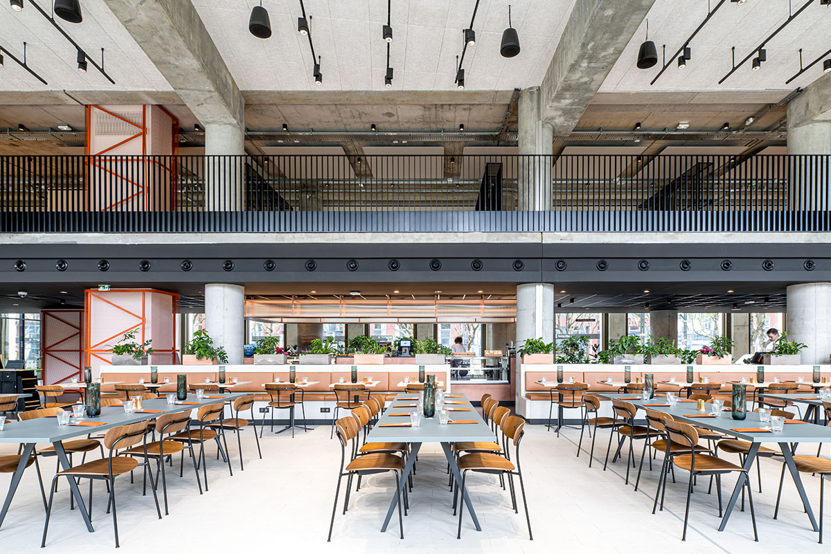
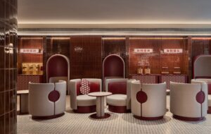
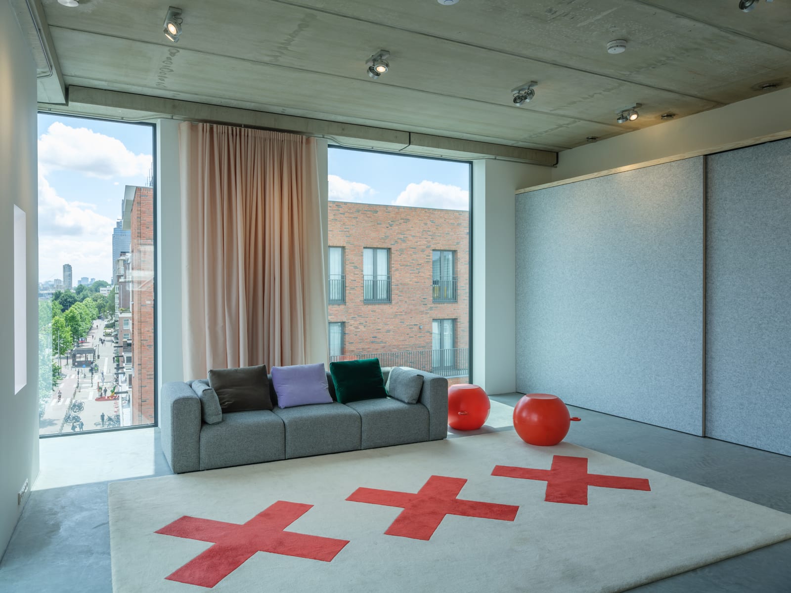
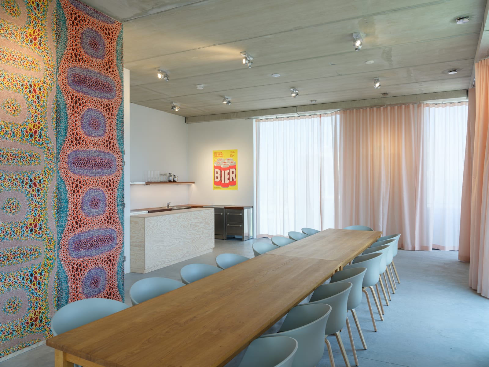
Inside, thonik’s new office space is arranged over two floors alongside a sake bar on the ground floor leading to a Japanese Omakase restaurant on the first floor. Dotted with pieces by HAY and Hans Lensvelt, the furniture is enhanced by bespoke thonik-designed rugs and intricate Mosa ceramic tiles. Meanwhile, an event space dubbed ‘the thonik loft’ is located on the top floor and a rooftop terrace, open to the public, offers 360-degree views over Amsterdam’s inner city and the financial district, and seeks to be a hub for the local creative community.
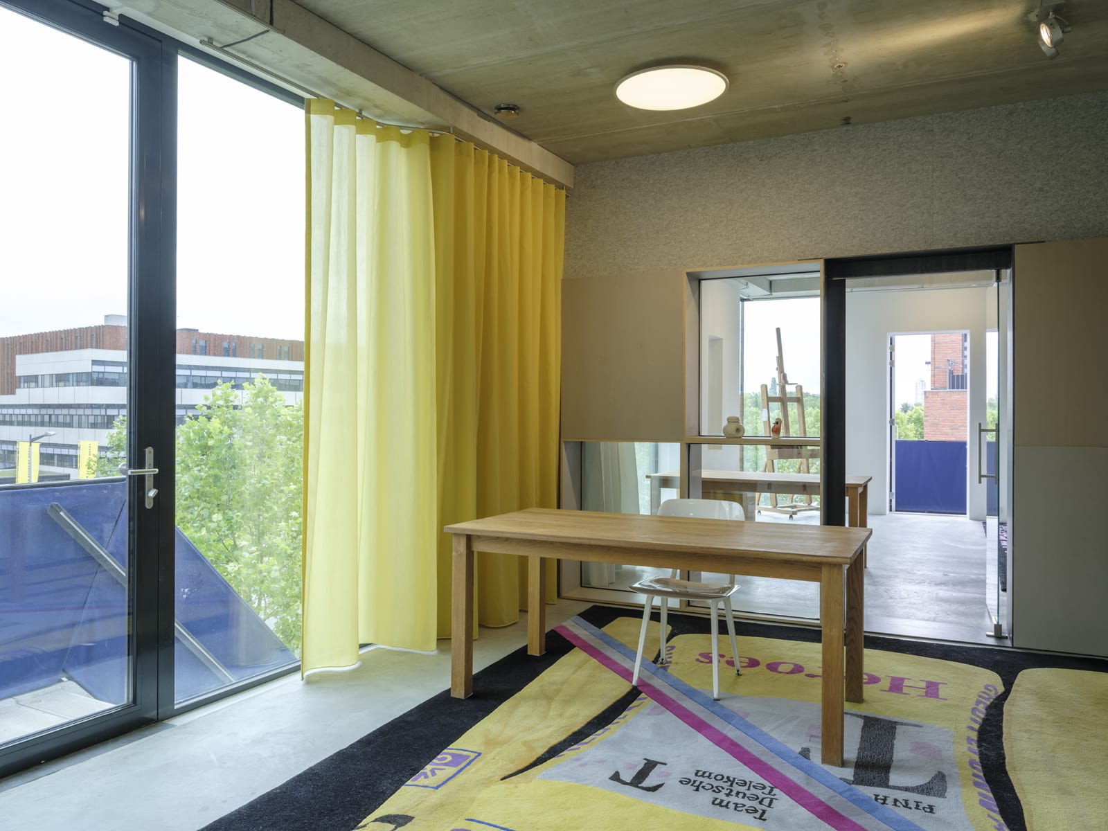
Connecting both inside and out is an external staircase and balconies, embellished in the firm’s iconic graphic and designed to invite surrounding neighbours to look inside, a move that reflects thonik’s community-minded ethos. Striving to bring sustainable living to locals and the city alike, the building is all electric with zero emissions, thanks to triple-glazed and UV-coated windows, while the indoor temperature is regulated with an air source heat pump. What’s more, the space also features additional solar and wind energy, high-quality insulation and smart ventilation.
“We see Studio thonik as an outsider in an otherwise utilitarian setting; the building positively energises and engages with the Wibautstraat’s overwhelmingly anonymous, post-war architecture and bearing witness to thonik’s belief that design should always contribute to a more beautiful and better world”, concludes Widdershoven.
All images are courtesy of Ossip and thonik

