 |||
|||
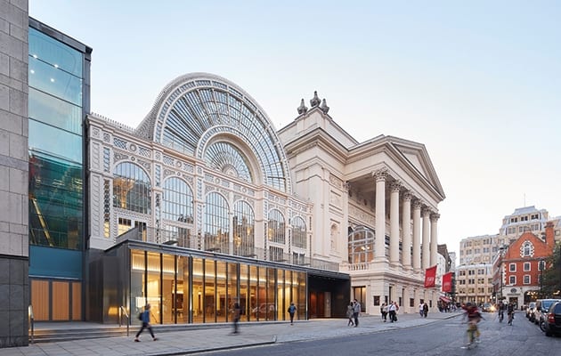
The Royal Opera House’s £50.7m redesign goes by the name of Open Up. Its intention is to make the building more accessible and welcoming to non-performance goers. As ROH chief executive Alex Beard said just before the public unveiling: “We’re aiming to give people of all ages a taste of the remarkable creativity at play here.”
In 21st century arts venue speak, that means improving the shop and adding more eateries. Because “the world has changed and institutions need to bring in as much income as possible”, says Open Up project director Sarah Younger. Architect Stanton Williams has achieved both of these, and created generous public areas, good light and improved flow to boot. But it is the institution’s repositioning of its staff that is particularly interesting – and is best shown off in the shop and on the terrace.
 The Linbury Theatre features American black walnut
First to the shop, which used to be a dark room accessed from a dark corridor that ran from the (also dark) Covent Garden piazza entrance to the main foyer. Stanton Williams has taken the corridor’s internal wall down, and pushed up the shop area’s low bulkheads as much as possible.
Retail designer Drinkall Dean was handed a shell, and created lots of classy but inviting merchandising units in walnut and antiqued brass, with white as a background accent. These are lit by bespoke baffle fittings, created by Open Up’s lighting design firm StudioFractal.
The units are filled with new ranges commissioned by merchandising consultant Emma Matthews. “Craftsmanship is the main focus,” she says, referring to all the efforts that go on behind the scenes to create the ROH’s performances. So she has collaborated with the costume department in Thurrock to do a line of cushions, trims and buttons – all linked to specific productions. Meanwhile photographer Andrej Uspenski’s portrait shots of the main dancers are on postcards.
 A more generous staircase leads down to the Linbury Theatre
The shop is now accessed via an enlarged and more transparent revolving door from Covent Garden Piazza, and from the newly configured main foyer. While the shop was open to the public all day in its previous incarnation, much of the rest of the building was not.
Now, visitors who take the new wide staircase to the upper floor will get tantalising glimpses of more ROH people at work. As well as refurbishing the amphitheatre foyer, adding a new bar and 230-cover restaurant designed by Studio Linse, Stanton Williams has improved the L-shaped terrace that overlooks the piazza. The terrace is now partially enclosed with sliding glass doors and roof lights, to form a new conservatory.
On the other side, windows running the length of the building are no longer obscured by planters. They now give direct views into the costume-fitting department, where people work away at big ironing boards and sewing machines. Behind a screen is a ballet physio area, with a sprung floor covered by artificial turf. Meanwhile, running parallel with the restaurant terrace is the model-making area.
Most of Stanton Williams’ interventions have been to the ROH’s 1990s extension, designed by Dixon Jones/BDP, with minimal works to the 1858 EM Barry design. The shop and terrace are interesting from an employee point of view but structurally the action happens around the Bow Street entrance and in the smaller theatre.
 The ground floor foyer looks down to an informal platform area
The Bow Street entrance is bigger than it was, and much of the solid wall has been replaced with glazing. A hole has been punched into the floor of the ground floor foyer in front of all that glass, giving views down into the foyer of the lower-ground Linbury Theatre. That foyer is now reached by a more generous staircase, which ends on an informal platform area. Once a grand piano is installed, the ROH’s pianists will use it as a practice room, which should delight visitors.
Meanwhile, the 400-seat Linbury Theatre has been transformed from a dreary auditorium reminiscent of a school theatre into a state-of-the-art space. Stanton Williams has designed it in American black walnut – with joinery by Swift Crafted – with wider, upholstered seating.
“We wanted to change the experience of the space for the performers as well as the audience,” says Stanton Williams associate director Rawden Pettitt. The space now has a Jacobean theatre shape “for more intimacy. Before, performers were greeted by single‑tiered rake,” he explains. “That was good for ballet, because people like to see feet. But not good for opera. Now, you can create a shallow or steep rake,” and Arup has improved the acoustics. Performances will start in December.
Stanton Williams’ light touch has been finessed through its minimal materials palette: walnut, Crema Marfil marble, patinated brass, polished plaster sit alongside that American black.
While the overall effect appears effortless, the last three years have involved a frenetic juggling of 30 contractors while the house didn’t miss a single performance or rehearsal. However, the proof of the pudding will be in the eating (in all those cafes), and any increased income generated.
Stanton Williams’ Royal Opera House redesign not only opens the building up to visitors, but it makes it a better place to work

