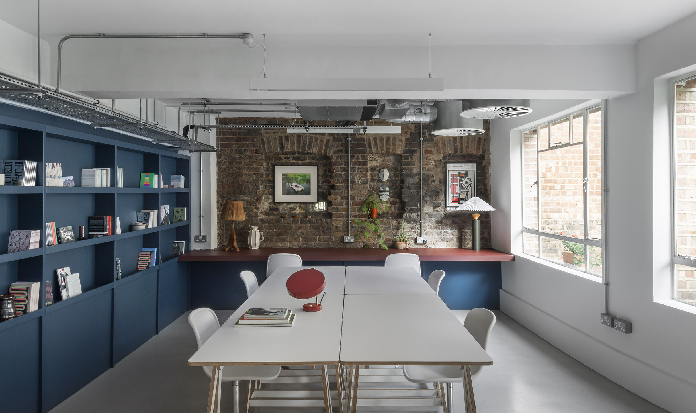
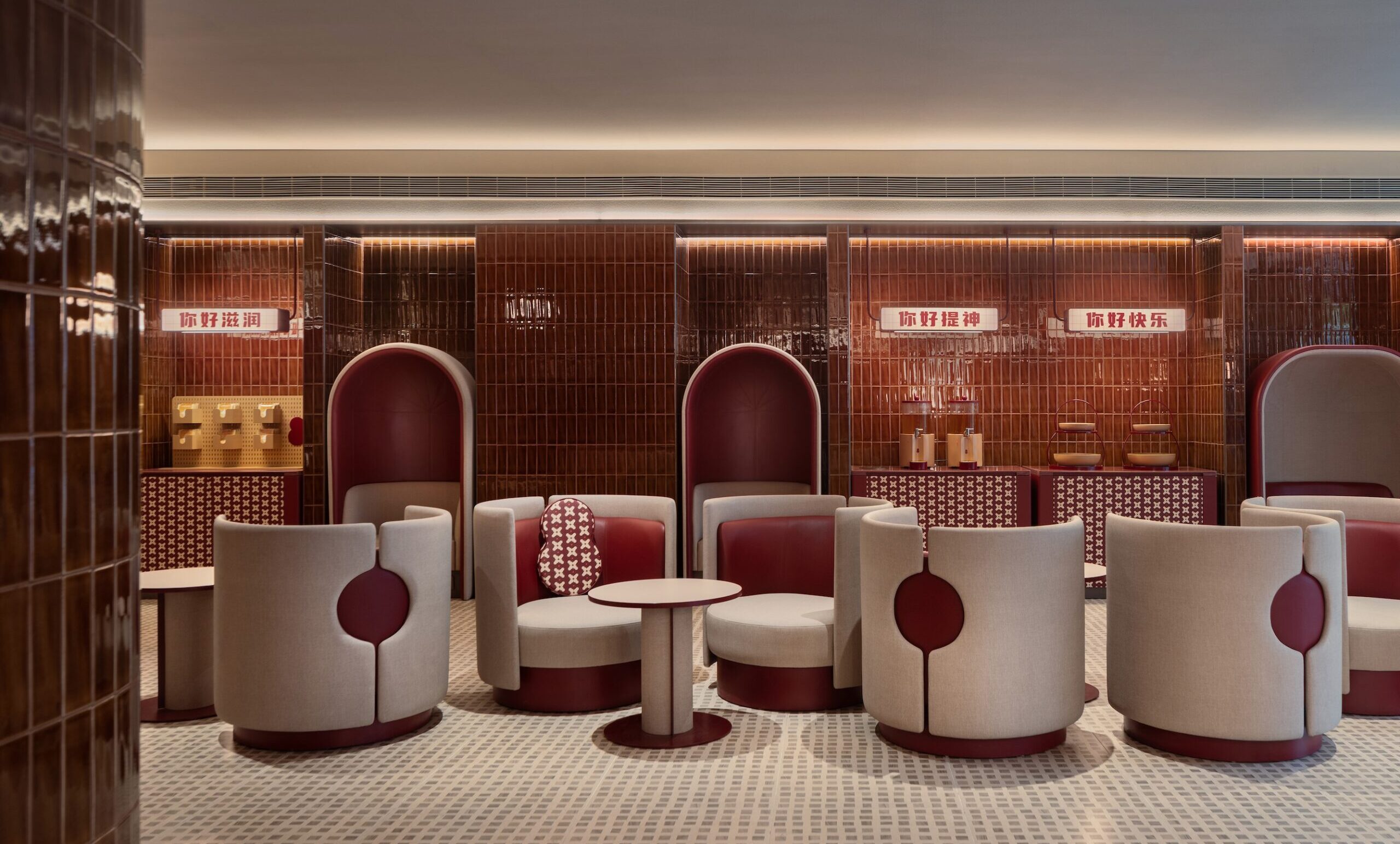
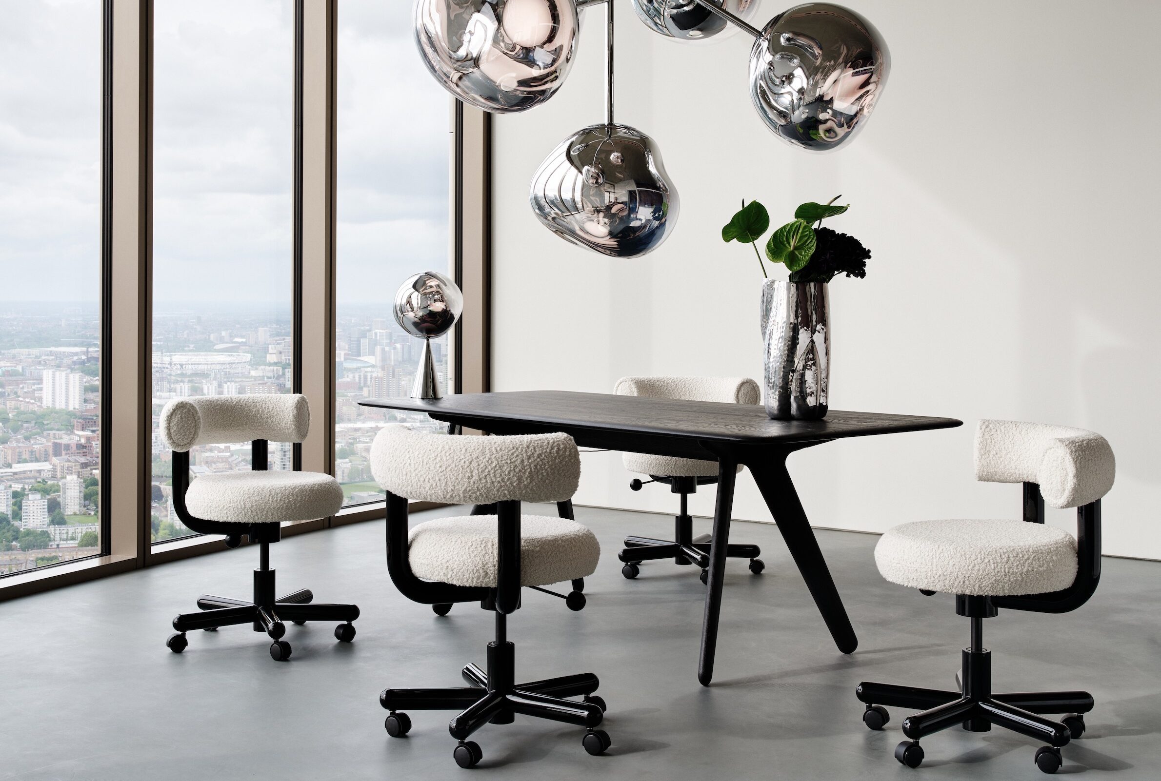
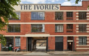
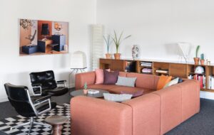
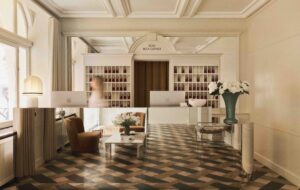
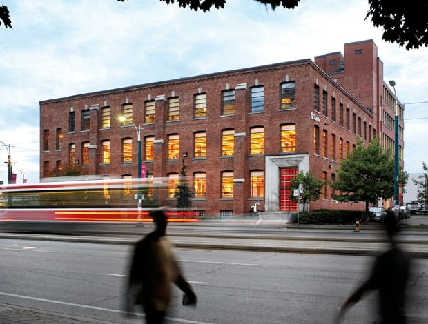
 A former sock factory is now Stantec’s workspace|The reception area sits on the ground floor inside the new, double height void. Timber slatted screens made of reclaimed wood define the space|The ‘war room’ on the first floor is where meetings and design charettes take place. Reclaimed chalk board from a local school is used for brainstorming|A new staircase was added to encourage more social interaction. Services run through the raised floor, visible through glass fascias|The ‘green zone’ holds services such as printing, washrooms and tea points|The open-plan work zone has plenty of natural light and simple Teknion work stations|Bespoke cabinetry in the café, with a sunken floor that exposes the original timber boards|The building’s previous incarnation as a sock factory||
“Multi-tasking consultancy Stantec overhauls a former sock factory in Toronto
Oh Canada, so sensible and pragmatic, you shame us with your functional healthcare for all, low government debt and tightly regulated banking system. Now, unsurprisingly, we can also take heed from your best office spaces. Energy efficiency. Tick. Recycled materials. Tick. Art gallery, natural light, democratic spatial organisation. Tick, tick, tick. Is there no end to it?
In the new Toronto hub of Stantec, an international consultancy specialising in engineering, architecture, interior design and infrastructure (among other things), it seems not.
Three years ago, the firm decided that it had to consolidate its architecture and engineering arms into one space. As project architect Dathe Wong explains, it didn’t make sense for the two groups (totalling 180 people) to work separately across the city in three different offices, as had been the case before.
“We’ve been selling the idea of an integrated team to our clients – and our projects turn out better when we manage to work closer together. That idea naturally led to us moving to a new space,” he says. “It was about accommodating workspace but it was also meant to be a flagship Canadian office for Stantec. We wanted to make sure that we set certain targets for ourselves.”
There was debate about how to go about it – whether the answer was to design a new building, take on an old one, or have a location outside of the city.
“We quickly decided that being downtown was absolutely critical. Toronto has a very vibrant urban core and we definitely wanted to be part of it,” says Wong. “For larger organisations like ourselves, there is a lot of pressure to move away from the city – then people can drive in and out. You have cheaper rent and larger office space. We were trying to push away from that mentality,” he explains.
It was finally decided that Stantec should set up shop in a listed, disused sock factory in the western part of the city, near the garment district and the waterfront (manufacturing stopped in the 1980s). The building’s shell is striking – three storeys of the original brick and timber structure from the 1890s interlaced with a five-storey concrete addition from the 1930s. Stantec now occupies the bottom two floors of both parts of the building. A big chunk of the structural work was to carve out a two-storey void in the middle of the building and add new staircase.
“We quickly decided that being downtown was absolutely critical. Toronto has a very vibrant urban core and we definitely wanted to be part of it”
“That was key to linking our disciplines, linking our floors – making sure we didn’t use the elevator as a default and that we circulated through the building,” Wong says.
Both floors have been broken up into zones, defined by the void and the new slatted timber screens of reclaimed Ontario pine (which, incredibly, has spent the past 200 years buried under landfill at the water’s edge). The screens are obviously a nod to the original internal features, but it also warms up the office in a way that many restored industrial buildings fail to do.
The ‘blue zone’, or public space, holds the reception, meeting rooms (six on the ground floor), a café and an architectural library.
The ‘green zone’ is for services – printer rooms, washrooms and showers – while the studio zone is for workstations, which get plenty of natural light. The overall idea was to respect the industrial heritage by preserving as much of the original timber structure as possible (floors, ceilings, columns) while adapting to Stantec’s needs.
As Wong explains, “Conceptually, we had this historic layer, which is the timber structure. And then we have our contemporary layer on top of that.”
This idea of layers is a theme that has been accentuated by a raised-floor system, slices of which are visible through glass fascias in the void. When construction started, there were no services, only a few rooftop units dropping down a central core and some sprinkler lines for the manufacturing space – leaving the architects free to devise all of their own lighting and air distribution.
“A raised-floor system hasn’t been used in a retrofit in an older building like this, so we had to work our way through that,” Wong adds. “We loved that wood ceiling – it’s beautiful – so we wanted to make sure it was preserved. The last thing we wanted to do was to stick another layer over it for services. So the idea of the raised floor was an architectural and engineering solution, where I said, please, let’s either not touch the ceiling, or only have minimal ductwork, and the engineers said well, why don’t we go under the floor? It gave us great flexibility, it preserved the wood ceiling and it is low energy.”
Where the original floors haven’t been preserved, bare concrete slabs were installed to continue with the raw, industrial feeling of the space. For the same reason, unfinished steel fittings were used in the void and on the staircase.
Stantec is quite keen that the building should have a positive effect on the community. The old cargo entrance has been donated back to the city as a gallery for local artists. Due to fewer parking spaces, Stantec is helping staff with subsidised transport passes. Plus, says Wong, they wanted to think beyond their own stay here. “We’ve come into the building, we’ve adapted it for our purposes, but we’re hoping that when the space is no longer suitable for us, some other generation can use it. To us, that is the greenest approach.
But the key success here has been the bringing together of Stantec’s different segments to work in a new way.
“I think it’s a way of changing the approach of the entire industry,” Wong concludes. “Typically, we’re very compartmentalised in our various disciplines. Architects don’t start anything until infrastructure is in place; engineering typically doesn’t start until an architect has a proposal and floor plans. We’re trying to change that.”

