 Words by Michael Willoughby
Kohn Pedersen Fox ovehauled the 1930s offices of Uniliver, making the most of the spectacular riverside views. Michael Willoughby was blown away, by the outside at least
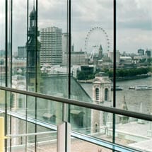
It’s always good to get out of the office. On the roof of the Thames-side 100 Victoria Embankment, it’s absolutely sublime. Pampas grass and beech trees form the dune-like foreground for a view that takes in all the splendid spires and towers that the South Bank and the City of London have to offer. It’s extraordinary to be at eye level with the dome of St Paul’s Cathedral and Wren’s more fanciful creation, St Bride’s. The National Theatre, the Globe and Westminster Abbey look completely different when seen cheek by jowl.
But, my is it blowy! The wind pummels the roof, bowing the roof garden rows of pampas and beech and playing havoc with my digital recorder.
“It’s like being on the coast!” I yell to architect John Bushell, of international practice Kohn Pedersen Fox, as my jacket flaps wildly around my midriff.
“London funnels all of its wind down the Thames and so what are here are the only things that would survive on the coast,” he say, leaning authoritatively into the wind, and giving me an impromptu geo-biology lesson. “That’s why they have chosen these plants. It’s in a windy space.” He is absolutely certain about everything and doesn’t ask me a single question during our tour. I feel like an excitable, windswept schoolboy.
But Bushell must be somewhat excited because the roof garden, created with the famous plant expert Charles Funke, is the realisation of a long-held dream for the architect, who did his fifth year dissertation on the very subject.
Perhaps his blasé nature has been buffed during the process of simultaneously planning a complete gutting and structural refurbishment of a Grade II listed building while working with Unilever, legendary trustee of some of Britain’s most respected brands: Comfort, Persil, Knorr, PG Tips, Lynx, Marmite, Walls and, more recently, Ben & Jerry’s Ice Cream.
Its hard to believe that Unilever was ever thinking about moving away from the building, but when KPF started on the project, the steering committee asked Bushell straight up whether he thought they should stay at 100 Victoria Embankment. “I simply drew their attention to the view, to the location,” Bushell says.
The building is itself a national treasure. Built pale grey Portland stone in 1932 in the style known back then –
Bushell informs me – as Classique Moderne. The front curves round towards the river with a stone base made up of a heavily rusticated ground floor with a portcullis-like door, and massively extended solidity over the next three floors with smaller arched windows punched in. The second level of the composition has a huge attached, Doric colonnade with strong solid ends, the third is a window-pierced subtly detailed cornice with original urns. At least some of the carvings on the base were by Eric Gill. It deserves to be better known, but is perhaps invisible sat next to the traffic chaos of the Embankment and Ludgate Circus.
So KPF’s task on the exterior was quite simple: “It was a question of preservation and undoing ad hoc things that had happened in the past,” Bushell says. The back of the building was simply falling apart and needed a good seeing to.
Inside was a different matter. While the building was spacious in the 1930s, with five of the partners being in a pioneering open-plan-style office, an accretion of walls and partitioning had taken place through the years. “Over time lots of things got filled in. You lost all connection with where you were in the building and it became a rabbit warren,” says Bushell.
During the war, the Ministry for Food took possession of the building and started to fill in spaces and confuse things. “The front door had been put at the side and the real front door had been closed and turned into a meeting room. So the whole process had been to take something that was quite fresh and over time it got to the point where they felt they had a very closed space; somewhere difficult to orientate yourself inside,” he adds.
Ironically, given the building’s aspect, people coming in from all over the world to meet with senior executives would be hustled to underground meeting areas. It got to the point where the directors were ashamed of their building. “They were worried they weren’t getting good graduates because it had a fuddy-duddy atmosphere,” says Bushell. “They wanted us to design a new workplace.”
Luckily, despite the classical flavour of the building, the structure is steel framed, allowing the architects a fair amount of latitude when it came to remodelling the interior, particularly the atrium, which is the most startling addition to the building.
White, clad in glass-reinforced (GRP) acoustic panelling with rounded edges, Bushell says that the atrium is a form of soft modernism which “makes reference to” but does not pastiche the Thirties. Large columns project into the space and affixed to them, at the top, are four platforms with large, white joins offset with each other that seem to spiral down. They are each connected with a spiral staircase that is hewn from a cylindrical form.
From the bottom of the lowest of these platforms, dubbed “the flying carpets”, is a rather sinister structure: a four-phonograph horned installation – Space Trumpet by British artist Conrad Shawcross – modelled on the listening devices that were used on the south coast of England during the second world war. The trumpets are controlled by a central computer and change shape every day at noon, never forming the same sculpture twice.
The atrium is intended as a semi-public space – the floor is of the same material as the pavement outside, Bushell points out – and it was created to feel like a room, but somehow, I don’t feel happy about it. The steel columns seem too thick, the rounded plastic balcony edges look wrong – too chunky, somehow – and the acoustic material is too obviously acoustic material. The installation appears to be stuck onto the platforms as an afterthought.
The architect says that projectors are stationed around the building and shine varicoloured light onto the interior surface after twilight.
Lime green supports hold up the lifts and thin segments of straws form a background wall, ensuring that lift occupants can see out when at a horizontal angle, but exterior prying eyes are unlikely to be able see in. On the struts of the windows next to the lifts are holographic strips, which reflect all the colours of the rainbow around the gallery.
Bushell talks of the influence of Alvar Alto and Future Systems’ Selfridges building and of the 1930s, but I can’t make the links. Perhaps it is a space to be photographed. It’s sensationally photogenic.
But if the atrium falls somewhat flat, for me at least, the top floor cafe and meeting room areas are a triumph. Bushell tells me that he wanted to give people who came to the top floors – particularly those who were just in from overseas – “a sense of arrival” and he has achieved this in spades. The roof garden and the river and London, looking splendid, can be seen through the windows.
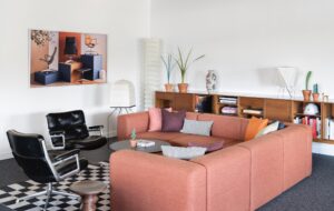
The chief executives’ dining room must be one of the world’s leading corporate spaces. A huge, round, glass-topped dining room, a bespoke design by Luke Hughes with rough metal mesh under glass, is surrounded by simple VVD01 B&B chairs, softly bent into an L-shape. The table can be extended to seat 22 people. A chandelier floats above. Eames Softpad chairs and a Vitra Noguchi coffee table sit in the next door executive lounge.
The architects haven’t neglected the regular Joes, either. They share the same view and Campus chairs, but Lammhults and Fritz Hansen tables vibe with the slate walls in the staff canteen.
Abutting this area are meeting rooms with reeds embedded into the walls by the entrances. These have been made by an Amish community and sit – incongruously – next to a fridge containing Ben & Jerry’s ice cream. Though the teams have just begun moving in, products for tasting and testing have started to arrive.
“They always bring loads of them to meetings,” says Bushell. “After a while, all I could eat was Slimfast. Apparently they work if you have enough of them.”
The building’s large floor plates ensure the workings are tremendously spacious and curve around the front of the building. Large ‘vitality’ boards are installed every so often containing, what the team says, is ‘inspirational art’, but to me looks more like the kind of thing you might expect to find in a BUPA hospice – reeds, flowers, leaves, trees, smiling faces – on boards that can be slotted in. Perhaps it’s just the effect the boards themselves have. They bring “colour and brand promotion throughout,” a spokesperson tells me.
The Naos desks are by Ergonom and at the same height as the KI storage units. The confidential documents storage has been taken out of ugly green bins and placed into a flush and colour-matching, lockable depository.
“We wanted something very flexible with a certain amount of height adjustment requirements,” says KPF employee
Etain Fitzpatrick, who worked to choose the furniture. “The brief was that they didn’t want to spend loads of money on the build and then skimp on the furniture. There were a few systems that fitted but we liked the ones with the glass top. It’s all cantilevered and height adjustable and can be regrouped into twos and fours.” Le Klint Undercover Pentant lights float in clusters above, bringing a spot of colour.
As I leave, corporate office cleaners with massive feather dusters are listlessly tickling the spotless furniture. The marketing genii of Unilever are arriving at their new space. I have no doubt their sparkling new office space – and being able to go up on the roof and gaze at London’s architectural wonders face to face – will inspire them to create ever more alarming personal hygiene issues, more tempting ice creams and less disgusting diet shakes.

