 |||
|||
Established in 1935, the Bank of Canada moved into its permanent headquarters – a late neoclassical granite building in Ottawa’s institutional quarter – in 1937. Over the next few decades, plans for additions were drafted but delayed until Canada’s most famous modernist architect Arthur Erickson took up the project in the late 1970s.
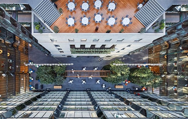
Erickson’s modernised design kept the original building and complemented it with two mirrored glass towers joined by four pedestrian bridges and encapsulated by a large 12-storey indoor atrium, complete with a lush garden and reflecting pool open to the public.
Innovative for its time – floor-to-ceiling glass walls, open floor workspaces and indoor atriums hadn’t yet become so ubiquitous – Erickson’s design was, however, starting to feel the layers of time and the impact of 21st-century technological advancements. The building and its plaza were in need of a substantial upgrade, courtesy of Perkins+Will’s trio of Ottawa, Toronto and Chicago offices plus landscape architect DTAH.
This alone should give you an idea of the sheer size of what has been labelled the Bank of Canada Renewal. Spanning five years, three of which required the relocation of 1,800 employees to a swing space nearby, the redevelopment called for rigorous management.
 Photo by doublespace photography
Headed up by core manager Matt Johnston in Ottawa, Toronto-based lead architect Andrew Frontini and Chicago-based lead interior designer Joseph T. Connell, the project’s coordination and execution relied on Perkins+Will’s integrated platform, allowing all offices to work together almost seamlessly. “There’s a lot of fine-tuning on a project like this,” says Frontini, but if anything, this goes to show the power of pooling resources.
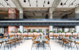
This collaborative spirit permeates Perkins+Will’s new design, which has transformed the atrium and two lobbies into collaborative spaces that preserve Erickson’s legacy while injecting it with much-needed functionality.
“This lush tropical space was a secret treasure in the city, but programmatically, it didn’t work,” says Frontini. With its terraced layout and water features, the garden was just a transitional space with very little floor area left. So the team asked itself: “How could we use this as a workplace?”
The result is a three-strand approach built around “me” spaces that focus on individual work, “we” spaces that foster collaboration, and “us” spaces catering for events, large gatherings and the overlap of work and socialness. The “we” spaces seem particularly noteworthy since they reflect the architect’s conscious decision to reduce the number of meeting rooms in order to drive people into the now communal atrium.
 Photo by doublespace photography
After mapping the employees’ meetings and use of the space, Perkins+Will noticed how underutilised the meeting rooms were and decided to consolidate these functions in the atrium, two lobbies and a large conference space below that can hold up to 500 people. “The programming of the building drives them to the space,” Frontini explains. “Employees are now interacting and meeting people they didn’t know worked in the bank.”
Meeting space is not the only function available in these new “we” spaces. The atrium and the lobbies now boast a digital library, a media centre, a cafe and a technology support kiosk centre where staff can mingle and interact. And if those aren’t enough, employees can always head to the rooftop terrace of the central building, part of which extends outside of the glass atrium. As Frontini explains: “You can work from anywhere within the building.”
The team even allowed for two so-called “innovation floors” with open floorplates that can be reconfigured according to the project at hand (the Bank recently worked on the design and release of a new Canadian $10 note).
With an office size just over 74,300sq m, the architects’ brief wasn’t limited to space utilisation. As part of the renovation, Perkins+Will also updated the bank’s mechanical and electrical distribution and brought the building’s seismic and fire regulations up to par. Unsurprisingly, this entailed surgically demolishing all elevator cores and rebuilding from scratch. “We completely gutted the interior,” says Frontini, “and all the while, we had an architecture legacy.”
 Photo by doublespace photography
Preserving Erickson’s heritage while updating the building to 21st century standards was achieved by integrating technology in strategic places: discreet radiant heat and cooling were inserted in the structural coffers, an additional skin of glass was installed to create a dynamic buffer zone for the now LEED Gold-certified building. In the atrium, the wood trellis was renovated and the water features removed as they were hard to maintain (a fitting example of design that may, sometimes, look better on paper than in practice).
Another element in need of an overhaul was the security profile of the country’s central bank. “Post 9/11, a security overlay has affected every organisation,” says Frontini, and part of this meant closing the atrium to the public, and relocating the Currency Museum, which was previously situated
within the building, outside the perimeter.
This brings us to the exterior, where the plaza was redesigned to integrate the entrance to the museum, now located below ground. The new entrance, a striking, skylit pyramid jutting out like an iceberg, seems to symbolise the bank’s enhanced public outreach. “This creates an urban theatre in the city,” says Frontini. “School buses and tourists arrive and the space gets animated by that.”
 Photo by doublespace photography
Also worth noting is that the team replaced the old English slate which previously covered the plaza surface with Canadian granite, a material more suitable for the country’s notoriously harsh climate.
“Canadian granite complements the patinated copper the way the slate did, but provides a much more durable surface for interior and exterior use.” Frontini further points out that the new finish “flows into the ground floor” of the bank, in line with Erickson’s design that provided for a continuous surface between interior and exterior.
With this streamlined plaza, Frontini hopes the public will come and bring to life a institutional neighbourhood that, much like the City of London used to, (yes, things are looking up on this side of the pond) dies down after work hours. “Governmental buildings don’t give much; the plaza was an attempt to create some vibrancy and public space in the city.”
Subscribe to OnOffice for more features like this
Perkins+Will has given Canada’s central bank a refreshing new interactive focus by encouraging its employees to use existing spaces in new ways

