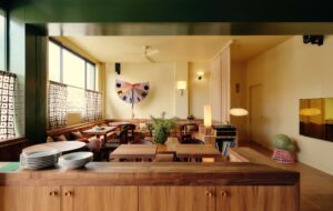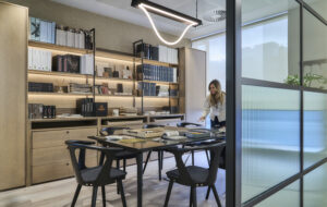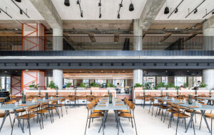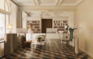
 Two law firms, one development, one architect, one interior architect – two different results.
Norton Rose
In 1929, the (frequently impractical) German architect Bruno Taut wrote: “Beauty originates from the direct relationship between building and purpose. If everything is founded on sound efficiency, the efficiency itself, or rather its utility, will form its own aesthetic law.” Sometimes the solution to an architectural problem is so elegant that it becomes a main part of the building’s interest, whether it be the never-ending gallery wall space in New York’s Guggenheim, which created the snail shell form, or the flying buttresses of the larger gothic churches. The towering form of the skyscraper is, apart from anything else, an attempt to fit a lot into a small plot.
International law firm Norton Rose had just such a problem – a lack of direct client access due to an incredible riverfront location in the private Foster + Partners designed development, More London. The building – sleek as a pair of Oakleys, with a fascinating colonnade along the side of the ninth floor – is popular with staff, as well it might be; residents’ balcony-hosted cocktail parties promise to be memorable, with views over the Tower of London and Tower Bridge. And the absence of clutter on the river allows the front of the office spaces to remain spankingly clean and gives the public the freedom to use the slate paving in front of the sleek skinned buildings as
an esplanade.
However, for the law firm the prospect of corporate clients arriving at the less-becoming Tooley Street and having to walk around the side was alarming. In the hands of master architect Ken Shuttleworth, the firm’s drawback has been turned into a poem about access; an instant progression right into the luxury heart of the building – a private taxi tunnel, replete with computer-controlled LED light tubes and Norton motorcycles – which curves beneath the building. It’s how Batman would arrive, given the choice.
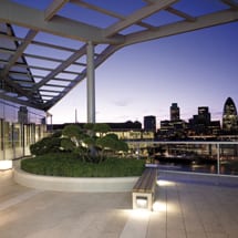
The arrival is the start of a memorable walk through. After getting out of their car or cab, visitors ascend a tapering staircase that leads them into a cavernous glass atrium, replete with dangling cathedral-like lamps. They will not linger here, but instead board an elevator with one button – straight to the ninth floor – and ascend the crystal cliff face dropping them off in a serene and sublime waiting area with views over an outsize, bonsai-inspired terrace facing two World Heritage Sites. Without the alteration to the space, the arrival procedure would have been elegant but no apotheosis.
Norton Rose was lucky – or wise – to be able to have Foster make changes to the building as it was going up. The two-fingered building has floors 19.5m across – the ideal size for the typical modern law firm configuration of two rows of double-occupancy offices, a row of meeting rooms and administrative support. The wings are slightly splayed to maximise riverfront views and to draw people to the front of the office. The curtain walling in the atrium, which originally dropped to ground floor level, was lifted to allow for the introduction of shops and cafes and to prevent
a totally cliff-like feel.
Local firm MCM was behind that touch and the rest of the interior build. Project architect Jon Race says that a key part of his work on any interiors project is to create a seamless join between the exterior and the interior. “While they will always be different, since the base build is the envelope and the fit out is the contents – and we are different architects – we often feel the join is less than successful and we always try and meld the two things together,” he says.
Using this design principle, Race drew upon the curvilinear nature of the exterior to create the curving pods that can be found deep within the building core on the client floor. Holding the areas of the space that don’t require so much light, they are covered with Page Lacquer in an Armani-esque coffee colour and help set the scene for the hotel-like floor. The sporadic fluorescent lights pick up on the verticality of the frame while drawing attention to the shape of the pod over its reflective properties. Around the pod are arranged meeting rooms of various sizes faced in what appears to be a highly exotic wood but is, in fact, just satin walnut with the sap left in – creating, once arranged symmetrically on some surfaces, fascinating patterns.
“Some people who came to an open day thought it was an endangered tropical species,” says Race. In fact, since the whole trunk was used in the creation of the build, more than half the number of trees were needed and the colourful patterns – which also fill the Terrace Room and the private business room – are more rather than less environmentally friendly. The variegation in tone helps add interest and warmth to areas that might otherwise be rather bland. Neutrality can be boring; the flames of walnut ensure that these browns work together with warmth.
Elsewhere, the business areas feature two types of moleanos limestone, rough and machined for the business lounge and smooth and dark for the reception area. The stone was chosen for the large amount of fossils visible.
Further variegated neutral tones are used functionally in the client meeting rooms – a sophisticated tri-coloured banding on corridor-facing walls, from beige opaque at the bottom to semi-transparent brown to clearer glass at the top. The opaque at the bottom allows for the introduction of a credenza next to the door so that catering staff can drop food or drink off without coming all the way into the room, while the shape of the credenza and any wires trailing from it are not seen outside. Light is still able to enter and leave the meeting room. The device – cream to clear in bands – is echoed in the private telephone rooms, this time in sound-proofing suede.
Separate from the meeting rooms are dining areas each with different lights, chairs and tables, and credenzas at the side, although having the same frame, are faced in different woods. “We spent a long time sitting in chairs and in lighting emporia,” says Norton Rose finance director Kevin Mortell, who headed up the relocation task force. Instead of blinds on windows, the firm has installed fritting that waxes and wanes depending on the position of the window relative to the sun. Nothing appears to have been left to chance by Norton Rose or the client.
Appearances are not, on this occasion, deceptive. The planning of the office sounds legal in its precision, with client-architect meetings every Thursday for nearly two years.
“We built three fee-earning offices before we decided which way the veneer should go,” says Race. “We tested coat hooks and went through six to eight mock-ups before we chose. The steering group really put in an investment of time.”
He has nothing but admiration for Norton Rose. “Sometimes what you have asked for isn’t what you want. You need to interrogate it a bit further, otherwise someone spills red wine at the opening party and suddenly you discover your carpet is crap.”
Instead, the building is a triumph.
LG
Meanwhile, Norton Rose’s direct neighbour at More London is fellow law firm LG. The interior architect for its Foster-designed building? MCM. And they beat Norton Rose to the punch, choosing the firm when only Ernst & Young were on the site.
LG – a company with several centuries of experience behind it – was seeking a very different look from Norton Rose, according to managing partner Penny Francis, who says straight out: “It was an opportunity to start afresh. It was important to the partnership because it was also moving south of the river and moving away from the historic legal land.”
They chose a fresh site over which they also had a say with Fosters because it offered a chance to “grasp the nettle and inform change”. But what changes? Visitors to the old building – a 1950s “monstrosity” – had to walk up the final flight of steps to the last floor.
Project architect Sally Stead says that the firm wanted sharp lines, colour and an absence of stuffiness and leather. The office most definitely veers away from the hotel-like finishes of next door and meeting rooms are stepped back to allow for views through the river-facing picture windows. A wide staircase poetically connects the two meeting floors and delicately decorates the view of the City and Tower of London upon entering the headquarters. The colour shows itself in bright greens, magentas and reds in the facing of the meeting areas, which read as a connecting internal space from More London’s river side through the skin of the building. It is also in evidence in kitchens, postal areas and, most notably, in the cafe with its jewel-like seam of tiles on the floor cleverly demarcating what could be a rather blank floor space.
Like Norton Rose, LG has also allowed light to flood into areas more traditionally reserved for a dimmer atmosphere, such as the medium-sized auditorium. The firm chose dedicated dining areas as opposed to “eating in meeting rooms”, which Francis says she “can’t stand”. She also can’t stand furniture being out of line, which leads to bolted-down chairs in the auditorium and her straightening all the rest of the furniture during my tour.
A more minimalist environment, LG is notably less luxuriant than Norton Rose. A major change is that Francis chose the art all at once for LG (“no committees”) while Norton Rose is taking its time. That shows in the quality and variety of what Norton Rose has on show so far – and its training facility is the most dedicated I have yet seen in a corporate environment.
But I have no doubt, having looked into Francis’ intense blue eyes, that this is what she had planned for LG. Neither budgetary constraint nor anything else would have got in the way of her creating a workplace exactly how she wanted it to be. While the Norton Raose move was led by an empowered, five-person steering committee, I gather that – following the requisite staff surveys – Francis led this project strongly and successfully on her own.
She wouldn’t change a thing, she tells me. And neither would Norton Rose.

