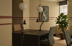
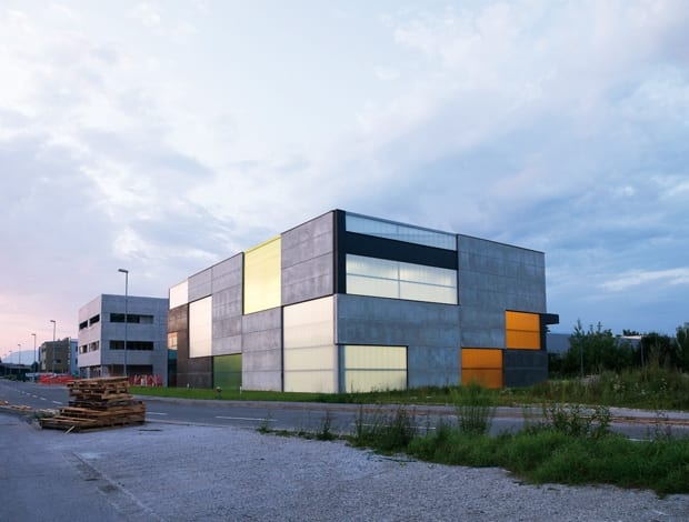
 A prefab concrete system combined with transparent coloured panels create a warehouse that stands out from its neighbours|The shape of the building and its simple materials make it look like an elegant rubik’s cube|The majority of the building is storage space, so poured concrete floors give easy access to lorries|The colours of the polycarbonate material were chosen according to which were cheapest|Despite a tiny budget, the architects took extra care to enhance public areas such as the entrance|A steel lattice decorates the stair, while a concrete and stone floor continues the polished industrial feel||
A Slovenian safety equipment supplier thinks outside the box for its low-budget premises – warehouse, office and retail space in one
A concrete cube doesn’t seem entirely out of place on the fringes of Škofja Loka in Slovenia. Similar buildings are clustered together in the city’s burgeoning industrial zone – but since Lokatrade Škofja Loka, which produces safety equipment, intended to use this particular site as an office and retail outlet as well as a storage warehouse, the design called for something that stretched beyond the usual nondescript box.
Certain limitations came with the job, however. The fact that Lokatrade had bought the land together with approved permit plans meant that the architects, Slovenian-based practice Ofis Arhitekti, were locked into using a construction company already contracted to build on the plot using a pre-selected concrete prefab system.
“The project task was to merge a programme inside the given volume and redefine the existing plans for the elevations. The sections had to remain the same,” says project leader for Ofis, Spela Videcnik. “The design would probably have been different if we hadn’t had these requirements, but then of course this is the cheapest way to construct the usual storage building. What is different about this client’s approach though is that he contacted us as architects to do the job, whereas others would do this type of building themselves with the construction company.”
“The challenge was to work within the same kind of budget as every other industrial concrete building like this has, but do something more special architecturally”
The building is a fairly simple box construction of slabs and columns, but what makes it stand out are the breaks in the concrete grid; offices have transparent double-glazing and storage spaces have semi-translucent coloured polycarbonate elements, while two rear openings act as loading dock doors.
Lit from within, the effect of the simple, raw materials is like an elegant rubik’s cube. Videcnik says that Ofis had recently designed a stadium roof in Slovenia from the same polycarbonate material, so they knew it was durable. The hurdle, she says, was the ¤180,000 budget.
“The challenge was to work within the same kind of budget as every other industrial concrete building like this has, but do something more special architecturally,” she says. “We wanted to break up the composition. We looked where the light needed to be and let that lead us.”
The particular colours for the panels were chosen for their price as opposed to branding – but the combination of grey concrete and yellow screens really works, and could go a way to establish a visual brand for the company.
The inside of the building is a simple affair with poured concrete floors so that lorries can easily move in and out in the main storage and loading space, which houses equipment of varying sizes and shapes. The simple office uses a combination of textile and wood, and is equipped for three employees – although about ten people work in the whole building on a daily basis, including the director who has a private office.
Despite budget limitations, Ofis tried to ensure that the building’s details presented a certain idea of quality to potentialvisitors and clients, who would be buying goods in the shop as well as using a newly appointed classroom for lectures on how to use the safety equipment.Stone composite tiles and a specially designed lattice grate in the stairwell are low cost examples of this added value, as are slate grey panels overhead and on the side of the entrance.
“It’s a publicly visible space,” says Videcnik. “We believe the entrance of a building gives some kind of idea of a company, so even if it’s a low budget, they deserve a good treatment.”
Not only that, but the client is pleased because the new building is an eye-catching gem on a road where the other ‘boxes’ don’t strike in quite the same way. It’s an opportunity to be a showpiece for Škofja Loka, says Videcnik.
“Hopefully, because these industrial buildings appear more and more on the highways and on the main entrances to towns and cities, they should make some kind of showcase to what the city does. It’s in a new industrial area on the periphery of this town – just an ordinary road, with ordinary boxes. But this one is different.”

