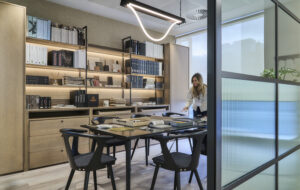
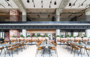
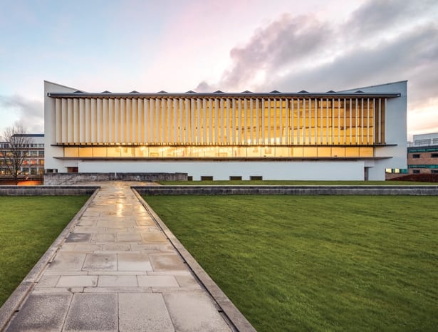
 The original 1967 library has been transformed inside|||
Tasked with uniting the original 1960s library at Lancaster University with a later extension, architecture firm Sheppard Robson has both connected the space to its surroundings and reflected modern learning methods.
While the existing “learning zone” across the quadrangle serves as a place for informal individual and group work, the library still retains its traditional role as an environment largely for more formal work, either alone or in groups. This is what Alex Solk, the partner who worked on the project, describes as “an environment of diligent spaces”. He says: “It was so important for us to deliver a library space that provides for serious study, leaving other amenities on campus to provide for further aspects of university life.”
To do this, Sheppard Robson, along with its interior design arm, ID:SR, met with over 500 stakeholders – including students, members of the faculty and maintenance staff. This research informed the decision on how to divide the space with four times the room given over to group study areas as to more individual working areas. A traditional reception desk has been replaced with a more intuitive navigation system and interactive screens instead.
 The atrium is a new addition to the original building
Sheppard Robson’s update of the 1967 original construction and 1997 extension concentrated on stripping the building back to its concrete frame and reorganising the interior. Formal study space is now positioned around the perimeter next to the floor-to-ceiling windows, meaning students can now benefit from natural light. The 800,000 volumes contained within the library have been repositioned nearer the core. What Solk describes as a “higgledy piggledy organisation of bookshelves”, which meant disrupted sightlines between different areas, is now a much more effective place to study. There’s a variety of work settings including desks, study carrels and high-standing desks with bar stools. “Lancaster is a college-focused university and students have a home college with high-quality group-working facilities,” says Solk; thus these individual learning areas are much in demand.
The atrium is one of the key additions to the 14,500sq m of interior space. Here Sheppard Robson utilised external space: what was previously the Japanese Garden. With a new glazed roof which lets in yet more natural light, bespoke joinery and viewing galleries from the floors above, the atrium aids orientation for the users. A tree creates a focal point with a calming influence.
 A focal point has been made of the main staircase
The main staircase, to the left of the entrance, was also reopened, making it the main circulation route once again. Solk explains, “The staircase had doors which made it pretty dark and bleak so we took those out and clad the outside in yellow glass to really express it.” This provides a material contrast to the newly revealed concrete shuttering on the inside of the building.
It’s not just the interior that has benefited from a refresh. Added to the entrance are large sections of glazing, meaning library facilities are more clearly visible.
Says Solk, “You can see learning on display to really show Lancaster as a research-focused top ten university. It’s fantastic to walk through Alexandra Square on the campus and see the library re-established at the heart of the university.”
Lancaster University’s overhauled library is an inspiring new place to study


