 |||
|||
In the southern suburbs of Amsterdam there are plenty of cyclists, a few cafes and a lot of housing – and until recently, there was a hulking structure by Dutch architect Huig Aart Maaskant, originally Europe’s largest office building. “It was a bit of a Marmite building. Locals seemed to either love it or hate it,” says Toby Neilson, the director of BDG who led the project to transform the building into a new headquarters for advertising behemoth WPP.

That project is now Amsteldok, the new name for the WPP campus, now home to several agencies under the WPP umbrella. The Amsterdam building is just the latest example of a new strategic move for the firm that affects both the way people work and the architectural spaces in which they do so.
The global advertising firm is in the process of bringing its agencies, often scattered across different offices in major cities, into central campuses, or hubs, in order to allow for greater collaboration and the sharing of expertise across the brands each agency works on.

In London, this strategy resulted in a space in the Sea Containers building where agencies around the city have been brought together under one roof. Across Europe there are others planned, including one in a former telephone exchange in Madrid and a Prague office in a former Soviet utilities company. The key has been finding interesting buildings with a local identity, rather than building new, Neilson explains.

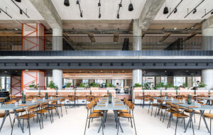
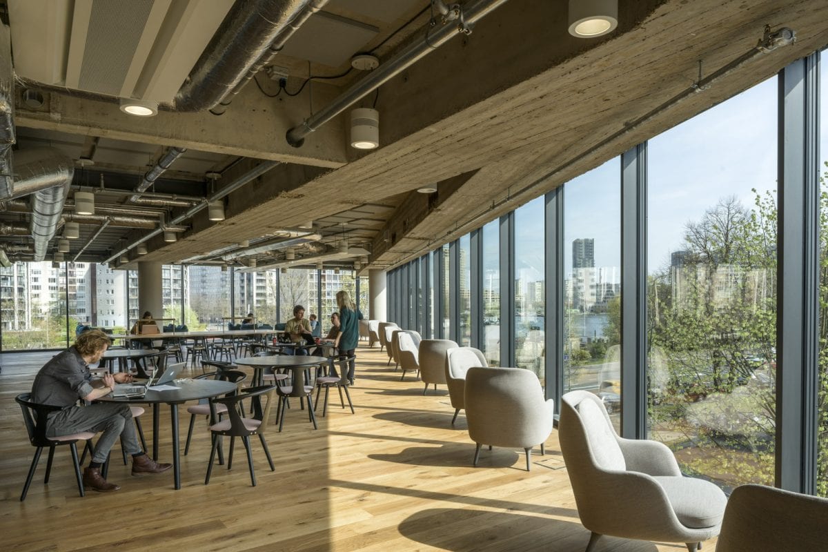
In Amsterdam, BDG – an architecture and workplace strategy consultancy whose parent company is WPP – undertook the shell-and-core fit out of the concrete giant, which posed challenges, particularly in fitting modern utilities and cabling through existing holes in the beams and ceilings. When BDG took on the building some of the floors had already been removed, which allowed the team to create a staircase directly from the foyer up to a huge, open breakout-style space, created for both ease of access for client meetings and as a space for staff to meet, catch up or have lunch. “The scale of the building is huge, and we had big open floorplates to work with,” says Neilson. “We wanted to offer immediate access to the shared spaces and keep some of the original character with the exposed beams.”

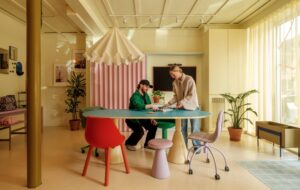
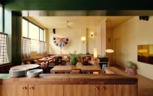
As well as the breakout area upstairs, there are two other immediately accessible collaboration spaces: the large entrance lobby – a feature planned for of all WPP’s campuses – and a cafe, accessed through a tunnel of pale green corrugated metal. The colour is used to indicate a transition point in the building and joins an interior branding scheme undertaken by VBAT, one of the 15 agencies that occupy the building. Each floor has its own colour, with the numbers indicated in a bespoke typeface beside the lift on each floor.
“We created the typography inspired by the city’s school of architecture, a version of Dutch type designed to be dynamic,” says Graham Sturt, creative director of VBAT. The lettering also features in the furniture in the foyer.

Though the agencies started to move into the office in November 2018, it wasn’t until April that it officially opened, and there are ongoing plans to make the space more than just an office for the 9-5. In the foyer, there is work on the walls created by local artists at an event held earlier in the year, plus space to hold networking events, discussions or exhibitions. There is also generous open space on top of the building, with views on all sides and a bar that offers potential for events. It currently functions as a space for people to sit and have lunch or socialise after work – when OnOffice visited, plenty of people had already spotted its potential: a crowd of workers with a pile of pizza boxes were making their way up to enjoy the early evening sunshine.


