 Mirror aluminium cladding allows the building to ‘vanish’|||
Adisappearing building may sound like an entertaining magic trick of sorts, but in ABLM Arquitectos’ Almost Invisible School, there is a rationale behind the fun.
Located on the outskirts of the “Golden City” of Salamanca in north-western Spain, the preschool and primary school sits in a municipality with great industrial tradition. This somewhat unusual context called for a few design tricks of the trompe-l’oeil category.
 The reflective surface is continued on the underside of the canopy
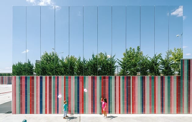
At ground level, the facade sports a colourful selection of ceramic tiles that offer a playful contrast to the surrounding concrete playgrounds. Ranging from pink to maroon, the seven-colour-palette tiles, by Spanish ceramist Toni Cumella, aspire to evoke the individuality of the pupils.
And while the ground floor celebrates uniqueness, the upper level is an ode to Spain’s everlasting blue skies. Part art installation, part camouflaging device, this is clad in mirrored composite aluminium panels punctured by a long strip of shutter-dressed windows. “Aluminium is a characteristic material in this industrial area, so it was used to reference its context,” explains Laura Martinez of ABLM Arquitectos. “Nevertheless, we chose a mirrored finish that gives the impression of a disappearing second floor and reflects the vegetation surrounding the building.”
 Bright colours create a welcoming child-friendly entrance
Born out of an ideas competition that sought the design of a two-storey school on a large industrial plot, the mirrored facade helps embed the school in its surroundings and plays on the perception of scale. “Schools are spaces where children spend much of their time,” the architects say. “We wanted to create a more domestic and liveable space for them.”
The reflective facade is amusing and playful, and it will no doubt become a talking point among pupils, teachers (and the media) alike. The idea reminds me of the poetic, concept-driven design proposals that filled my uni years, but if we look past the fun, perhaps there is more to the building than meets the eye.
 The bright exterior contrasts with the grey concrete playground
Organised around a vast inner playground, the space is subdivided in functional blocks that include a total of ten classrooms for preschool and primary education, four classrooms for special education (music, visual arts, information technology, etc) and a set of flexible classroom and support rooms. The children can also enjoy a library and a canteen, plus an indoor gymnasium and outdoor basketball court. As ABLM’s Arturo Blanco explains: “The library and the canteen are considered as classrooms as well, as a space to educate.”
The shades on the outer facade play a defining role indoors, too, allowing for a colour-coding system of sorts, where every level, course and classroom has its own colour.
 Every level, course and classroom has its own allocated colour
Founded in 2014, the practice has an affinity for the education sector: it has designed crèches, schools, youth residences and youth centres, but the aptly named Almost Invisible School – a name bound to catch one’s attention – is its first project to have reached the international scene.
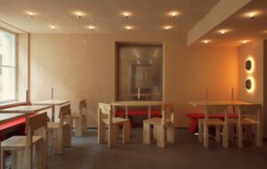
The firm was born “as a result of [the architects’] common interest in the strategic element intrinsic to architecture”. And if we were to look beyond the mirrored facade hype, the strategy is there. At first, it seems surprising to opt for stark white walls in a place that has been designed to be swarming with colour-loving children, but equally, perhaps that is exactly the point.
 Stark white walls allow school pupils to provide the colour
True to its name, the Almost Invisible School appears to take a step back to let its adventurous inhabitants bring the space to life. As Martinez and Blanco explain: “The white walls are a blank canvas so children can make it their own.”
Subscribe to OnOffice and get the world’s best workspaces delivered to your doorstep.
A playful Spanish school minimises its industrial surroundings with a mirrored second storey that vanishes into the clouds

