 The world’s first BREEM Execellent-rated airport terminal|Richard Wilson’s sculpture, inspired by the path of a stunt plane|Waves of north-facing glazing bring in daylight while reducing solar gain|Departures may be light and cavernous, but is it “a new Covent Garden”?||
Heathrow Terminal 2 may be making history as the world’s first BREEAM Excellent-rated airport terminal, but doesn’t quite fly as an awe-inspiring destination in itself
Press conferences can be delicate affairs – a case of subtly building expectation without overplaying your hand. The trick is to tell journalists what you want them to know without seeming as though you’re dissembling. But as soon as Luis Vidal, architect for the new £2.5bn Terminal 2 at London Heathrow, claimed that the assembled crowd should think of his building as a destination in its own right – adding for good measure that “we have provided a new Covent Garden for London”
– the yardstick by which the building was going to be measured changed irrevocably. Would it provide the terminal’s expected 20 million passengers a year with a slice of the city? Was it at the cutting edge of the fourth generation of airport terminals? Is it an example of an airport acting, in that most hackneyed of terms, as a “new cathedral”? All of which Vidal promised.
Sadly the answer has to be no. It’s not so much that this is a bad building – although some of the detailing can only be described as clunky – just that it’s simply an average take on what’s become a tired archetype.
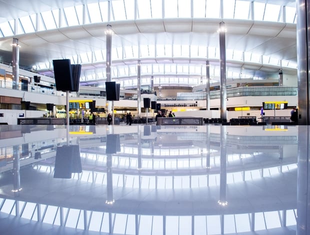
Any international traveller knows the tropes by now. There’s the vast (largely column-free) floor plan, of course, and lots of steel and glass. Then there’s the undulating roof. The three waves have been designed to let the traveller intuitively know the three separate functions of the building – check-in, security, and departure – without recourse to a jungle of signage.
The trouble is, a wall blocking the security area off from check-in rather ruins the effect. The architect insists visitors will sail through check-in and that the acoustics are spot-on, which can only be effectively judged when the first travellers arrive in early June. Once past security, you get clear views out to the aircraft through windows at the far end, and down on the much-vaunted plaza below. This, is has to be said, looks much more like an airport departure lounge than a ‘destination’. With the possible exception of a branch of John Lewis, there’s little sense of place – you could be anywhere in the world.
Foster + Partners masterplanned Heathrow’s much-needed overhaul and designed the concept during the initial project phase, before being dropped and replaced by Vidal. When asked at the press conference why the switch had been made, no reasons were given, leaving one to surmise that the original proposal was too expensive for Ferrovial, the Spanish company that bought BAA in 2006.
Rather than trying to pretend that the building is something it blatantly is not, perhaps Vidal would have been better off concentrating on T2’s environmental credentials, because this will be the world’s first airport terminal to be awarded a BREEAM Excellent rating.
The windows allow in plenty of natural (northern) light, reducing the need for artificial lighting and making sure the space doesn’t overheat. I’m sure it will turnout to be a perfectly pleasant place to spend time.
If the terminal itself is a bland affair then the major talking point is likely to be the huge sculpture by Richard Wilson – the artist probably best known for the his extraordinary 20:50 oil installation currently housed in the basement of the Saatchi Gallery – that travellers will encounter as they arrive and exit the airport.
Called Slipstream, it was inspired by the projected flight path of a Zivko Edge 540 stunt plane, using a computer to plot the plane’s flight through the air. It’s one of those pieces of quasi-public art that encourages journalists like me to reel off statistics, so here goes. It’s 78m long, uses 77 tonnes of aluminium, took a year to build and install and is suspended from four roof-supported columns.
Manufactured by CSI in Hull, it was made in 23 giant sections. According to the artist, the piece is “rooted in location. This work is a metaphor for travel; it is a time-based work.” It’s difficult not to be impressed by the craft and engineering behind the piece, however, the finished result feels derivative, looking like the bastard love child of Frank Gehry‘s Bilbao Guggenheim and Marc Newson‘s Lockheed Lounge chaise.
At the launch, Sir Peter Bazalgette, the chair of Arts Council England, described it as an “icon of our creativity”, but while its scale is initially breathtaking, Slipstream refuses to linger long in the memory.
Ultimately, Terminal 2 sticks to a mould established at Stansted Airport in 1991 by what was then Foster Associates. So used has the international traveller become to these halls of steel and glass that it’s easy to forget the wonder and awe with which Stansted was met.
When it opened, for instance, the architecture critic Martin Pawley described it as “one of the largest and most beautiful sheds ever built”, adding that it possessed “the most breathtaking roof since the Middle Ages”. He concluded, for good measure, that it was “an authentic milestone on Foster Associates’ road to the eclipse of history and tradition in architecture”.
A little under 25 years later, Foster’s building has become the vernacular for airport design. When it’s done incredibly well – as it was in Rogers Stirk Harbour + Partners‘ Heathrow Terminal 5 – it still has the power to impress. Anything less, it merely induces a shrug of the shoulders borne of over-familiarity.
I know I’m not alone in believing that it’s time a new language for international travel was created. One that distills a sense of place and provides a genuine (and preferably uncliched) taste of the city you’re about to visit. At Terminal 2 it’s something to which Luis Vidal merely pays lip-service.

