 |||
|||
The unassuming streets running between Southwark and London Bridge tube stations have always had a quiet appeal to me. Tucked some way back from the main drag of Southwark Street yet still within the outer hinterland of Tate Modern and benefitting from the knock-on regenerative effects of the phenomenally successful gallery, these busy streets have plenty of character, with a preponderance of converted Victorian warehouses, railway arches, plentiful food and drink offerings and a smattering of cultural institutions and venues such as The Africa Centre, Union Theatre and Jerwood Space. Helped also by excellent transport links, it’s not surprising that many former warehouses and industrial facilities have become popular workspaces.
This is the neighbourhood context for the RIBA National Award-winning regeneration of 53 Great Suffolk Street. Hawkins\Brown’s £9m reworking of the former warehouse exemplifies the classic dilemmas facing anyone regenerating a historic building for contemporary purposes. Is the building worth saving? What should it be replaced with? Should it look new or appear to match the vintage of those around it? Can it appear both contemporary and respectful of its surroundings?
Visiting 53 Great Suffolk Street, it seems that Hawkins\Brown and its client have taken the right decisions at every turn – in contrast to several jarring new builds in the vicinity. The site was occupied by a four-storey converted brick-fronted warehouse already in use as offices, flanked by an adjoining single storey building used for storage that shared the distinctive pitched roofline. Hawkins\Brown carried out feasibility studies for the client, which had initially considered clearing the whole site and redeveloping it as residential before deciding to retain and extend instead as workspace. Emboldened by the many changes already made to the building over the years, the winning strategy redevelops the lower building and overhauls and extends the retained side to create a handsome twin-fronted building with 1,700sq m of extra workspace.

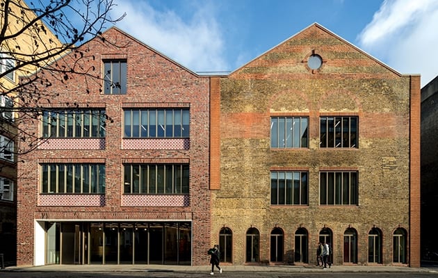
Aimed at the TMT sector, the result is a pair of conjoined, non-identical twins that operate as one with floor levels matched, and with a new full fourth storey and a basement. The new-build has a core that bears the weight of the new level on the retained building as well as containing stylish new toilets. This partial redevelopment had the advantage of minimising the number of interventions in the retained part of the project and instead letting the new take the strain. The addition also houses the showpiece of the interior – a cantilevered raw steel staircase that serves both new and old parts of the workplace.
The architect has wisely resisted symmetry and any attempt at matchy-matchy. Instead, the new can clearly be read with distinct differences in the facade composition, while retaining a shared harmony. “We should be honest about building a new building. It might be well mannered, but it has to have its own personality,” says Hawkins\Brown partner Seth Rutt.
The entrance is moved to the new part, whose ground floor frame references that of the building it replaces. Its pitched form, meanwhile, has been referenced in the new roof at the top.
With the retained building’s original windows long gone, Hawkins\Brown opted to reconfigure the rows of four windows on the first and second floors into two much larger windows to bring more light into the workspace. The Schüco window system – finished in light bronze anodised aluminium and fitted with high-performance glazing – is used across both old and new, with the new portion sporting a rectangular top floor window rather than mimicking the circular of its neighbour. A particularly nice touch is the introduction of a spandrel band of terracotta tiles on the new main and side elevations. These sport a distinctive quatrefoil pattern borrowed from Victorian housing further down the street and adopted as a way of subtly embedding the new build in its context.
The choice of brick was a key part of the composition of the new-build facades, deliberately distinguishing them from the older part through colour, texture and bond. The bricks were made by German manufacturer Janinhoff in a traditional circular, coal-fired kiln in a process that introduces sprinkled sea salt to create extreme variations in colour and texture. They were then laid with a random (within a set of conditions) bond, to give what Rutt describes as an aged feel that also “brings the hand of the artisan to the building”.

Meanwhile the brick of the retained building was given a light-touch going-over with some patching and a new brick parapet added along the sides.
“There’s a real tapestry and richness of history. So instead of taking all the layers off, we tried to leave all the character of the building,” says Rutt.
Inside, the star attraction is the angular metal staircase that cuts up through the full height of the building within a glazed enclosure that shows it off to the tenants. The staircase was created from site-welded raw steel panels that have been buffed and treated with black wax to give an inhomogeneous effect. This is complemented by two patinated brass handrails, which terminate in a pleasing, highly tactile flourish at the bottom. Each tread has brass ridge details.
The same treatment of steel is used to clad the reception desk, which is illuminated with a row of cantilevered Potence lights by Jean Prouvé from Vitra.

The drama of the staircase is amplified by a delicate pendant chandelier in the stairwell extending 15m down from the lightwell at the top. Manufactured by Bocci, this incorporates 36 strands, each of a different length to Hawkins\Brown’s specification, and terminating in a hand-blown glass bulb.
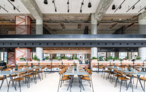
Hawkins\Brown fitted out the whole building to Category A. Finishes are simple – a polished reception concrete floor, brick walls that can easily take wear and tear and exposed concrete soffits. The new roof pavilion, lift overrun and plant are clad in zinc. The aim was to be honest about the intervention, with no attempt to smooth over the juxtaposition of old and new brick walls either inside or out.
“We wanted to create a robust shell and resolved not to have any plasterboard in the building,” says Rutt. “We enjoy the layers of retrofitted buildings where you get quirky details because it reminds you’re in an existing building that’s being reused.”
Particular attention was paid to the exposed services running beneath the ceilings, which were painstakingly detailed to minimise intrusion, with only the cable tray allowed to descend lower than the steel beams.

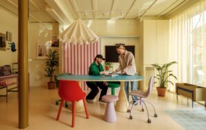
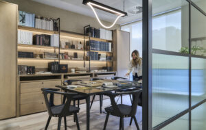
Designed with scope for multiple-tenant occupancy, the building is currently occupied by just two companies, and their office fit outs demonstrate that the building can take very different interpretations of workplace. One is a conventional office with suspended ceilings and cupboards against the glazed wall overlooking the showpiece staircase. The other – a fit out for marketing agency GPJ by Studio Weave/Architecture 00 on the upper two floors – is more in tune with Hawkins\Brown’s shell-and-core design ethos, generally leaving the ceilings as they were and retaining views of the staircase.
Individual rooms off the main workspace have different characters, including the top floor meeting room behind the circular window, in which Studio Weave/Architecture 00 created a striking installation of pink vertical tubes hanging from the ceiling. As well as having acoustic benefits, these reference Vivienne Westwood, who inspired the room’s Westwood name. Elsewhere there are small booths for secluded working. Loose furniture includes oak workstations by KI.
There’s room for all sorts of approaches here, and no doubt the building will cope with many more variations over its newly extended lifespan, while avoiding the current workplace fashion for showy communal facilities.
While warehouse-to-office conversions are hardly new, 53 Great Suffolk Street is particularly successful because of its ability to negotiate a clearly contemporary yet respectful intervention that feels rooted in the spirit of the area. Not only does the project give the original building another lease of life, it undoubtedly improves the streetscape and retains an active use in contrast to the often-deadening effect of luxury residential on a community. And this rehabilitation is no mean feat – next door at number 55, a fine listed Victorian warehouse has long lain empty, a stubborn reminder that such regenerations are never plain sailing, even despite this area’s upward trajectory.
Hawkins\Brown’s extension of a south London warehouse creates a pair of non-identical twins which work as one


