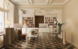
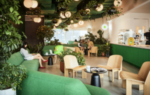
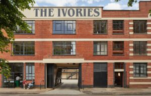
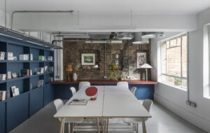
 Piero Lissoni’s love letter to all things glassy|The self-supporting black steel staircase – heavy and light at the same time|Glass is the material of choice wherever possible, from doors to desks|Working areas face onto an internal courtyard|Forbidding black steel doors guard the entrance|Lissoni’s building is bright enough not to need artificial lighting by day||
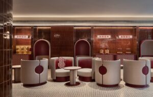
At Glas Italia’s Lombardy headquarters, customers are led to the company’s furniture collection through a building so filled with daylight that no electric light is needed here during the day. After they’ve passed along the last bright minimalist corridor, the sales assistant will turn a handle and they will be ushered into a contrasting, black-painted space, full of the manufacturer’s glass furniture.
Export manager Flavio Parlato calls this “a sacred space,” explaining that the extra-clear glass used in the products are more visible against the dark background. This jewel-like place forms a stunning showroom for the furniture collection. The thinking customer, however, may realise that it is the rest of the building that is the real showcase of Glas Italia’s product and its possibilities.
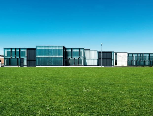
The facade of this 11,000sq m structure comprises huge sheets of frosted glass, set in a black steel frame. Glass forms the partitions between meeting rooms, the reception desk, the bookshelf in the reception area, the balustrade on the dramatic freestanding staircase – even the desks. The main capital investment was triggered by an investment in a new lamination line, useful for just the type of architectural glass that is on display all around.
So the building is perhaps the world’s most beautiful advertisement – not just for the firm’s materials and technical processes, but its design nous as well. Piero Lissoni, the architect of the building, is the designer of a significant proportion of the company’s furniture collection, including its colourful Dark Side of the Moon table, Haiku partitions, Tutti Frutti magazine racks and Outline mirror. Additionally, he is director of the firm. When I ask him how being a director of a company and one of its designers affected the process of designing the building, he says the whole thing was easy: “After a principal discussion with fire safety people about how my design could incorporate opening windows, it was very quick. We did the whole facade in two months. If somebody destroyed part of it during construction, we could replace it immediately. It was very, very, very, very, very simple.”(Customers note: glass is also regenerative!)
Lissoni goes on to describe how much he enjoyed designing the building for his own firm. He said it was like being “an instrument in the orchestra instead of the conductor.” So what tune, exactly, has this instrument produced? And what inspired him?
The building contains offices for 20 people, with conference rooms, meeting rooms and a showroom on the upper floor. The ground floor contains the factory and reception area, and below is the warehouse (130 people work on site in total). Externally, visitors approach the building over a concrete walkway; this and the staggered concrete blocks at the rear of the building – which look from the air like a staircase – are an homage to the great Italian monumental architect Carlo Scarpa.
The frosted glass and steel window frames at the front of the building deliberately create the effect of a piano keyboard, black upon white. “Sorry to be super-banal,” says Lissoni. “It was obviously a piano. It’s like a pentagram. A musical one, I mean, not a pagan one.”
The result is a sort of chiaroscuro in which the glass represents art and design, in its lightness; and the dark steel represents the precision manufacturing process. Both are an integral part of the Glas Italia brand, says Parlato. In fact, Lissoni was keen to design a building around these working practices as much as the pre-existing factory, which had been here since 1970. “It is all the public face of the technology, the people and the production,” he says. And he tells me how he worked with the engineers so he could make changes to his design. His vision is redolent of early modernism: “The technology came first,” he says, “and then I adapted my design around the technology.” It is obvious to him that this is how things should be done. But they aren’t often.“Why don’t we design good architecture?” he asks me. “Why is it something just for show? I treated my factory design like a sculpture. It was a pure factory for the men and women who work inside. And for my beautiful robots.”
The layout was an important part of this. Glas Italia’s process is such a demanding one that constant discussions and eyeballing of the products have to take place between the commercial and manufacturing sides of the company. “We are an industry, not a soft business,” says Parlato. “Production is the basis of everything, so we have to keep the offices, showroom and factory close together.” In case I neglect some of the other benefits of building in glass, I am reminded by both Lissoni and Parlato of its environmental claims. The facade uses U-glass (also known as channel glass, named after the channel-shape of each section), manufactured so a layer of air is trapped between its double glazing; using the glass cuts energy usage by 40%, they claim.
Glass may be practical and strong, its manufacture may be exacting, industrial – and hot – but Lissoni’s functional vision still has room for a couple of incredibly graceful set pieces, some of them gossamer light, and some heavy as lead. For example, the airy, frictionless corridors and the almost completely transparent office spaces with their ‘invisible’ glass desks. But most notable, surely, is the black steel staircase, which welcomes visitors to the foyer. The freestanding, heavy structure, reminiscent of the work of iron-wrangling artist Richard Serra, was bought on site in sections and then assembled. It could only be Italian.
Lissoni says he is obsessed with staircases, mentioning the impossible constructions drawn by MC Escher. In his view, staircases are “A special place where…you fly in the air a little bit. You should feel like you are moving inside a new dimension.” This feature, a functional sculpture, is challenged in drama by the huge pair of black steel gates which open up to allow lorries into the plant. One feels the liberal use of very large, black steel elements – such as these vast gates, the external sign, lit from within, and, most of all, the huge staircase – are vital in forming a solidifying presence against the lightness of the glass, which could be in danger of floating away.
Lissoni is certainly not apologetic about causing an architectural stir, even in a company for which he holds the directorship. “I created a total work,” he says, and I am reminded of Wagner and his Gesamtkunstwerk, for which the great composer wrote the music, the story and the libretto. Lissoni readily agrees with the comparison. And, anyway, whether he designs for himself or for others, it doesn’t make a difference, he says. “My clients, all of them are my victims. When I play like an architect, I tell them, ‘You are a victim first, and after that you are my client.’ I like to be inside in the process. I am joking with you a little bit, here.”

