 Conran + Partners with Brooks Brothers||
The lines are often blurred between the worlds of retail and the public realm, particularly when sponsors are calling the shots. When creative freedom is granted, though, the results can be as exciting as non-commercial alternatives, and explore the interesting middle ground between exhibition and commerce. This was the case with RIBA’s latest Regent Street Windows project, its sixth edition, which invited 13 architects to each work with a brand on a shop window design. The firms – which ranged from emerging practices like Coppin Dockray, Shiro Studio and Citizens Design Bureau to the more established Conran + Partners and Michaelis Boyd Associates – were challenged with designing an installation for a tricky, confined space, to be installed overnight, that would be seen by more than a million people a week on London’s busy shopping street. Here is onoffice’s top of the shops.
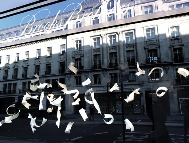
Conran + Partners with Brooks Brothers
This theatrical installation by Conran + Partners depicted a ‘flock’ of ceramic shirt collars frozen mid-flight, with a single gold collar at the lead, inspired by Brooks Brothers’ history as the first fashion brand to adopt the button-down collar. The firm worked with London-based ceramicist Billy Lloyd, who handmade the collars, which design director Tim Rundle says achieved “a really dynamic, sculptural result that would not have been possible using actual collars”.
The practice drew on the work of early photography pioneers Eadweard Muybridge and Étienne-Jules Marey, providing Lloyd with stop-motion images of a shirt collar moving around “as if in flight”, to use as a visual brief. Once made, the collars were hung using a suspension system based on fishing components. Conran + Partners also worked with lighting consultancy Into, to create “a sense of space within the confines of a rather small window,” says Rundle.

EPR Architects with Anthropologie
EPR’s design comprised around 1.3km of bamboo, sculpted, painted and arranged to depict what associate director Steven Pey describes as “the space that’s left after you take a big scoop out of an ice cream tub.” Explaining the spectrum of painted bamboo tips, Pey says: “The design gives a moiré effect to people walking by. When you stand on the other side of the street, you see the large swirl of colour, and as you approach, it reveals itself.” The material was chosen to align with Anthropologie’s crafty, handmade brand ethos, and painted in colours to suit its autumn collection. “It’s a warm, sustainable material we could use in an ordered, architectural way,” says Pey. EPR collaborated with the Materials Council and model makers/product designers Vertikal Space.

Space Group Architects with Penhaligon’s
Space Group architects took two of the latest fragrances from Penhaligon’s – male and female – which are inspired by the British coastline, as a starting point for its storefront. The results are two “immersive, multi-sensory spaces, an abstracted illusion of the perfumes’ characteristics,” describes practice founder Martin Gruenanger. The results depict Britain’s “harsh and wild” coastal landscape using bark, moss (which had to be kept alive throughout the installation), artificial internal rain “which was hugely complex to achieve” says Gruenanger, and crystals, referencing the saltiness of the scents. If you look closely, he says, you can see mist coming off the crystals, like seaside fog. Space Group worked with artist Aurelia McKelvey, an expert in natural materials, to bring the installation to life. The design incorporates work by sound artists Fennesz, Mia Zabelka and Oliver Stummer, who interpreted the perfumes to make a soundtrack that adds the finishing touch. This project won RIBA’s Best Design award.

Coppin Dockray Architects with L’Occitane en Provence
The kaleidoscopic visuals of Coppin Dockray’s installation for L’Occitane en Provence drew on the brand’s typical imagery of the landscapes of the south of France, but abstracted. This, explains practice founder Bev Dockray, is to convey vague memories of holidays in the region, depicted as “a shifting impression of intense light, colours and scents”. Practically, the design also dealt with bright reflections on the window caused by its orientation, using vivid colours and reflective elements close to the glass. It comprised 2D and 3D elements: vinyl stickers by Surface View, showing fragmented landscape images, dichroic film and mirror; and timber boxes by joiners NBJ London, with lighting by Mr Resistor. “The idea was to create something visually dramatic with maximum impact… that looks visually complex and intriguing, but is in fact very easy to construct,” says Dockray. This project was selected for the RIBA’s Best Architect award.
Visit architecture.com/ribawindows to listen to podcasts of the designers talking about their works.
RIBA’s Regent Street Windows project pairs retailers with architects to install some appealingly creative shopfronts


