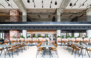
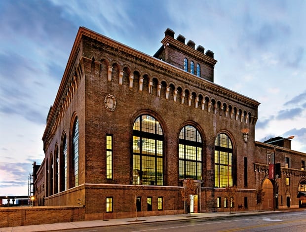
 The restored exterior of the 1920s building, with its tall, arched windows and terra cotta detailing|Two cantilevered floor plates fill the cathedral-like space and provide room for Cannon’s 120 employees|Concrete floors and industrial-style lighting honour the building’s original use, and vast windows let in ample natural light|The floorplates were overlapped to give the impression that they almost hover in space, and to allow as much light as possible to penetrate informal meeting areas|The area between the newly formed workspace and the external wall of the original building is now used as a community gallery|Adapted Knoll workstations are set up in a grid formation among the building’s original steel columns|A reference library at lower- ground level contasts steel and brick with carpeting and bright yellow bookcases|An oblong structure on the roof originally used to store conveyor equipment now houses the staff lunchroom and boardroom||
A disused steam power plant in downtown St Louis is transformed into a gem of a modern office
When pondering America’s coolest cities, St Louis generally doesn’t pop to mind despite a thriving arts scene and reputation for luminescent nightlife. The hidden benefit, though, is the vast amount of building stock from the city’s early-20th-century industrial heyday not yet snapped up for loft apartments, galleries and creative businesses as they have been in New York and San Francisco, where old warehouses and factories have been a hot commodity for years.
“St Louis has been a little slow in adopting that mentality,” says David Polzin, vice president for international architectural practice Cannon Design, which has transformed a coal-fired steam generation plant into the firm’s swish new downtown headquarters. The Power House, built in 1928, was decommissioned by the city in 1980 and designated as a landmark by the National Historic Register – but, rather fortunately for Cannon, had lain empty until now.
The firm’s decision to pioneer a change is a familiar story. After a period of leasing space in a high-rise, the business became disjointed as staff started to spread out over several floors. It wasn’t effective, says Polzin, because changes in the design profession had shifted the way the firm worked. It had flipped from a CAD environment to a Building Information Model environment, he explains, though physical proximity was still important to the work despite advances in technology.
“What we had before was not a very collaborative way to get things done; we wanted to be in one continuous cohesive space,” he says. “Our projects, particularly in the last decade, have really grown in scale and the teams have gotten larger, and the need for communication has really grown.”
In 2007, when the firm set about restoring the Power House, it was literally an empty shell with nothing inside except an abundance of toxic pigeon droppings. Cannon first set about restoring the exterior shell of the building and devising a workable solution for the interior, which was slightly tricky because of the proportions of the building. “Everyone who looked at the structure intuitively knew you had to add floors, but it was a question of how you do that without destroying the incredible cathedral-like quality of the space,” Polzin says.
The answer was to clear everything out and add two cantilevered floor plates supported by a new steel system, forming a sculptural three-storey gallery that feels like it almost hovers above the space. This, combined with the existing two floors and rooftop penthouse, create a total of almost 3,000 sq m of desk and informal workspace for 120 architects and designers. On the roof, an oblong structure originally used to store coal conveyor equipment houses a boardroom and staff lunchroom. The whole space had to be completely rehabilitated with the addition of new plumbing, electrics and heating/cooling systems.
“Everyone who looked at the structure intuitively knew you had to add floors, but it was a question of how you do that without destroying the incredible cathedral-like quality of the space”
The materials for the new internal structure are simple and economical – plasterboard on studs – but the contrast of the sculptural, modern addition against the rawness of the original building works without being awkward or intrusive.
“We wanted a pure, simple intervention within this very textural space. There is a structure and rigidity to the shell and so it was important to me to have a much more organic expression,” Polzin explains. He also made a point to retain the original steel structure: a set of eight columns and trusswork. “We have this very modern crisp working environment colliding with these distressed-looking columns – it’s a nice juxtaposition,” he adds.
Regulations stipulated that the outer shell not be altered or modernized, but Polzin says he wouldn’t have wanted to change much anyway. “To my mind this building was always modern, if you think about those big windows opening up onto the machinery it kept inside. The transparent envelope is the key element of this building and the thing we exploited most in the design.” The new floors are set back from the massive windows, meaning this transparency is retained, a design that also provides space for a community art gallery, giving the building real street-level presence.
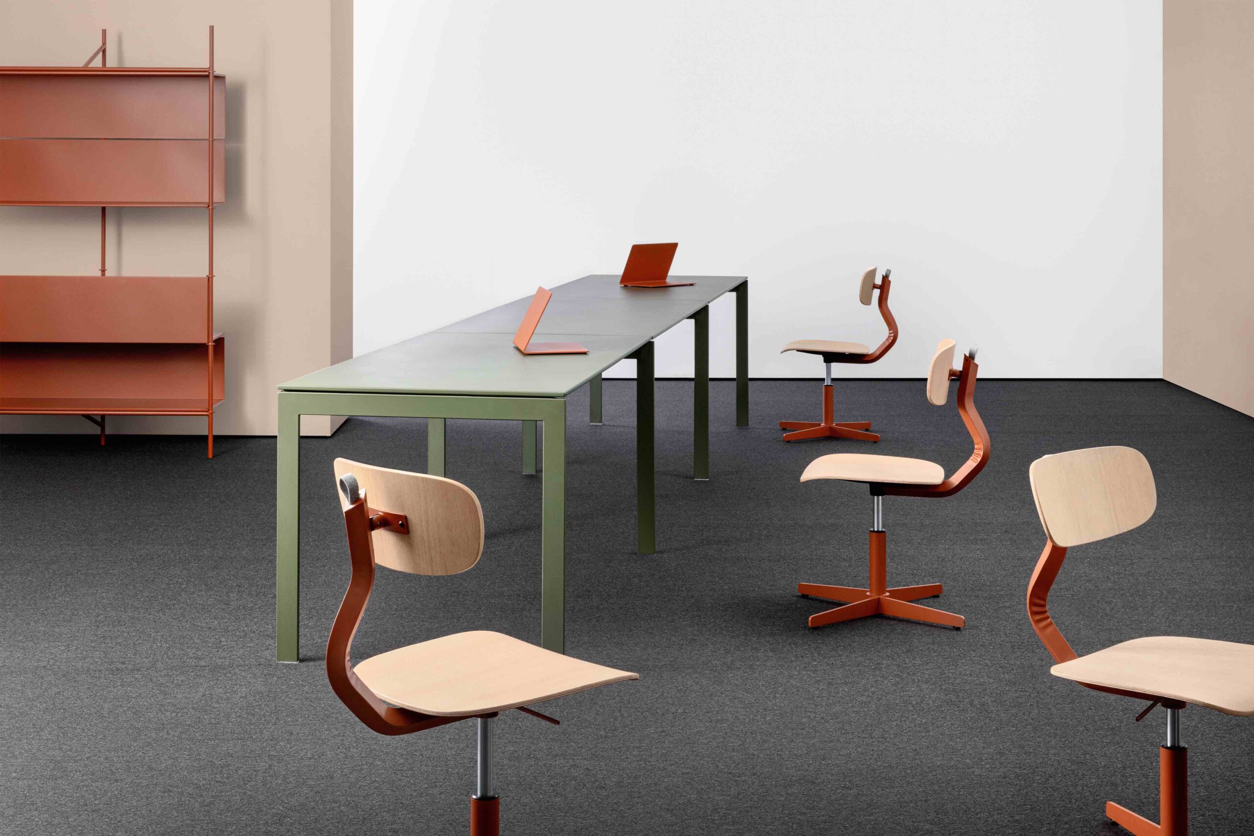
The detailing is understated; the ceilings, for example, have open ductwork and exposed surfaces, and the polished concrete floors at ground level are simple and clean. Carpeted work areas have simple grid arrangements of Knoll workstations with teal fabric panels and chartreuse storage units – touches of colour apparently inspired by the work of French designer Pierre Chareau.
As with most newly designed offices, quite a bit of emphasis was placed on how staff could work more collaboratively, although there was a concern about over-engineering these areas or forcing them on people. Loose, unprogrammed space for people to gather for impromptu meetings runs around the periphery of the new floors, which is what Polzin calls the “prime real estate” in contrast to the closed conference rooms. “It’s human nature to gravitate toward the balcony edges. Those have the best views and most natural light,” he says, adding that it was obviously the right configuration because staff immediately used these spaces as intended, which has made all the difference in their working culture.
“The transparent envelope is the key element of this building and the thing we exploited most in its design”
It’s been a worthwhile journey: “The refinements in office design are always incremental. Most often they’re subtle, sometimes they’re profound. But there is a quality to the space that is open and its as much about the human spirit and how one feels when one comes to work as it is about engineering these relationships in some proto-scientific way.”
It’s an understatement to say that Polzin, and the whole of Cannon, are pleased with this industrial gem and how it speaks volumes for what they can do as an architectural practice.
“The idea was to touch the building as lightly as possible and I think we achieved that,” he says proudly. “It works really well and everybody loves it. That’s not just boosterism or marketing, it really is true and there is nothing more gratifying than that.”

