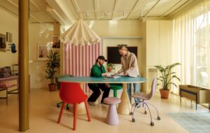
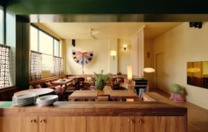
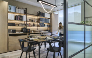
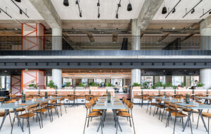
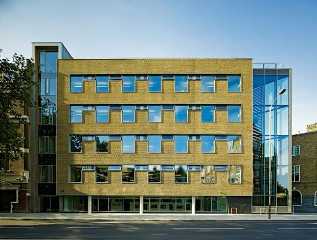
 The brick and glass facade of Romero House fits into the context of Westminster Bridge Road|A half-level shift between the two sides of the building is visible from the south side of the atrium, while a wall of glass bricks makes a feature of the central stair|Breakout areas and tea points next to the atrium provide congregational space on each floor|Openable windows and a 50 per cent solid-to-glaze ratio on office floors provide good levels of daylight and natural ventilation to staff|The back staircase is nestled inside the glazed point of Romero House, pointing toward Waterloo|Skylights at the top of the atrium flood light into the centre of the building and into the peripheral areas on the office floors|The structure’s concrete frame was painted white to reflect light and maintain a simple, clean aesthetic|A top-floor pavilion with sliding glass doors leads out to a roof terrace, which has sweeping views across London|Romero House sits next door to St George’s Cathedral in Southwark|Zinc-clad tiles and solar louvres on the back elevation||
The Catholic Overseas Development Agency has had its prayers answered with Romero House, a sustainable HQ by Black Architecture
Until recently, the land adjoining St George’s Cathedral in Southwark was a tarmac car park. The site’s original terraced houses were levelled during the war but, in an apt move, the Catholic Overseas Development Agency (CAFOD) has now built its headquarters there, creating a tidy little Catholic settlement in south London.
Guided by principles of “living simply”, CAFOD drafted eco-warriors Black Architecture to design Romero House – an office building that adheres to a triple-pronged code of sustainable development: economic, social and environmental, and seemingly in that order.
“CAFOD’s brief was consistent from the very beginning,” explains Paul Hinkin, one of Black’s founders and a staunch advocate of developing a new ‘eco-architecture’, though he points out that environmental sustainability was only one aspect of the job.
“They wanted a simple outward building that would tread lightly on the earth. A number of the areas they’re working in around the world are directly affected by climate change, and they wanted to ensure they’re not making anything worse. This isn’t an opulent building or a grand headquarters at all. It is very much about a solution that is delivered at low cost so that money isn’t diverted from the core charity aid of the organisation.”
Momentum for the project came about because CAFOD was cooped up in a series of buildings across Stockwell and Brixton, quite small in scale and a mix of old and new, and maintenance and energy costs were rising significantly. A consolidated move was a way to address these issues and to reinvent how the organisation works in a building that provides plenty of congregational space.
“They wanted a simple outward building that would tread lightly on the earth”
“The thing that kept coming up again and again was a desire to make a heart for CAFOD and to create a building that challenged the behaviours that had developed as a result of being in their previous accommodation,” says Hinkin.
To understand the building, it’s best to start from the bottom and work up, Hinkin says. The basement boiler room, which houses equipment to bring alternative energy into the building, essentially frees up an entire level of floor space for CAFOD.
“A lot of this technology would be on the roof of the building but a key part of our proposal was challenging that notion,” explains Hinkin. “The benefit is that you can use the top level as a social space (now a sun-filled pavilion with cafe facilities, prayer room, library, and roof terrace) and also there is a big advantage from deriving energy from the ground as opposed to gas or electricity.”
A ground-source heating and cooling system (linked directly to the building frame via water pipes cast into the concrete floor slabs), rainwater harvesting tanks, photovoltaic panels and solar thermal water heating mean that Romero House has a 72 per cent reduction in carbon emissions from the CIBSE office benchmark; no doubt helping to secure the building’s BREEAM Excellent rating.
The five-storey construction – a concrete frame split into two halves – has an atrium (running north to south) denoting the separation between the two. Triangular floor plates on the east side of the building hold the bulk of the open-plan office space, and a half-level shift to the west side provides all of the ancillary support spaces: breakout areas, lavatories and tea points. “One-to-one” rooms are tucked at the north end of the atrium on each floor.
There was a logical reason to use step sections, it turns out. “It’s a key part of the social sustainability because it means that on every floor they’re going half a flight of stairs to have access to facilities,” Hinkin explains. “One of the key things we found in other office buildings is that you tend to get floor by floor segregation. If you’ve designed all the facilities on one level there is no need to leave your floor for anything, therefore missing out on meeting people from other floors.”
Both sets of stairs in the building have dual functions and were gussied up with galvanised steel and ash detailing to encourage them as the vertical method of choice: the central “meet and greet” stair needed to also serve as an escape route (in case of a fire, a wall drops) while the back stair, on the dramatic glazed corner coming from Waterloo, is a chance to give staff a sense of their surroundings as well as an “incidental place” for phone calls and other personal activities.
“The context needs something strong in this corner,” Hinkin says. “We looked at having the entrance here but it didn’t work. I think this deals with the contextual drivers and gave us a good opportunity that would otherwise be a fire escape.”
And to the question of lighting – the architects spent a lot of time looking at and testing different levels of solid and glazing to work out what the optimum balance was for natural light versus heat gain and loss.
“This isn’t an opulent building at all … it is a low-cost solution so that money isn’t diverted from the core charity aid of the organisation”
They decided that, in addition to external solar shading on the south-west facade, a 50 per cent solid-to-glaze ratio was roughly the right response. Lifting the glazing as high as possible on the wall of each office floor punches daylight as deep as it can go to the centre of the floor plate.
“Lighting is another point where we think this intrinsic, new sustainable architecture begins to emerge,” Hinkin says. “We come off the back of a tradition where office buildings were fully glazed; that was seen as the answer – but in fact it’s completely the wrong answer. It is virtually impossible to control in terms of heat loss and gain. It makes people uncomfortable and it wastes money.”
The concrete’s thermal mass stores energy from the ground source system at night to offset the heating or cooling loads the next day. It means the majority of thermal energy requirements can be met from the ground source system, he says.
Moving further up the building, a meeting room inside a lightweight pavilion made out of local sweet chestnut, left untreated, is set off against the cladded zinc tiles that make up the back elevation. This is a pronounced contrast to the brick and glass facades on the main office triangle.
“A building that’s been designed with bioclimatic design principles shouldn’t look the same all the way around,” Hinkin says. “Anything that’s trying to use passive design principles should tune the way it responds to orientation. The idea of the Gherkin, where every surface in every orientation is rendered in the same way, is a very simplistic response to a set of very complex environmental drivers. We think that’s where the architecture lies. It lies in how you think about wind, sun, exposure and context and then design solutions that fit in with all of those.”
All in all, CAFOD and Black are pleased with the result. “We came with ideas of how workplace design can be different and just happened to find the perfect client in CAFOD,” states Hinkin. “It’s different than other office buildings because they often start with a picture of what it’s going to look like and shoehorn organisations into it. The biggest message here is that we did it the other way around. It doesn’t start with an image, it starts with a philosophy, and that’s what we get excited about.”


