 ||
||
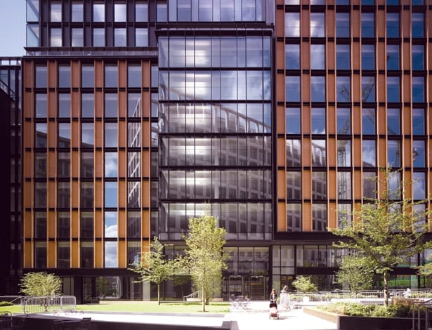
 Italian terracotta panels sit within black aluminium framesKing’s Cross’ £2bn transformation from polluted wasteland into a glimmering hub of commerce is not lost on those who knew what it was but a decade ago. It’s an astonishing turn of tides for this historic piece of London, once an industrial powerhouse that had more or less been left to rot since the 1960s. Gone are the seedy nightclubs and the working girls who’ve now scurried up Caledonian Road to pastures new.
In their place, a mix of office buildings, residential developments, squares and sleek restaurants sit on the spanking new streets of King’s Cross Central, a 27-hectare masterplan spearheaded by developer Argent. All of this is punctuated by the rebirth of St Pancras International and King’s Cross mainline station, with Central Saint Martins School of Art’s relocation to a refurbished granary bringing with it scope for young, trendy businesses.
It’s within this curious context that lauded French architecture practice Wilmotte & Associés has just completed its first building in the UK – a 49,000sq m office block in the brand-new Pancras Square. The 13-storey structure, 6 Pancras Square, has been developed by BNP Paribas Real Estate and AXA Real Estate, and was pre-let to Google as part of the tech giant’s permanent relocation to the area.
Equally impressive is the company it keeps: neighbouring buildings have been designed by Allies and Morrison (also the masterplanners), David Chipperfield and Eric Parry – and so by all accounts, Wilmotte & Associés has landed in London with quite a bang.
 Google’s blank canvas: the tech firm is leasing the space Referencing the area’s industrial past, the building’s distinctive feature is a series of textured, terracotta panels in its facade, which sit within a black anodised-aluminium frame. The idea is that the terracotta, all prefabricated in Italy, echoes the brickwork of the architecture in Victorian King’s Cross, some of which has been restored as part of the area’s regeneration.
“The beauty is that it lies within the King’s Cross Conservation Area alongside the Grade I-
listed St Pancras station and the Grade-II listed German Gymnasium and Granary Building,” says practice founder Jean-Michel Wilmotte. “It was designed to respond to the historical context and diversity, and to contribute to the new identity of the area and help create a sense of place.” It’s a
tall order, but one that Wilmotte handled deftly with contemporary architecture that is both efficient and impressive in an understated way.
“The beauty of the masterplan is that each building has its own identity and language, but it’s all cohesive,” says project architect Benoit Sanson. “We believe 6 Pancras Square is a good balance between statement and quality.”
It’s a very long building, which means one only ever has an oblique view of it. Coming out of the train station, it very slowly reveals itself. To break up the building’s monolithic presence, four glazed vertical fractures give the impression of different buildings by breaking up the massing. As with the rest of Pancras Square, planning restrictions limited its height to maintain the legally protected viewing corridor from Parliament Hill to St Paul’s Cathedral.
To comply with this, the 13-storey split-level building is massed on to three tiers and the structure is stepped, rising from south to north, with terraces on the eighth and 11th floors that give sweeping views over the dramatic roof of John McAslan + Partners’ King’s Cross Station Western Concourse, and across London.
At the time of writing Google was on site, no doubt adding Google-esque flourishes to its new HQ. Most of the dramatic ground-floor reception was covered and protected, and very little has been revealed about how things will change as it makes its mark. However, glimpses of the base building were enough to showcase Wilmotte’s detailing and emphasis on light and materiality.
 High-spec materials include striped Marmara marble in the atriumThe 25m-high glass atrium, set off by swathes of striped Marmara marble, presides over a semi-public walkway linking St Pancras International with Pancras Square and the entire area to the east of the station. The atrium’s glazed roof floods light in to all of the office floors, and four scenic, glazed lifts – notable for their lack of metal joins – whiz up and down the office levels. Bespoke lighting by Jean-Michel Wilmotte illuminates the atrium column and the ground floor.
The office floorplates needed to be efficient, with a spec to rival The City – and Wilmotte’s solution for the building was a steel frame with concrete floors, giving 96m-long spaces with open spans and no columns. A typical floor has 3,400sq m and 2.75m ceiling heights, though the top level is slightly more generous at 3.4m. All have 360-degree views and, most would agree, provide stellar groundwork for the Google brand to put down some roots.
One of Wilmotte’s claims is that the design of 6 Pancras Square includes a palette of ‘noble’ materials. It’s a word that implies materials that are ‘real’, less glossy, imperfect. Individually speaking, it might be true: anodised aluminium has a matte quality; textured marble and terracotta are certainly full of irregularities. But the overall effect of 6 Pancras Square is still one of carefully articulated design and meticulous finish.
The building achieved a BREEAM Excellent rating thanks in part to its motion-sensor lighting, good quality glazing, and shading provided by the depth of the terracotta tiles and metal fins in the aluminium frame.
 Looking skyward from the base of the 25m-high atriumWhen Google finally moves in, 6 Pancras Square will be part of King’s Cross’ evolving story, which is so much more than a cluster of new office buildings. It’s a whole new district, and the excitement of this is not lost on the architects.
“It’s not like Canary Wharf – when you go there on the weekend it’s a ghost town,” muses Sanson. “In King’s Cross there are students, it’s in the middle of the city, and if you walk here during the weekend it’s alive, which is quite wonderful.”
Wilmotte & Associés’ meticulous contribution to the King’s Cross masterplan – now leased to Google – uses the area’s terracotta and metal Victorian industrial buildings as a reference point


