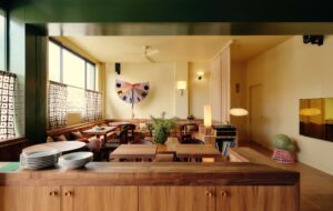
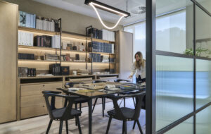
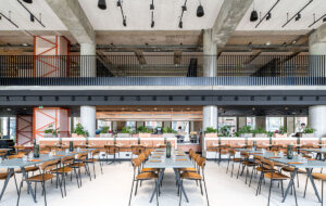
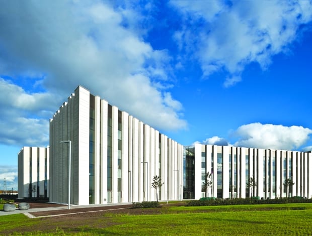
 A barcode-like facade references the DNA-typing carried out inside|The ETFE roof’s cushioned softness contrasts with the rest of the atrium|Four wings radiating from the atrium mimic the X-chromosome|Fortress-like walls incorporate deep reveals to provide prominent shade|Inspired by words such as “rootedness, security, stability and vision”||
Potentially, the new Scottish Crime Campus building strikes an uneasy balance between conforming – unwittingly – to the stereotype of forbidding police architecture and projecting an image of accessibility and modernity. The Scottish government funded £75m police HQ, located in Gartcosh, North Lanarkshire, eight miles from Glasgow, brings together the Specialist Crime Division of Police Scotland and partner agencies that were previously housed in separate offices. These include parts of the Crown Office and Procurator Fiscal Service, the National Crime Agency and HM Revenue and Customs.
The main aim behind centralising these agencies is that, by working in concert, they will combat serious organised crime more effectively, including tax evasion, international fraud, terrorism and murder. The hope is that, gathered under one roof, its 1,200 employees will cooperate more efficiently. Otherwise, this monumental building’s chief aspiration was to be well-designed. This reflects the Scottish government’s new architecture policy, which states, “There is now greater awareness of the value of architecture and place in Scotland and ever more discussion around their merits… Government-supported cultural programmes on architecture aim to further encourage debate on the role of architecture… to promote the value and benefits of good architecture and to improve understanding of building design.” And the building used to illustrate these words in its document? The Scottish Crime Campus.
The project’s press blurb even describes it as “iconic” (rather prematurely since a building only becomes iconic over time). Yet ironically, for architecture which dubs itself iconic, it is neither visible nor geographically accessible. It sits in a remote, isolated location, a 50-hectare business park occupying the site of a former steelworks that closed down in 1986. Today, it is a regeneration area, where more than £20m has been invested in land reclamation and new transport links. Yet this high-security building’s perimeter fence cuts it off from the nearby roads and station. Just as this is not a building the public can really enjoy, those within it can almost forget that they are in a post-industrial setting: the nearby station and roads are screened by dense planting and beyond this lies a romantic vista of the Campsie Fells.
Yet the aim of BMJ Architects and Ryder Architecture, which designed the campus, is to promote the idea of transparency. “On one level, the building is secure like a castle,” says Gordon Murray of Ryder Architecture, who was responsible for its shell and core. “On another, we didn’t want to create a hermetic black box, like a prison building. It’s an office for the state and so it is more transparent.”
Forming part of the brief was a list of various abstract words – “rootedness, security, stability, confidence, vision, meaning, legibility, quality” – whose characteristics the building’s design needed to embody. These themselves also convey the contradictory way in which the building strives to be transparent yet impregnable: after all, the word “legibility” implies openness, while “security” suggests defence. Murray picks up on the theme of rootedness when he says, “We didn’t want a building that looked ephemeral but permanent.” Certainly, from a distance, the Scottish Crime Campus looks like a fortress, albeit an unconventional one, its facade made of pre-cast white concrete broken up to form an irregular but graphic pattern of vertical stripes.
This turns out to be the building’s main design conceit – one which sets it apart from the featureless architecture normally associated with police organisations. In fact, the Scottish Crime Campus – the rather jaunty word “campus” itself seemingly chosen to water down the authoritarian connotations of the police force – is sophisticated in its referencing of other comparable, corporate institutions. “We visited and made reference to such places as David Chipperfield‘s BBC Scotland HQ [in nearby Glasgow], Niels Torp‘s Waterside (British Airways’ head office in London), and the Netherlands Forensic Institute in The Hague by Claus en Kaan,” says Murray.
But back to the intriguing facade, which, it turns out, alludes to the unique barcodes that can represent DNA profiles used in crime detection, as well as the dermal ridges on fingerprints. “The building has a state-of-the-art forensic science lab which carries out cutting-edge DNA-typing,” says Murray. “So we decided we’d have a look at how DNA is converted into barcodes, then designed a form of architecture based on this.”
The solid parts of the façade’s highly fire-resistant, flat-slab concrete frame alternate with deep window reveals, giving the building’s exterior its sharply graphic, striped look. These solid elements also feature horizontal grooves designed to evoke the stratified geological formations of the ground it stands on. The four-storey outer walls rise to a uniform height forming a stark, fortress-like, continuous roofline.
The reveals provide plenty of shade inside the building, one of whose strengths is its high level of sustainability. (It has achieved a BREEAM Very Good rating.) Even so, natural daylight floods in via its translucent ETFE roof and floor-to-ceiling windows, while a lighting-control system automatically adjusts illumination levels in line with levels of daylight and switches off when there are no people in a room.
“The lifts have a stand-by mode which means they shut down when not in use; lights and fans go off,” says Murray. “When the lifts go down they don’t use electricity, but generate it.” Meanwhile, solar thermal panels provide some of the building’s hot water, while harvested rainwater is used to flush more than half the loos.
The DNA theme also inspired the 12,600sq m interior, although less overtly. Here, four wings radiate around a central, triple-height atrium, a configuration that mimics the X-shape of the chromosomes in DNA’s double-helix structure. All the agencies have access to the atrium, which, available for informal meetings or larger gatherings, encourages interaction between employees. Connecting bridges criss-crossing the atrium not only aid circulation but further foster collaboration between the agencies. Gigantic, globular lights resembling paper lanterns hint at something more homely and domestic.
This highly adventurous design for a police HQ – which, incidentally, came in £7m under budget – begs the question of how readily the clients accepted it. “It was an unusual project for everyone,”admits Murray. “Our main challenge was collaborating with the client. We had to liaise with all the agencies and synthesise their needs into one design. They were generally open to our ideas – with a bit of persuasion. In the end, we achieved more than the clients thought could be achieved.”


