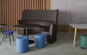
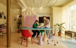
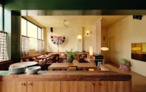
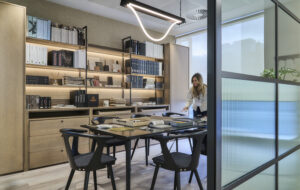
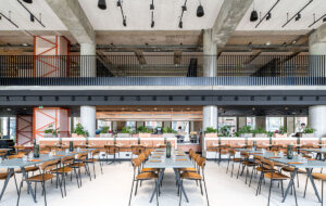
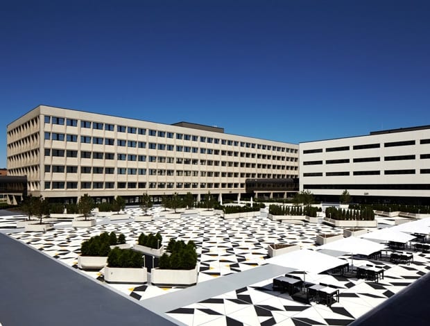
 3M’s various buildings now overlook a pedestrian area that was once a car park|The plaza planters and walkways are transformed by LED rope lights at dusk|The tangram-inspired design uses 3M’s reflective tape, used for road markings|Illuminated ceilings in softly rounded shapes give a retro-futuristic look|Collaboration hubs have touch-screen tables and walls, and soffit display|Streamlined Corian furniture, like the reception desk, features throughout|Bright, pebble-like seating fulfil’s 3M’s aim to be more informal and less beige|A new steel staircase, one of two inserted to aid circulation between floors||
When American multinational 3M’s 15-storey global HQ, near the city of Saint Paul in Minnesota, was designed by local architects Ellerbe & Co in the early 1960s, it was the embodiment of mid-century corporate culture. With its interiors highly compartmentalised into uniform spaces, it subjugated human needs to an ultra-rational aesthetic predicated purely on functionality and spatial efficiency. In the early 70s, three low-rise structures were added, with all four buildings arranged around an enormous car park and connected by a raised, enclosed walkway. The sight of these sleekly rectilinear structures adjoining a parking lot – at a time when car culture was unquestioningly seen as glamorous – must have looked impressive to the employees of a company whose early-20th-century inventions included masking tape and waterproof sandpaper. Today, it produces adhesives, abrasives and laminates as well as dental, medical and electronic products, and employs more than 80,000 staff worldwide.
But if 3M’s HQ appeared thrustingly contemporary 50 years ago, by 2010 the company clearly perceived it as an antiquated behemoth in urgent need of modernisation. And while its cellular layout was equated with productivity in the 60s, a half-century later it was regarded as holding it back. So 3M hired architects Atelier Hitoshi Abe (based in Los Angeles and Sendai, Japan) and Austrian practice Peter Ebner and Friends to come up with a proposal for the renovation of the HQ’s main lobby and visitor entrance with a view to fostering employee interaction, enlivening the environment and communicating 3M’s brand values more clearly. But, after further discussions between the architects and 3M, the latter requested a much more extensive renovation which is almost mind-boggling in its complexity, not to say far more organic, informal and unconventional than one might expect.
“I was approached by 3M’s former CEO, Sir George Buckley, after he’d attended a lecture I once gave about the future of architecture,” recalls Peter Ebner. “Our brief was broad – to think of future ways of working, and to encourage more communication between employees. Aesthetically, 3M also wanted its offices to get away from boring beige and grey. We collaborated closely with 3M’s board members, who are very interested in architecture.” Ebner disdainfully describes 3M’s original 60s HQ, known as 220, as “a bad copy of Mies van der Rohe.
While he favoured generous, open-plan interiors, the ground floor of 220 was very cluttered.” Ebner was responsible for renovating the first two floors of the 3,160sq m tower, which now houses a new lobby, conference rooms, a lecture hall, coffee bar and collaborative workspace. Ebner also designed a new cube-shaped building that stands in front of 220, called The Exchange, used for meetings, and landscaped an area behind it, creating a six-acre garden.
Atelier Hitoshi Abe, meanwhile, renovated parts of the 70s buildings, one of which now incorporates a new ’employee mall’ – a microcosm of an American town, complete with a US Bank branch, newspaper stands, an optometrist, hair salon and laundry facilities. Abe also designed new dining areas and, in the walkway – dubbed, like something out of The Jetsons, ‘the skyway’ – a cafe and training rooms. But Abe’s most significant intervention was the introduction of open-plan ‘hubs’ in passageways once deemed less important than the workstations. Although many of the original cubicles containing the latter remain intact, the hubs make the rigidly cellular layount less oppressive, while fostering more interaction between staff members.
Some hubs are enclosed, albeit with glass, consistent with the new HQ’s ethos of greater transparency. And it’s these hubs that give the renovated HQ a distinctly space age look. Each one boasts chairs and sofas in a different, punchy hue – from Yves Klein blue to bright apple green or red – all perched on white floors, brilliantly illuminated by artificial lighting mimicking skylights. These spaces inevitably recall the retro-futuristic sets of 2001: A Space Odyssey. Were the hubs inspired by it? “No, they weren’t influenced by anything in particular,” claims Pierre De Angelis, Abe’s chief designer. “3M wanted each hub to have a unified aesthetic.” In fact, the hubs’ furniture nods not just to the pop aesthetic of the late 60s but also, ironically, to the HQ’s mid-century roots, including as it does pieces by Arne Jacobsen and the Eameses. “We wanted to keep a flavour of the original 60s building, to mix old and new,” says Ebner of his design ethos.
But while the spaceship in 2001: A Space Odyssey had one resident computer in the form of HAL 9000, the new HQ’s spacecraft-like hubs are awash with touch-screen computers integrated into table tops which provide the staff with an intranet that allows them to share information with fellow employees worldwide. There are further LED screens at ceiling height, relaying yet more data. “Employees are allowed to spend 15% of their work time conducting their own research, which they can share with others via computers and their mobile phones,” says Ebner. Of course, this ultra-contemporary environment is also designed to be attractive to staff, and ultimately to retain them.
The hubs aren’t the only flamboyant element in the new HQ. The former car park has been given a dramatic makeover: in tune with our more eco-friendly times, Abe converted it into a pedestrian space, now called the Plaza, where employees can hang out. Intriguingly, its floor has a geometric pattern based on the Chinese puzzle, tangram – echoed by similarly shaped planters – though there is no symbolism behind this, says De Angelis: “It simply introduces a bold focal point”. At night, the Plaza even looks festive since it can be lit by ambient lighting, he adds: “At the base of the planters are LED rope lights. In winter, whenever it snows, these illuminate the surrounding snowfall, creating a winter garden.”
Wittily, the Plaza’s tiled pattern is punctuated with accents of colour that turn out to be one of 3M’s products: ultra-reflective, adhesive-backed tape normally used for road markings. This self-referential detail may serve to remind visitors and employees alike of the sort of things 3M manufactures. But it also highlights another aspect of this project: the architects, Abe in particular, have gone beyond the principle, practical aim of reconfiguring its interiors to encourage more communication between employees. They’ve also had a lot of fun along the way, judging by the revamped HQ’s many playful elements.

