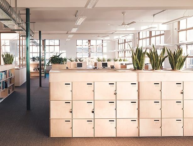
 Opendesk lockers with integrated planting for Greenpeace’s HQ|||
Ah plywood, the onion of the construction world. Multi-layered, versatile, and the basis for many an architectural recipe, though rarely the lead ingredient. That has changed lately, however, with a host of resourceful architects and designers using the material in inventive ways, changing its cheap, unfinished image to one of low-tech creativity. The aesthetic of raw engineered wood has ties to the hacked warehouse studios of East London and the like, where young creatives with limited funds build their own interior architecture in which to live and work. Like many trends that drip down from the artistic community, it was born from necessity and economy, but has given the material a cool new reputation and now it is prevalent. This is much to the joy of architects everywhere with stretched budgets, yet looking to inject some personality and ingenuity into their projects.
One such example is WAM’s (Walker and Martin) latest work for Kent-based travel company Holiday Extras, for which the architects designed a headquarters over a decade ago. As part of a recent update, two meeting and socialising hubs in the main workspace and a nearby satellite office (for offshoot company Short Breaks) have been given the ply treatment. The first has a starburst of plywood boards on the ceiling, drawing people to sit on its Vitra chair collection and collaborate. The second goes a step further, with the entire central atrium lounge sporting a plywood hat. This area is at the heart of the building, connecting all the workspace, so WAM aimed to create a warm, inviting environment for team meetings. The roof void doubles the room’s height in the middle and brings in lots of natural light, while the ceiling and top half of the walls are coated in a pattern of plywood panels, showing what can be done with materials by adding a touch of creative flair.
 Greenpeace liked the environmental ethos of Opendesk’s ply products
“Part of the design ethos was to take an ordinary, readily available material and do something interesting with it,” says Stuart Martin, founder of the practice. “I think turning the panels on their sides gave it an extra dynamic, so you get this diamond rhythm. It’s deceptively simple, but of course the beauty is in the setting out, making sure all the cuts and joins are in the right place, so it looks like it folds around the walls and into the ceiling.”
The original “mothership” building used an abundance of plywood, so Martin was keen to use it here to maintain a visual and material connection. Its availability and cost were selling points, he says, but it still took a little persuasion for everyone to agree to the idea. “When you say you’re going to put ply panels over the walls, some people look at you in horror,” he laughs. “There’s still this perception of ply as a substrate, that it’s disposable, almost, rather than a finished material. But I like that game of playing with something you wouldn’t expect.”
 Timber screens act as dividers while allowing light through
Speaking of the unexpected, our next example resides within a 1980s office block in Romford, Essex. Once a tired, cellular design, this interior has been invigorated thanks to plywood, and some imaginative application by architects Metropolitan Workshop. The practice wanted to create a more flexible, open and informal working environment for energy support services company Lakehouse, which is a common transformation these days. The space has been stripped back and given a neutral palette peppered with flashes of bright yellow, giving visual prominence to a series of plywood interior structures and furniture, which break up the now open-plan space. Built from birch-faced ply panels and fin louvres, the material brings with it a contemporary, calm and bright feel, and also connects with the company.
“Unfinished plywood has a strong resonance with construction, and therefore Lakehouse’s business,” says project architect Edward Rhodes, “as well as the clean, crisper workspace environment we wanted to create.” Other construction-themed materials were considered, says Rhodes, such as glass-reinforced cement, but this has a more polished appearance and is more expensive, he explains, whereas ply was more adaptable, lighter in colour, and more sustainable.
 The slats also create meeting pods within the open-plan space
Timber louvres tie the whole scheme together, starting in reception where the desk is clad in a recurring pattern of planks, and a double-height waiting and meeting area is also wrapped in them. This screens the space, offering separation and partial privacy without blocking views and light across the building. The louvres also help to filter light from some windows; they are used as baffles above the central staircase; and have created semi-private booths for small meetings. The decision to use ply has given a distinct identity to the communal areas particularly, and encouraged staff to move around and make their workday more varied.
Greenpeace’s London HQ has been given a similar revival by furniture company and plywood purveyor Opendesk, together with Architecture 00. The office in north London was designed by Feilden Clegg Bradley around 25 years ago, so Architecture 00 and Opendesk (together with Linton Ross, who was project architect at FCB for the original design) were brought in to give it a refresh. This is fairly light touch, says co-founder (and previously an architect with 00) Joni Steiner, to create a natural, open aesthetic using raw-look plywood furniture and lots of plants.
 A starburst of louvres draw people to the seating area
Greenpeace felt an affinity for Opendesk’s business model, which sees them produce furniture on demand in workshops close to the client. “Greenpeace is a big organisation with strong ethics, so they see the benefits of local production,” says Steiner. “The provenance of things is important to them. Not just environmental but economic and social sustainability, retaining money in the local community.”
Its supply chain is broken down and presented openly to clients, to show that everyone along the chain is being treated fairly. This transparency also means Greenpeace could find out in-depth information about the furniture’s ecological footprint, from the exact forest in Finland where the timber was sourced, to the glue content; then cycle ten minutes to the workshop where it was being CNC cut, to discuss details with the maker.
 Ply ceiling panels provide warmth and dynamism
Some of the furniture pieces are adapted versions of existing Opendesk designs, tweaked in size to optimise the space, while the bookshelves and lockers were designed in collaboration with Greenpeace for this project. These designs are now part of the Opendesk design library, which anyone around the world, from a big company to an individual, can purchase and customise to their needs.
“They liked that there was a legacy beyond their own workplace,” says Steiner. “It also starts to change this idea of authorship, that you design something and it’s finished. Our pieces are modular, so you can adjust and upgrade them. One person can design a desk, someone else can suggest a variant or new capability. It’s coauthored.”
This is where the benefits of plywood come in. Affordable, easy to CNC cut, and available everywhere… the material is ideal for Opendesk’s model. The company’s exponentially popular offering means such designs will be popping up in high-profile projects like Here East, and spaces for Nike and Google soon, adding further clout to the campaign for ply.
Designers are taking this humble yet versatile material centre stage

