 |||
|||
It’s safe to say this is the first workplace OnOffice has published that has drawn inspiration from a dry cleaner’s. It is the result of this unusual muse, however, that has compelled me to sunny Sunderland to see Rock Townsend’s recently unveiled Berghaus headquarters, in particular a gif showing the dry-cleaner-inspired contraption in action. Revolving over the heads of office staff is a giant electric clothing rail, a bit like Alicia Silverstone’s wardrobe in the 1990s film Clueless. Here, though, tartan and feather boas have been replaced by colourful outdoor jackets.

It’s no gimmick – in fact it’s a highly practical solution to the company’s major storage issue. As a long-time producer of sports equipment and clothing, it generates a lot of stuff, which was previously hoarded in meeting rooms at the centre of the two office floors. “It was rammed with decades’ worth of kit,” says Rock Townsend director Mark Gabbey, “so the floor was basically a racetrack. It wasn’t permeable, you couldn’t see through and this was stunting communication and creativity.”
Before, the workspace had a basic 90s fit-out with low suspended ceilings, bad brand-colour carpets, and executive offices hogging natural light and views over the River Wear. Rock Townsend’s first and most dramatic intervention was to rip out the ceilings of the first-floor space to reveal a pitched roof, creating a light and open space and giving way to a vast overhead void for the so-called sky rail.
By moving all the storage up and out of the way, central spaces have been freed up for use as meeting areas – a mixture of private rooms and open breakout areas; plus natural light can travel through the space. It has also allowed important spaces like the material testing laboratories and a sample development room to be placed next to the desk areas, encouraging staff to use them more often, and, together with the sky rail, giving a creative factory feel.
This fulfilled another vital part of the architectural brief: to sell the brand to clients and future staff. “They weren’t declaring the interesting bits of their process,” says Tim Robinson, architect at the firm. “We wanted to pick up on the journey of the product. There’s amazing experimentation and technology going on and it should be celebrated. If someone comes for a meeting now, they’re part of the experience, and it’s a great advert for them.”
Katie Greenyer, creative director of Berghaus’s parent company Pentland Brands (which also owns companies like Speedo and Red or Dead, and is a majority owner of JD Sports) continues: “We need to attract the best talent. Before, not only were we trying to attract people to Sunderland, but it was a shithole too. Once you’ve got somewhere like this, it’s an inspirational place to work and you get staff retention.”

Though visitors arrive at a generic industrial park building, that first impression is soon replaced by one of a bright, double-height foyer. Rock Townsend purchased around 1,500m of neon pink/orange climbing rope to inject colour throughout the neutral, stripped-back interior in subtle brand-related fashion, and a fair length of this has been used to create the main staircase balustrades. Underneath, a CNC-routed plywood reception desk sports a contour map of Sunderland, and opposite, a waiting area is populated by a motley collection of seating, including a swing. Here, scaffolding boards are used as acoustic ceiling baffles, pierced through with fluorescent tube lights – one of many innovative responses to the very tight budget, and part of a diverse scheme by lighting consultant Nulty+.
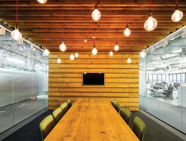
The perimeter of the building is mostly given to open-plan workspace, where everyone has their own generously proportioned desk and storage, plus access to a host of shared breakout space. Even so, Rock Townsend’s redesign and reorganisation has managed to free up an eighth of the floorplan, to be repurposed soon. Flooring is a mix of existing metal panels, another cost-saving measure, and carpet in heavy traffic areas. One side of the first floor houses three showrooms with adaptable retail displays for Berghaus to present its apparel, footwear and equipment to buyers.

Meanwhile back on the ground floor, an expansive canteen area overlooking the river allows staff to eat lunch or have ad hoc meetings away from their desks on long bench tables, or around a huge statement kitchen counter that appears to have been lifted out of an excavated section of the floor. This is another major installation by Rock Townsend that intended to diversify the floorscape for its adventurous workforce, says Robinson.
“We wanted to introduce more danger into the design,” he says, hastening to add that building control did, eventually, let this through. “The staff are used to climbing mountains, so we didn’t want the office to just be a flat plain. The lowered floor gives relief and differentiation, like a landscape.”
The firm commissioned Cornwall furniture maker Felix McCormack to make bespoke high and low stools for each side of the kitchen counter, with “tide marks” to enhance the natural landscape effect. The counter itself looks like concrete but is, in fact, screeded timber, which provides a far cheaper and lighter-weight alternative. It also seems to be held up by that same pink climbing rope – a visual contrast that adds to the design’s theme of risk and adventure.
According to Rock Townsend, the concept is based on a cave and a glacier: the outer perimeter being the clean, fresh, open glacier, and the core the intimate, domestic cave. It’s a loose premise that hasn’t been overdesigned, but translates into a varied environment supportive of interaction and creativity. Its best feature is the floor-to-ceiling windows giving panoramic views of beautiful Tyne and Wear countryside, because ultimately, the architects explain, the scheme was designed around Berghaus’ raison d’être – the outdoors.

Outdoor specialist Berghaus brought a sense of adventure to the refurb of its dull Sunderland HQ

