 ||
||
 The refurbished screening rooms have comfier seatsIf you had the good (or bad, taste depending) fortune to visit London’s Trocadero in the 1990s, the incessant cacophony and flashing lights of arcade machines will most likely still be vivid in your memory. Walking into the atrium now, it’s hard to believe it’s the same place where Sega World once reigned, having been transformed into a chic Picturehouse cinema, the chain’s new flagship.
Its stirring new entrance and completely transformed interior architecture by London studio Panter Hudspith, with interiors by Martin Brudnizki Design Studio, aims to return the Grade II-listed 1896 building to some of its original grandeur, with a modern flavour.
Amid the frenetic bustle of Piccadilly Circus, the building has a subtle and satisfyingly retro new entrance on Shaftesbury Avenue (compared with the visually intense retail and tourist traps that surround it) that “instantly says cinema”, explains Mark Panter of Panter Hudspith. The traditional readograph signage by signmakers Goodwin & Goodwin taps into the public affection for cinematic heritage.
This leads to a larger, colonnaded entrance on a small side street, with carousel bulbs above the entrance, where the design is intended to “return some theatre to arriving at the cinema”, says Panter. The architects also restored the baroque facade, ridding it of “unsympathetic additions”, part of a plan to re-establish the Trocadero as a city landmark.
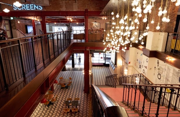
 The former ballroom of the Trocadero is now the cinema’s foyer At ground level, where the original Trocadero ballroom once stood, the architects have knocked through old retail units to create a dramatic double-height foyer with a monochrome, herringbone tiled floor, and camouflaged the existing ceiling ductwork with a uniform coat of grey paint. Ahead, to the left, is an impressive oak staircase with red tiling and decorative balustrades, topped by a huge installation of clustered lights. “We wanted the stairs to be reminiscent of a red carpet,” says Panter, again referencing theatrical inspirations. This red is continued throughout on the painted structural metalwork.

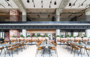
To the right is a large cafe, with primary-coloured mid-century canteen chairs and red industrial-style pendants; this area is hoped to draw in extra customers and revenue in the cinema’s quieter times. The foyer is decorated with artwork by Patrick Vale and Paul Davis, depicting the history of cinema, which adds a layer of detail with a personal touch.
 Upstairs, the atrium’s mezzanine floor holds the ticket kiosks; here the architect has used an awkward structural wall to dramatic effect, housing booths within red steel girders. The lounge bar opposite shows Brudnizki’s flair for luxurious furnishings, with a pewter-topped bar and a collection of vibrantly coloured sofas and armchairs, all contrasting with the exposed brick walls. Another front-of-house space, a members’ bar spanning three upper floors, will open soon and promises more of the same aesthetic.
Lastly, the cinemas themselves occupy existing auditoria from a former tenant, brought up to date with new technology and redesigned to give better sightlines and bigger, comfier seats; new curtains for the screens are the cherry on the cake in terms of the vintage cinema experience.
The practice has renovated several other Picturehouse cinemas, in Greenwich, Clapham, East Dulwich and York, and is currently working on another in Crouch End. All involve adapting an existing structure and bringing out its inherent character, says Panter, and are therefore tricky to get off the ground. “But once they’re open,” he continues, “they develop a local following, because they’re community cinemas essentially. They regenerate the area, and take on a new life for the public.”


A new West End cinema shows how front-of-house space is moving up the billing


