 ||
||
If anyone with a knowledge of contemporary ceramics was asked to guess who had created the coolly clean-lined, immaculately proportioned, hand-glazed ceramic tiles fronting the exterior of central London building 24 Savile Row, probably the last person they’d think of is Kate Malone.
An established ceramicist, Malone is known for her bulbous, exuberantly organic pots and vases inspired by nature, from magma to exotic fruit and vegetable specimens such as gourds, pineapples and artichokes. Her work is riotously colourful and neo-baroque. A clue as to where she’s coming from aesthetically lies in her admiration for the flamboyant sculptor Andrew Logan and Zandra Rhodes, who are also her friends.
 Dsquared2 occupies the retail space and has also taken the second floor offices
In a video of Malone talking to Stephen Pey of London-based EPR Architects – which designed this new seven-storey, mixed-use office and retail building at the intersection of Savile Row and Conduit Street – she cheerfully acknowledges that her work is normally “loud, ebullient and colourful”. Yet she points out that the tiles’ surface, while pared-back, is also “rich and elaborate”.
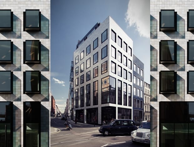
Seen from afar, their pale silver tones recall mother-of-pearl, but a closer inspection reveals that they’re covered with intricate crystalline structures. These form when the glaze is allowed to cool in a carefully controlled way after it has been fired at an extremely high temperature – around 1,260°C. Nature, the source of many of Malone’s ideas, has fittingly resurfaced here in the shape of subtly 3D, abstract patterns resembling fractured ice crystals.
The patterns are all different, making each tile unique. So, althoughall 10,000 tiles have the same proportions and form a slick-looking grid on the building’s facades, their surfaces are, conversely, organic.
 Sections of cobalt blue tiles break up the facade vertically
 Sand-cast bronze panels by ceramicist Michael Eden clad the building’s plinth
In fact, Malone is highly experienced in developing glazes, having researched the subject for 30 years. However, she struggled to find a factory that could fabricate the volume of tiles needed to clad 24 Savile Row until she discovered Surrey-based ceramic workshop Froyle, which can fire tiles at high temperatures. To begin with, Malone’s studio hand-mixed and kiln-tested the glazes, then supplied them to Froyle, which proceeded to hand-glaze the tiles, hand-sponge their edges and fire them in batches of 100.
“The main story behind 24 Savile Row is its tiled facades, and the collaboration that it involved between art and architecture,” says Pey, who also notes that the tiles’ glazes constantly reflect different kinds of light as the weather changes, thereby regularly altering the appearance of the building.
Their decorative quality certainly accorded with the intentions of EPR’s clients, developers Aerium and Terrace Hill, which acted as the development manager. After all, their aim was to upgrade the site, which had previously been occupied by a nondescript 1960s building. “The old building, which we demolished, was erected to join up Savile Row and Conduit Street. Before then, the streets didn’t intersect,” says Pey.
In 2012, EPR won a competition to design the multi-million-pound development. At 3,900sq m, it is split into 930sq m devoted to retail spaces on the basement, first and second floors, all currently occupied by fashion label Dsquared2, and 2,970sq m designated as offices.
Pey describes the project as unique, yet other architects have incorporated glazed ceramic facades into their buildings, such as Eric Parry’s One Eagle Place on nearby Piccadilly. But Pey counters that 24 Savile Row involved a greater degree of collaboration with an artist. This is true in the sense that Malone’s tiles cover the building’s entire exterior, whereas at One Eagle Place artist Richard Deacon contributed a smaller element, a ceramic cornice.
 Seen from a distance, Kate Malone’s hand-crafted tiles shimmer like mother-of-pearl Even so, 24 Savile Row – which stands on a sand-cast bronze plinth with a black ceramic finish co-created by Malone and another high-profile ceramicist, Michael Eden – belongs to an established tradition of architecture with ceramic facades. Key examples include the polychrome mosques of Isfahan in Iran, dating from around the 8th century, art nouveau buildings such as Antoni Gaudí’s Casa Battló and Jørn Utzon’s tile-clad Sydney Opera House of 1957. Interestingly, Malone’s website reveals that she is also influenced by architecture, from Gaudí’s Sagrada Família to Bangkok’s Grand Palace, whose roof is studded with ceramic flowers.
According to Pey, Westminster Council’s planning requirements were particularly stringent: “24 Savile Row had to be in-keeping with local context and history, and as the site is in the Mayfair conservation area these requirements were even stricter.” Fortunately, EPR found a sympathetic ally in Robert Ayton, the council’s head of design and conservation. “He is keen on pottery and ceramics and took an interest in it,” says Pey.
 A grid of projecting windows stand proud of the tiled facade that faces on to Savile RowPey reasoned that the building’s location on legendary Savile Row necessitated that its design be very distinctive and somehow bespoke, in keeping with the street’s heritage of made-to-measure tailoring.
This, in turn, led to the idea of incorporating individually hand-crafted tiles. Context was another concern for Pey: the Conduit Street facade of 24 Savile Row has recessed windows that are consistent with those of the Georgian buildings nudging it. A part of this facade is clad in cobalt blue tiles, which, says Pey, “turn electric blue whenever sunlight hits them”. This variation in colour also breaks up the facade into smaller vertical widths that echo the proportions of the older buildings alongside it.
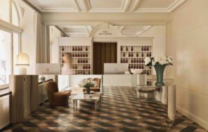
On the Savile Row side, the design of the windows is more varied – they’re both recessed and projecting. The idea was to add visual interest and avoid the exterior looking monolithic. Internally, in the office’s light-filled, minimalist interiors, the floor-to-ceiling projecting windows create bays that people can step right into, with views up and down the street. While this obviously won’t appeal to people with a fear of heights, others will like the strong, dramatic sense that these windows give of connecting the indoors with the outside world.
The building also reflects EPR’s concern with sustainability. It has garnered a BREEAM Excellent rating and is one of the first in London to only use LED lighting. It also has a sedum roof, designed to encourage biodiversity.
Overall, Pey ardently hopes that 24 Savile Row’s highly considered design will inspire the creation of others like it: “It would be great if this level of detail, the level of collaboration with an artist we’ve achieved here were to set new standards in other buildings.”
Replacing a tired 1960s office block, 24 Savile Row features a lustrous ceramic-tiled facade that is a sympathetic union of architecture and decorative art

